
 As part of my preparation for my talk at CSSDay HTML Special, I was perusing the most recent HTML specs (WHATWG Living Standard, W3C HTML 5.1) to see what undiscovered gems lay there. It turns out that HTML sliders have a lot of cool features specced that aren’t very well implemented:
- Ticks that snap via the
listattribute and the<datalist>element. This is fairly decently implemented, except labelled ticks, which is not supported anywhere. - Vertical sliders when height > width, implemented nowhere (instead, browsers employ proprietary ways for making sliders vertical: An
orient=verticalattribute in Gecko,-webkit-appearance: slider-vertical;in WebKit/Blink andwriting-mode: bt-lr;in IE/Edge). Good ol’ rotate transforms work too, but have the usual problems, such as layout not being affected by the transform. - Two-handle sliders for ranges, via the
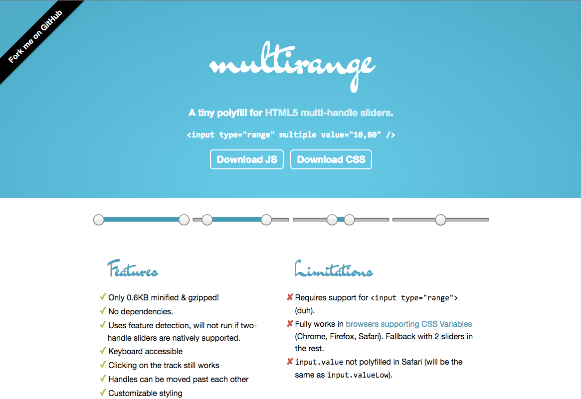
multipleattribute.
I made a quick testcase for all three, and to my disappointment (but not to my surprise), support was extremely poor. I was most excited about the last one, since I’ve been wanting range sliders in HTML for a long time. Sadly, there are no implementations. But hey, what if I could create a polyfill by cleverly overlaying two sliders? Would it be possible? I started experimenting in JSBin last night, just for the lolz, then soon realized this could actually work and started a GitHub repo. Since CSS variables are now supported almost everywhere, I’ve had a lot of fun using them. Sure, I could get broader support without them, but the code is much simpler, more elegant and customizable now. I also originally started with a Bliss dependency, but realized it wasn’t worth it for such a tiny script.
So, enjoy, and contribute!


 Whenever I wanted to convert a CSS named color to RGB, I used to open