Categories
Articles Thoughts

JS private class fields considered harmful

Reading Time: 2 minutes

Today I mourn. What am I mourning? Encapsulation. At least in my projects.

As a library author, I’ve decided to avoid private class fields from now on and gradually refactor them out of my existing libraries.

Why did I make such a drastic decision?

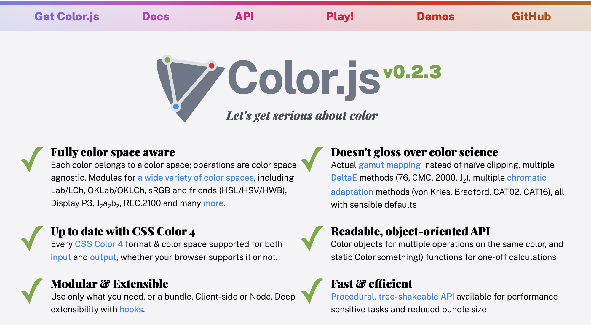
It all started a few days ago, when I was building a Vue 3 app that used Color.js Color objects. For context, Vue 3 uses proxies to implement its reactivity system, just like Mavo did back in 2016 (the first one to do so as far as I’m aware). I was getting several errors and upon tracking them down I had a very sad realization: instances of classes that use private fields cannot be proxied.

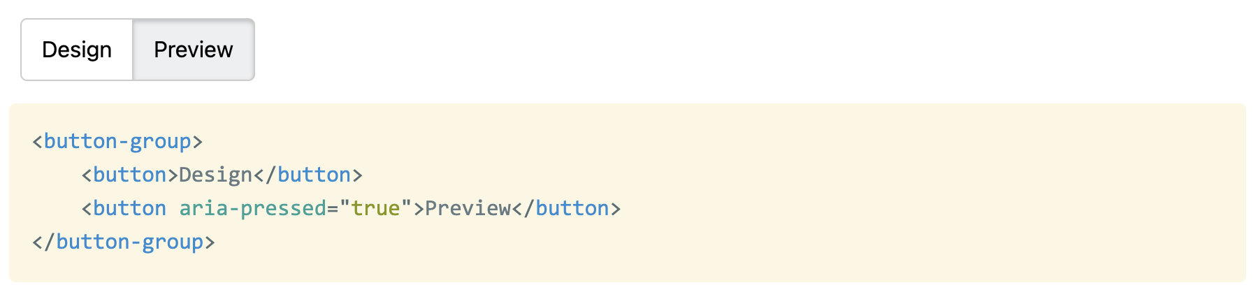
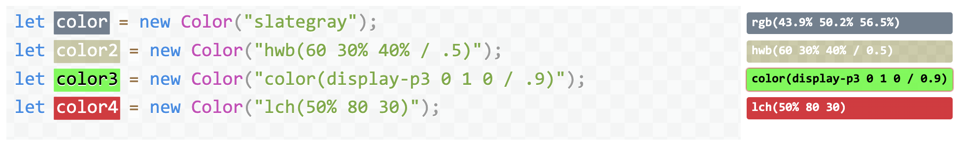
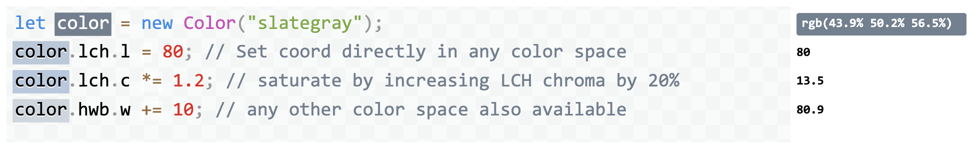
I will let that sink in for a bit. Private fields, proxies, pick one, you can’t have both. Here is a reduced testcase illustrating the problem.

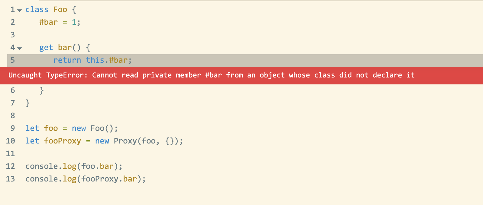
Basically, because a Proxy creates a different object, it breaks both strict equality (obj1 === obj2), as well as private properties. MDN even has a whole section on this. Unfortunately, the workaround proposed is no help when proxies are used to implement reactivity, so when I tried to report this as a Vue bug, it was (rightly) closed as wontfix. It would not be possible to fix this in Mavo either, for the same reason.

I joined TC39 fairly recently, so I was not aware of the background when proxies or private class fields were designed. Several fellow TC39 members filled me in on the discussions from back then. A lot of the background is in this super long thread, some interesting tl;drs as replies to my tweet:

After a lot of back and forth, I decided I cannot justify using private properties going forwards. The tradeoff is simply not worth it. There is no real workaround for proxy-ability, whereas for private fields there is always private-by-convention. Does it suck? Absolutely. However, a sucky workaround is better than a nonexistent workaround.

Also, I control the internal implementation of my classes, whereas proxying happens by other parties. As a library user, it must be incredibly confusing to have to deal with errors about access to private fields in a class you did not write.

This was one of the saddest PRs I have ever written https://github.com/LeaVerou/color.js/pull/306. It feels like such a huge step backwards. I’ve waited years for private fields to be supported everywhere and relished when they got there. I was among the first library authors to adopt them in library code, before a lot of tooling even parsed them properly (and some still don’t).

Sure, they were kind of annoying to use (you usually want protected, i.e. visible to subclasses, not actually private), but they were better than nothing. I was not joking in the first paragraph; I am literally grieving.

I may still use private fields on a case by case basis, where I cannot imagine objects being proxied being very useful, for example in web components. But from now on I will not reach to them without thought, like I have been for the past couple of years.

Categories
News

Contrast Ratio has a new home — and this is great news!

Reading Time: 2 minutes

It has been over a decade when I launched contrast-ratio.com, an app to calculate the WCAG 2.1 contrast ratio between any two CSS colors. At the time, all similar tools suffered from several flaws when being used for CSS editing:

  • No support for semi-transparent colors (Since WCAG included no guidance for alpha transparency — I had to do original research to calculate the contrast ratio range for that case)
  • No support for color formats other than hex or (at best) RGB with sliders. I wanted something where I could just paste a CSS color just like I had it specified in my code (e.g. hsl(220 10% 90%), possibly tweak it a bit to pass, then paste it back. I didn’t want to use unintuitive hex colors, and I didn’t want to fiddle with sliders.
  • Poor UX, often calculating the actual ratio required further user actions, making iteration tedious

Over the years, contrast-ratio.com grew in popularity: it was recommended in several books, talks, and workshops. It basically became the standard URL developers would visit for this purpose.

However, I’ve been too busy to work on it further beyond just merging pull requests. My time is currently split between the dozens of open source projects I have started and maintain, my TAG work, my CSS WG work, and my teaching & research at MIT.

Therefore, when Ross and Drew from Siege Media approached me with a generous offer to buy the domain, and a commitment to take over maintainship of the open source project, I was cautiously optimistic. But now, after having seen some of their plans for it, I could not be more certain that the future of this tool is much brighter with them.

Please join me in welcoming them to the project and help them get settled in as new stewards!

ETA: Siege Media Press Release

Categories
Personal

Position Statement for the 2022 W3C TAG Election

Reading Time: 3 minutes

Update: I got re-elected!! Thank you for trusting me once more with this huge responsibility towards the Open Web. I will continue to do my best to justify the confidence the W3C membership has placed in me. 🥹

Context: In 2020, I ran for the TAG election for the first time and had the great honor of being elected by the W3C membership. This year, I’m running for re-election. The W3C Technical Architecture Group (TAG) is the Working Group that ensures that Web Platform technologies are usable and follow consistent design principles, whether they are created inside or outside W3C. It advocates for the needs of everyone who uses the Web and everyone who works on the Web. If you work for a company that is a W3C Member, please consider encouraging your AC rep to vote for me! My candidate statement follows.

I’m Lea, and I’m running for re-election to the TAG to continue applying my usability research, CSS WG, and TAG experience to help W3C stay connected to the developer community, and to better serve their needs by ensuring web platform features are not only powerful, but also learnable and approachable, with a smooth ease-of-use to complexity curve.

I wear many hats. My background spans almost two decades of web design & development experience, one decade of standards work in the CSS WG, nearly a decade of PhD level human-computer interaction research & teaching at MIT, and over a decade of educating web developers through talks, books, articles, and helping them through my dozens of open source projects, some of which are used on millions of websites. For those unfamiliar with my background, I encourage taking a look at my 2020 candidate statement.

In 2020, I had the great honor of being elected to serve on the TAG by the W3C membership. In the two years I have served on the TAG, I participated in over 70 design reviews and helped prioritize API design in our reviewing. I have been publicly praised for the quality of design reviews I led. 

It is important that the TAG does not operate in a vacuum:  The primary purpose of our work is to serve developers and end-users by ensuring web platform features are usable, secure and privacy preserving. I have used my experience during design reviews to make sure we remain connected to this mission.

Together with Sangwhan Moon, I took the lead on our Web Platform Design Principles effort, which documents the principles that underlie Web Platform features — previously only existing in WG lore. The Web Platform is going through an explosion of new features; only in the last year the TAG received almost a hundred design review requests. With this volume, it is important that reviews are consistent, transparent, and fast. Evolving our published design principles helps with all three goals.

The Web ecosystem is not just the Web Platform itself, but also the various tools and libraries out there. I started a project to publish a subset of the design principles that apply to web developers, to help them in creating Web Platform compatible APIs. After all, with web components, web developers are now HTML designers, with Houdini APIs, they are now CSS designers, and with JS, they’ve been JS API designers since forever. The project is currently in its infancy, and If elected, it will be one of my tasks to get it published within my next term.

As a Greek woman, I bring both a Mediterranean and European perspective that diversifies the TAG and as a fully bilingual Greek and English speaker, I can fully participate in rapid technical discussions while also having an appreciation of the Internationalization needs of those who use the Web in languages other than English.

To ensure my participation has been beneficial for the TAG, I reached out to the chairs for feedback before deciding to run again. Both were very positive and strongly encouraged me to run again.

As someone not employed at a big tech company, I am not influenced by any particular company line. My only agenda is to lead the Web Platform to its full potential, and if re-elected, I’m willing to commit to spending the requisite hundreds of hours working towards that goal over the next two years. This was just the beginning, there is so much more important work to be done!

I would like to thank Open JS Foundation for graciously funding my TAG-related travel, in the event that I am re-elected, and both OpenJS Foundation and Bocoup for funding it during my first term.

Categories
News

State of CSS 2022 now open!

Reading Time: 3 minutes

Take State of CSS 2022 survey

A while ago I posted a call for feedback to inform the design of the State of CSS 2022 survey. The response has been overwhelming and it was glorious. We got quite a lot of proposals, feedback, votes. But that also meant we had to make some tough decisions about what gets in the survey and what doesn’t, otherwise we’d end up with a survey so long nobody would want to finish it!

In the end we added questions about 15 new CSS features based on proposals in that repo, and decided against adding 9. Overall, there are 30 new CSS features the 2022 survey asks about. To make space for all of that, we also removed a few that were not really shining much light into what developers do anymore, and also a couple others that were not actually about CSS.

However, CSS features are not the only — or even the most important questions being asked.

Last year, some of the freeform questions about pain points were particularly useful to browser vendors for prioritizing implementation and standards work, and we expect this to be true this year as well. We put considerable effort into redesigning these freeform questions to make them more intuitive, while maintaining their helpfulness for browser vendors:

We hope the new wording makes it more clear that these are mutually exclusive, so that respondents do not feel they need to duplicate their answers.

One of the new questions I’m excited about is this question to gauge whether the respondent spends more time writing JS or CSS:

A focus of this year’s State of CSS survey is to reach a broader range of developers; a majority of respondents of past surveys has been JS developers who also write CSS, rather than developers that focus on CSS equally or even primarily. This is a natural consequence of this having been spun off the State of JS survey. To truly see what the State of CSS is in 2022, we need input from all types of developers, as developers with different focus have different needs and priorities. This question will allow us to evaluate how well we have reached this goal, and going forward, whether we are improving every year.

Another thing I’m excited about in this year’s survey is the ability to add freeform comments to any question.

Adding freeform comments to a question

It’s often hard to tell what the background is behind each of the three answers: are people not using a given feature due to poor browser support, poor ergonomics, or some other reason? When people do use a feature, was their experience good or bad? Would they use it again?

We went back and forth many times about having a more structured followup question there, but in the end settled on a simple freeform field for this first iteration. Maybe next year it will be more structured, depending on how people use it this year.

So, without further ado, the survey is finally open for responses:

Take State of CSS 2022 survey

This survey is not just for fun: the results actually inform what browsers prioritize for implementation. So by spending a few minutes on a thoughtful and comprehensive response, you can actually make both your and other developers’ lives better! What are you waiting for?

Categories
Original Thoughts

On ratings and meters

Reading Time: 3 minutes

I always thought that the semantically appropriate way to represent a rating (e.g. a star rating) is a <meter> element. They essentially convey the same type of information, the star rating is just a different presentation.

An example of a star rating widget, from Amazon

However, trying to style a <meter> element to look like a star rating is …tricky at best. Not to mention that this approach won’t even work in Shadow trees (unless you include the CSS in every single shadow tree).

So, I set out to create a proper web component for star ratings. The first conundrum was, how does this relate to a <meter> element?

  • Option 1: Should it extend <meter> using builtin extends?
  • Option 2: Should it use a web component with a <meter> in Shadow DOM?
  • Option 3: Should it be an entirely separate web component that just uses a meter ARIA Role and related ARIA attributes?
Categories
News

Help design the State of CSS Survey 2022!

Reading Time: 2 minutes

Since 2019, the annual State of CSS survey has collected feedback from web developers from across the world to try and take the pulse of the CSS ecosystem, and it’s become a valuable resource not only for CSS developers, but also for browser vendors. This summer, one of my side projects is helping out with survey design and outreach for the State of CSS survey, thanks to a generous Google UI fund grant.

The target is for the survey to launch in mid September, and we are currently working on the outline. So far we have created a preliminary outline based on last year’s survey and early research. All our work happens is in the open, in this repo. Here are some of the changes from last year’s survey:

  • Removed the Pre-processors category as it feels like there isn’t too much debate around that area.
  • Got rid of “which browser do you primarily develop in?” question as we already ask which browsers people test in.
  • Merged “Opinions” and “Environments” sections into new “Usage” section.
  • Moved browsers question to “Other Tools”.
  • New features:
    • currentcolor
    • color-mix()
    • Wide gamut colors
    • scroll-behavior
    • scroll-padding
    • font-palette
    • :focus-visible
    • :has() pseudo-class
    • :where() pseudo-class
    • Cascade Layers
    • Houdini Paint API
    • and there are several others we are considering

We are currently looking for feedback from the community, including suggesting CSS features to ask about, libraries and tools, or even new questions altogether.

There are also some design issues to flesh out, you’re welcome to weigh in there too.

If you want to quickly vote on which features are most important for you to make it into the survey, you can do that either via GitHub 👍🏼reactions, or here (which uses GitHub reactions behind the scenes). Do note that reactions are only one metric among many we will use to consider items.

The feedback period will be open until August 20, then we will start working on launching the survey.

Do note that browser makers are looking at this and similar surveys to prioritize what to implement. This is why Google is sponsoring this project. So any effort you put into survey outline feedback, and on responding to the survey when it’s ready, could come back to you tenfold when your favorite CSS features get implemented faster!

Categories
Articles

What is the best way to mark up an exclusive button group?

Reading Time: 2 minutes

A few days ago I asked Twitter a seemingly simple question (I meant aria-pressed, not aria-selected but Twitter doesn’t allow edits…):

For background, I was implementing a web component for an app I’m working on at work and I was getting into some pretty weird rabbit holes with my approach of generating radios and labels.

Unsurprisingly, most people thought the best solution is radio buttons and labels. After all, it works without CSS, right? Progressive enhancement and everything?

That’s what I thought too. I had contorted my component to generate labels and radios in the Shadow DOM from buttons in the light DOM, which resulted in awkward code and awkward CSS, but I felt I was fighting the good fight and doing the best thing for accessibility.

All this was challenged when the actual accessibility expert, Léonie Watson chimed in. For those of you who don’t know her, she is pretty much the expert when it comes to web accessibility and standards. She is also visually impaired herself, giving her a firsthand experience many other a11y aficionados lack. Her recommendation was contrary to what most others were saying:

She went on to make the point that if a design looks like buttons, it should act like buttons, otherwise there are mismatched expectations and poor UX for AT users:

In case you were wondering if state would be equally noticeable with aria-pressed and buttons, it is:

And some advice on grouping:

In theory doing this in Shadow DOM and/or using ElementInternals implicit roles should be fine, though in practice we’ve had some trouble with that.

Today I posted my attempt to implement what we’ve discussed in a <button-group> component, which restarted the discussion.

Its implementation is right here if you want to improve it further! And make sure to check out the actual Twitter thread, as there is a lot of good stuff I couldn’t include in this!

Edit: Léonie wrote a blog post too, Perceived affordances and the functionality mismatch. It’s a great read.

Categories
Releases Speaking

Introducing Rety: live coding, without the stress

Reading Time: 3 minutes

I recently spoke at CSS Day in Amsterdam. It was only my second f2f talk after the pandemic. It went down really well, both in person, and recently that the video was released:

Here is a sample of tweets about it that made me particularly warm and fuzzy inside:

There’s a lot more where these came from too.

This was not just my second post-pandemic talk, but my first talk using Rety, which is what this post is about.

As you may know, I love live coding as a teaching tool, and over the years it has become part of my trademark speaking style.

When combined with some kind of interactive preview, it allows the speaker to demonstrate not only the final state of a coding snippet, but also how you get there, and what the intermediate results are. Live coding is to programming what a blackboard is to math or physics.

But it does create a unique challenge: My live coded slides don’t make sense without me. This may be acceptable for a conference talk, which is usually recorded, but not in other contexts, such as teaching a university course, where all instructors need to be able to teach all lectures, and students need to be able to quickly refer to examples shown.

Back in the fall of 2021, when we were preparing for the second iteration of our course, Design for the Web: Languages and User Interfaces, this came up as a pressing issue. The current state of the course required me to be there to teach my lectures, and this may well be the last year I teach it, since I’m finishing up my PhD soon.

I didn’t want to completely remove live coding from my slides, as I truly believe it is the perfect implementation of the “show, don’t tell” teaching adage for certain things, so I thought instead: what if I could record my live coding, and make it replayable?

Doing so manually seemed like cruel and unusual punishment. And thus, Rety was born (pronounced like the “rety” in “retype”).

While originally the plan was for me to still live code, and have the Rety functionality there for students and future instructors, I ended up using it during my own lectures as well, as I concluded that a well crafted Rety script was strictly superior to me doing the live coding:

  • Same progressive development as a live demo
  • It still affords unplanned demonstrations (e.g. to answer a question), since Rety still works with the same editors, and I could always pause it and take over if needed.
  • I could record myself and edit the script to maximize education value and minimize typos, delays, fumbling etc.
  • People can consume typed text far faster than people can type text. This is why most video tutorials speed up the typing. With Rety, typing speed is adjustable, and doesn’t need to match mine.

After test driving it for our course the entire spring 2022 semester, it went through the ultimate test in June 2022: I used it for my CSSDay conference talk. You can watch the talk here (first live demo at 7:15).

Right now Rety is just a set of two classes: Recorder and Replayer, which are used entirely independently. The exact UI is left up to the Rety user. E.g. to use it in my slides, I integrated it with the Live Demo plugin of Inspire.js (it is automatically included if a <script class="demo-script" type="application/json"> is found in a live demo slide).

The library could use more docs and some tests and I have doubts about the API, but I figured I should release it it earlier rather than later (it’s already been sitting in a repo for 7 months). After all, what best time to release it than when the first Rety talk is still making the rounds?

My vision is to ultimately evolve and standardize the Rety script format, so that it can be used to describe a coding interaction across a variety of tools. There are so many possibilities!

  • Wouldn’t it be cool if CodePen and similar playgrounds supported embedding a Rety script into a pen?
  • What if you could store Rety scripts in a repo and editors like VS Code recognized them and let you replay them?

Enjoy: Rety

Categories
Original Releases

Releasing Color.js: A library that takes color seriously

Reading Time: 3 minutes

Related: Chris’ blog post for the release of Color.js

This post has been long overdue: Chris and I started working on Color.js in 2020, over 2 years ago! It was shortly after I had finished the Color lecture for the class I was teaching at MIT and I was appalled by the lack of color libraries that did the things I needed for the demos in my slides. I asked Chris, “Hey, what if we make a Color library? You will bring your Color Science knowledge and I will bring my JS and API design knowledge. Wouldn’t this be the coolest color library ever?”. There was also a fair bit of discussion in the CSS WG about a native Color object for the Web Platform, and we needed to play around with JS for a while before we could work on an API that would be baked into browsers.

We had a prototype ready in a few months and presented it to the CSS WG. People loved it and some started using it despite it not being “officially” released. There was even a library that used Color.js as a dependency!

Once we got some experience from this usage, we worked on a draft specification for a Color API for the Web. In July 2021 we presented it again in a CSS WG Color breakout and everyone agreed to incubate it in WICG, where it lives now.

Why can’t we just standardize the API in Color.js? While one is influenced by the other, a Web Platform API has different constraints and needs to follow more restricted design principles compared to a JS library, which can be more flexible. E.g. exotic properties (things like color.lch.l) are very common in JS libraries, but are now considered an antipattern in Web Platform APIs.

Work on Color.js as well as the Color API continued, on and off as time permitted, but no release. There were always things to do and bugs to fix before more eyes would look at it. Because eyes were looking at it anyway, we even slapped a big fat warning on the homepage:

Eventually a few days ago, I discovered that the Color.js package we had published on npm somehow has over 6000 downloads per week, nearly all of them direct. I would not bat an eyelid at those numbers if we had released Color.js into the wild, but for a library we actively avoided mentioning to anyone outside of standards groups, it was rather odd.

How did this happen? Maybe it was the HTTP 203 episode that mentioned it in passing? Regardless, it gave us hope that it’s filling a very real need in the pretty crowded space of color manipulation libraries and it gave us a push to finally get it out there.

So here we are, releasing Color.js into the wild. So what’s cool about it?

  • Completely color space agnostic, each Color object just has a reference to a color space, a list of coordinates,, and optionally an alpha.
  • Supports a large variety of color spaces including all color spaces from CSS Color 4, as well as the unofficial CSS Color HDR draft.
  • Supports interpolation as defined in CSS Color 4
  • Doesn’t skimp on color science: does actual gamut mapping instead of naïve clipping, and actual chromatic adaptation when converting between color spaces with different white points.
  • Multiple DeltaE methods for calculating color difference (2000, CMC, 76, Jz, OK etc)
  • The library itself is written to be very modular and ESM-first (with CJS and IIFE bundles) and provides a tree-shakeable API as well.

Enjoy: Color.js

There is also an entire (buggy, but usable) script in the website for realtime editable color demos that we call “Color Notebook”. It looks like this:

And you can create and share your own documents with live Color.js demos. You log in with GitHub and the app saves in GitHub Gists.

Color spaces presently supported by Color.js
Categories
Original Personal Releases

On Yak Shaving and <md-block>, a new HTML element for Markdown

Reading Time: 2 minutes

This week has been Yak Shaving Galore. It went a bit like this:

  1. I’ve been working on a web component that I need for the project I’m working on. More on that later, but let’s call it <x-foo> for now.
  2. Of course that needs to be developed as a separate reusable library and released as a separate open source project. No, this is not the titular component, this was only level 1 of my multi-level yak shaving… 🤦🏽‍♀️
  3. I wanted to showcase various usage examples of that component in its page, so I made another component for these demos: <x-foo-live>. This demo component would have markup with editable parts on one side and the live rendering on the other side.
  4. I wanted the editable parts to autosize as you type. Hey, I’ve written a library for that in the past, it’s called Stretchy!
  5. But Stretchy was not written in ESM, nor did it support Shadow DOM. I must rewrite Stretchy in ESM and support Shadow DOM first! Surely it won’t take more than a half hour, it’s a tiny library.
  6. (It took more than a half hour)
  7. Ok, now I have a nice lil’ module, but I also need to export IIFE as well, so that it’s compatible with Stretchy v1. Let’s switch to Rollup and npm scripts and ditch Gulp.
  8. Oh look, Stretchy’s CSS is still written in Sass, even though it doesn’t really need it now. Let’s rewrite it to use CSS variables, use PostCSS for nesting, and use conic-gradient() instead of inline SVG data URIs.
  9. Ok, Stretchy v2 is ready, now I need to update its docs. Oooh, it doesn’t have a README? I should add one. But I don’t want to duplicate content between the page and the README. Hmmm, if only…
  10. I know! I’ll make a web component for rendering both inline and remote Markdown! I have an unfinished one lying around somewhere, surely it won’t take more than a couple hours to finish it?
  11. (It took almost a day, two with docs, demos etc)
  12. Done! Here it is! https://md-block.verou.me
  13. Great! Now I can update Stretchy’s docs and release its v2
  14. Great! Now I can use Stretchy in my <x-foo-live> component demoing my <x-foo> component and be back to only one level of yak shaving!
  15. Wow, it’s already Friday afternoon?! 🤦🏽‍♀️😂

Hopefully you find <md-block> useful! Enjoy!