I always thought that the semantically appropriate way to represent a rating (e.g. a star rating) is a <meter> element. They essentially convey the same type of information, the star rating is just a different presentation.
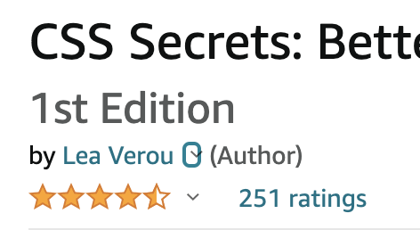
An example of a star rating widget, from Amazon
However, trying to style a <meter> element to look like a star rating is …tricky at best. Not to mention that this approach won’t even work in Shadow trees (unless you include the CSS in every single shadow tree).
So, I set out to create a proper web component for star ratings. The first conundrum was, how does this relate to a <meter> element?
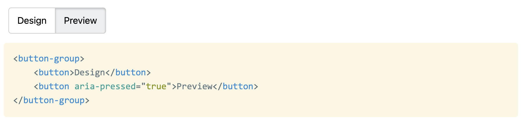
A few days ago I asked Twitter a seemingly simple question (I meant aria-pressed, not aria-selected but Twitter doesn’t allow edits…):
What is the best, most accessible way to mark up mutually exclusive button groups? Radios + labels styled as buttons? <button> with aria-selected="true" + JS to manage the behavior? Something else? pic.twitter.com/T63oHzenTl
For background, I was implementing a web component for an app I’m working on at work and I was getting into some pretty weird rabbit holes with my approach of generating radios and labels.
That’s what I thought too. I had contorted my component to generate labels and radios in the Shadow DOM from buttons in the light DOM, which resulted in awkward code and awkward CSS, but I felt I was fighting the good fight and doing the best thing for accessibility.
All this was challenged when the actual accessibility expert, Léonie Watson chimed in. For those of you who don’t know her, she is pretty much the expert when it comes to web accessibility and standards. She is also visually impaired herself, giving her a firsthand experience many other a11y aficionados lack. Her recommendation was contrary to what most others were saying:
If the intent is that only one button can be activated at a time, suggest using <button> elements with aria-pressed, so the state of the active chosen button is "true" and the rest automatically set to "false".
She went on to make the point that if a design looks like buttons, it should act like buttons, otherwise there are mismatched expectations and poor UX for AT users:
They have similar behaviours, yes, but your design gives them the appearance of buttons (I think?) not radio buttons, so there is a mismatch of expectations in terms of k'board interaction and shortcuts.
Sure. It's generally better to use the element that matches the intent. If you use radio buttons but style them to look like buttons, it creates a mismatch that you need to polyfill with ARIA etc.
In case you were wondering if state would be equally noticeable with aria-pressed and buttons, it is:
The vailable state info is the same – you either hear that one button is pressed and the others are not, or that one radio is selected and the others are not. The state/behaviour in both cases is essentially the same, but the interaction/expectations are not.
If the grouping is also important, putting each group of buttons inside a <section> element with aria-label to give it an accessible name should do the trick. Has the added bonus of turning each section into a navigable landmark.
This week has been Yak Shaving Galore. It went a bit like this:
I’ve been working on a web component that I need for the project I’m working on. More on that later, but let’s call it <x-foo> for now.
Of course that needs to be developed as a separate reusable library and released as a separate open source project. No, this is not the titular component, this was only level 1 of my multi-level yak shaving… 🤦🏽♀️
I wanted to showcase various usage examples of that component in its page, so I made another component for these demos: <x-foo-live>. This demo component would have markup with editable parts on one side and the live rendering on the other side.
I wanted the editable parts to autosize as you type. Hey, I’ve written a library for that in the past, it’s called Stretchy!
But Stretchy was not written in ESM, nor did it support Shadow DOM. I must rewrite Stretchy in ESM and support Shadow DOM first! Surely it won’t take more than a half hour, it’s a tiny library.
(It took more than a half hour)
Ok, now I have a nice lil’ module, but I also need to export IIFE as well, so that it’s compatible with Stretchy v1. Let’s switch to Rollup and npm scripts and ditch Gulp.
Oh look, Stretchy’s CSS is still written in Sass, even though it doesn’t really need it now. Let’s rewrite it to use CSS variables, use PostCSS for nesting, and use conic-gradient() instead of inline SVG data URIs.
Ok, Stretchy v2 is ready, now I need to update its docs. Oooh, it doesn’t have a README? I should add one. But I don’t want to duplicate content between the page and the README. Hmmm, if only…
I know! I’ll make a web component for rendering both inline and remote Markdown! I have an unfinished one lying around somewhere, surely it won’t take more than a couple hours to finish it?
Web Components had so much potential to empower HTML to do more, and make web development more accessible to non-programmers and easier for programmers. Remember how exciting it was every time we got new shiny HTML elements that actually do stuff? Remember how exciting it was to be able to do sliders, color pickers, dialogs, disclosure widgets straight in the HTML, without having to include any widget libraries?
The promise of Web Components was that we’d get this convenience, but for a much wider range of HTML elements, developed much faster, as nobody needs to wait for the full spec + implementation process. We’d just include a script, and boom, we have more elements at our disposal!
Or, that was the idea. Somewhere along the way, the space got flooded by JS frameworks aficionados, who revel in complex APIs, overengineered build processes and dependency graphs that look like the roots of a banyan tree.