Posts that hold POTENTIALLY original content, partially or totally. Content that I came up and haven’t read about somewhere else. It might not be actually original, as people often have the same ideas, it’s just original as far as my knowledge goes, which isn’t infinite :P. IF it its actually original, then it’s licensed through the MIT license.
I always thought that the semantically appropriate way to represent a rating (e.g. a star rating) is a <meter> element. They essentially convey the same type of information, the star rating is just a different presentation.
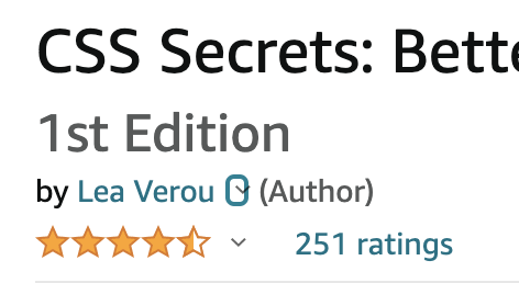
An example of a star rating widget, from Amazon
However, trying to style a <meter> element to look like a star rating is …tricky at best. Not to mention that this approach won’t even work in Shadow trees (unless you include the CSS in every single shadow tree).
So, I set out to create a proper web component for star ratings. The first conundrum was, how does this relate to a <meter> element?
This post has been long overdue: Chris and I started working on Color.js in 2020, over 2 years ago! It was shortly after I had finished the Color lecture for the class I was teaching at MIT and I was appalled by the lack of color libraries that did the things I needed for the demos in my slides. I asked Chris, “Hey, what if we make a Color library? You will bring your Color Science knowledge and I will bring my JS and API design knowledge. Wouldn’t this be the coolest color library ever?”. There was also a fair bit of discussion in the CSS WG about a native Color object for the Web Platform, and we needed to play around with JS for a while before we could work on an API that would be baked into browsers.
We had a prototype ready in a few months and presented it to the CSS WG. People loved it and some started using it despite it not being “officially” released. There was even a library that used Color.js as a dependency!
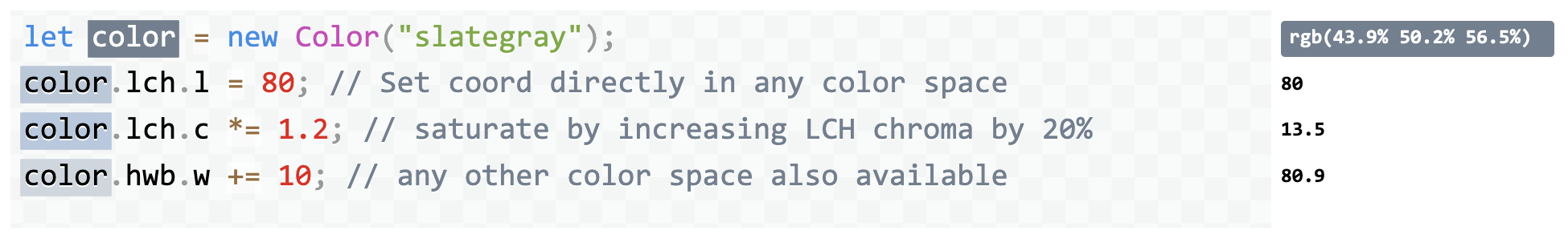
Why can’t we just standardize the API in Color.js? While one is influenced by the other, a Web Platform API has different constraints and needs to follow more restricted design principles compared to a JS library, which can be more flexible. E.g. exotic properties (things like color.lch.l) are very common in JS libraries, but are now considered an antipattern in Web Platform APIs.
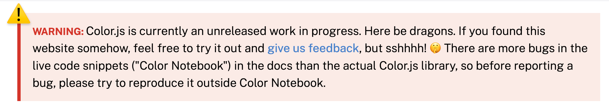
Work on Color.js as well as the Color API continued, on and off as time permitted, but no release. There were always things to do and bugs to fix before more eyes would look at it. Because eyes were looking at it anyway, we even slapped a big fat warning on the homepage:
Eventually a few days ago, I discovered that the Color.js package we had published on npm somehow has over 6000 downloads per week, nearly all of them direct. I would not bat an eyelid at those numbers if we had released Color.js into the wild, but for a library we actively avoided mentioning to anyone outside of standards groups, it was rather odd.
How did this happen? Maybe it was the HTTP 203 episode that mentioned it in passing? Regardless, it gave us hope that it’s filling a very real need in the pretty crowded space of color manipulation libraries and it gave us a push to finally get it out there.
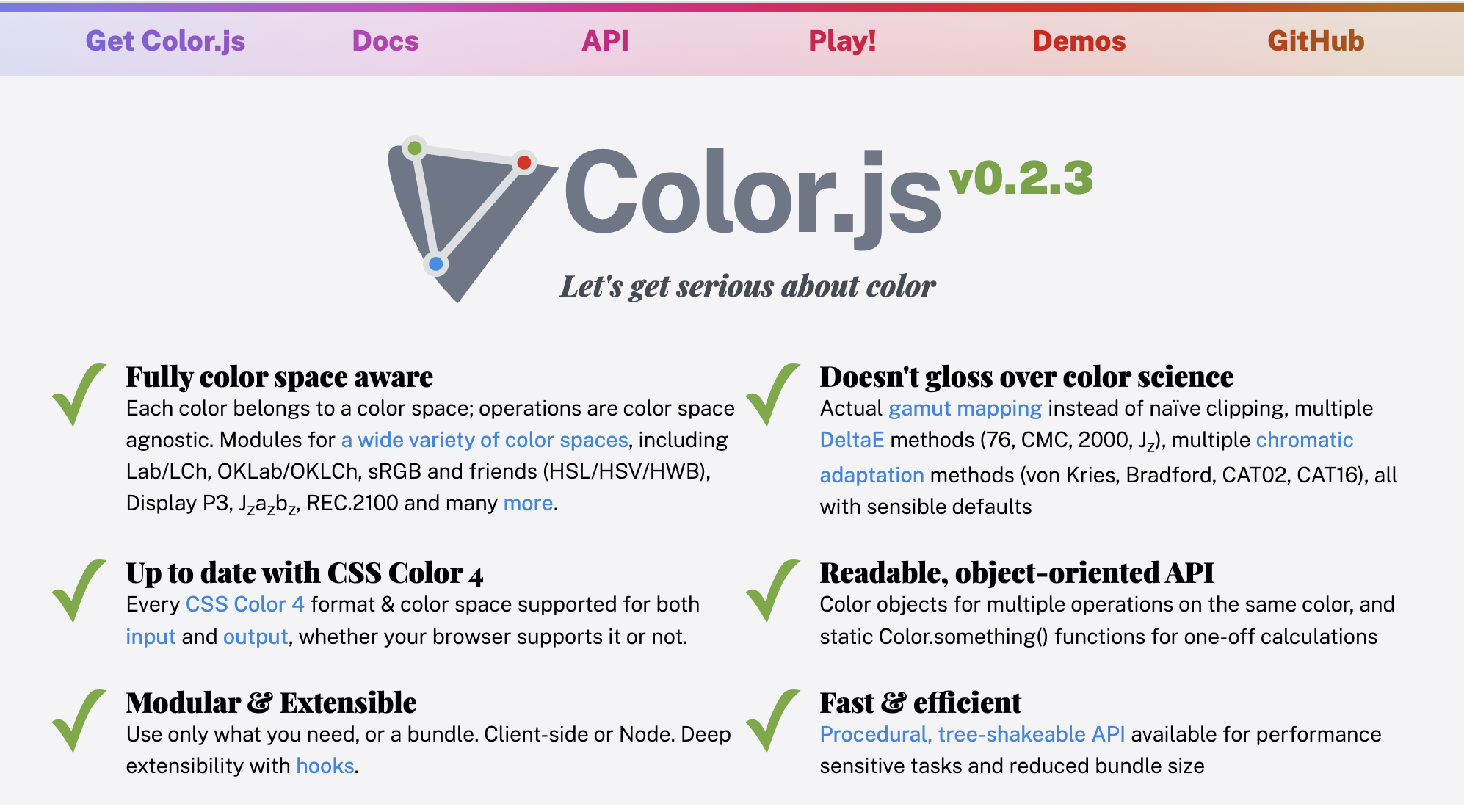
So here we are, releasing Color.js into the wild. So what’s cool about it?
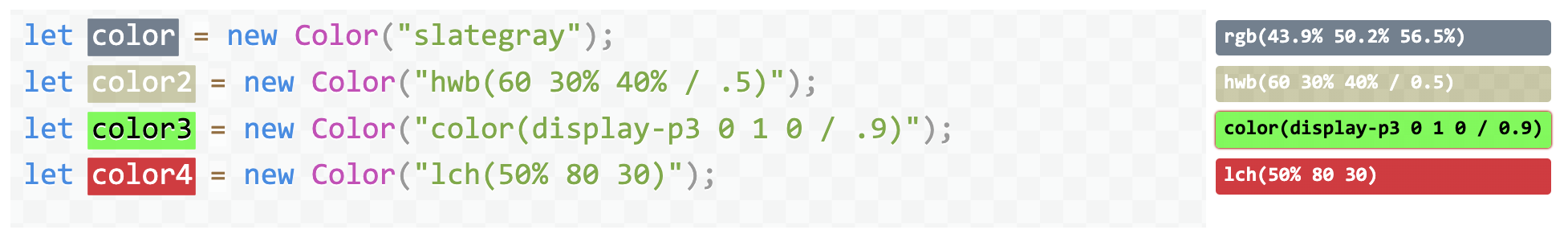
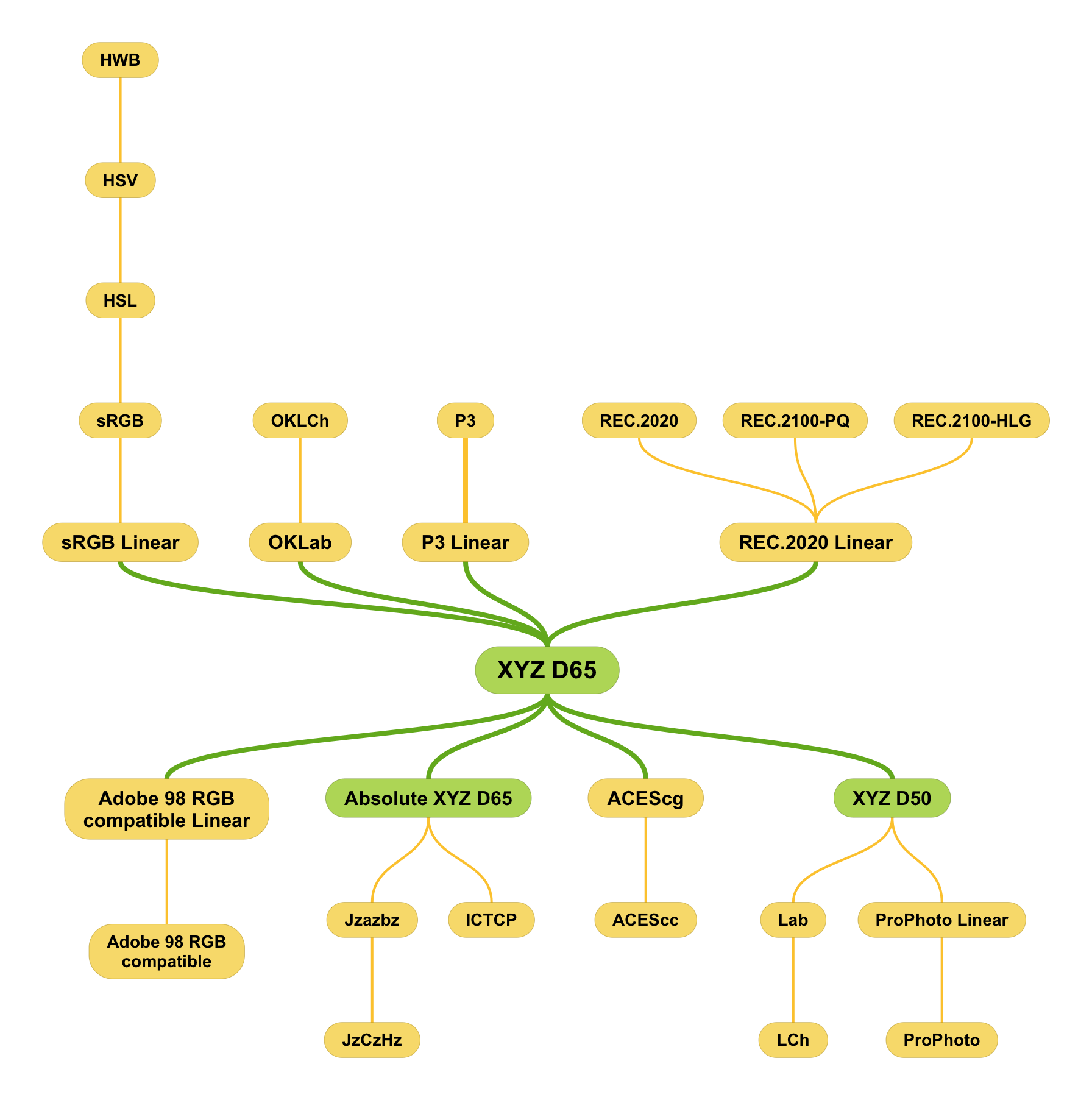
Completely color space agnostic, each Color object just has a reference to a color space, a list of coordinates,, and optionally an alpha.
Supports a large variety of color spaces including all color spaces from CSS Color 4, as well as the unofficial CSS Color HDR draft.
Supports interpolation as defined in CSS Color 4
Doesn’t skimp on color science: does actual gamut mapping instead of naïve clipping, and actual chromatic adaptation when converting between color spaces with different white points.
Multiple DeltaE methods for calculating color difference (2000, CMC, 76, Jz, OK etc)
The library itself is written to be very modular and ESM-first (with CJS and IIFE bundles) and provides a tree-shakeable API as well.
This week has been Yak Shaving Galore. It went a bit like this:
I’ve been working on a web component that I need for the project I’m working on. More on that later, but let’s call it <x-foo> for now.
Of course that needs to be developed as a separate reusable library and released as a separate open source project. No, this is not the titular component, this was only level 1 of my multi-level yak shaving… 🤦🏽♀️
I wanted to showcase various usage examples of that component in its page, so I made another component for these demos: <x-foo-live>. This demo component would have markup with editable parts on one side and the live rendering on the other side.
I wanted the editable parts to autosize as you type. Hey, I’ve written a library for that in the past, it’s called Stretchy!
But Stretchy was not written in ESM, nor did it support Shadow DOM. I must rewrite Stretchy in ESM and support Shadow DOM first! Surely it won’t take more than a half hour, it’s a tiny library.
(It took more than a half hour)
Ok, now I have a nice lil’ module, but I also need to export IIFE as well, so that it’s compatible with Stretchy v1. Let’s switch to Rollup and npm scripts and ditch Gulp.
Oh look, Stretchy’s CSS is still written in Sass, even though it doesn’t really need it now. Let’s rewrite it to use CSS variables, use PostCSS for nesting, and use conic-gradient() instead of inline SVG data URIs.
Ok, Stretchy v2 is ready, now I need to update its docs. Oooh, it doesn’t have a README? I should add one. But I don’t want to duplicate content between the page and the README. Hmmm, if only…
I know! I’ll make a web component for rendering both inline and remote Markdown! I have an unfinished one lying around somewhere, surely it won’t take more than a couple hours to finish it?
When developing customizable components, one often wants to expose various parameters of the styling as custom properties, and form a sort of CSS API. This is still underutlized, but there are libraries, e.g. Shoelace, that already listcustomproperties alongside other parts of each component’s API (even CSS parts!).
Note: I’m using “component” here broadly, as any reusable chunk of HTML/CSS/JS, not necessarily a web component or framework component. What we are going to discuss applies to reusable chunks of HTML just as much as it does to “proper” web components.
Let’s suppose we are designing a certain button styling, that looks like this:
If you’ve been writing CSS for any length of time, you’re probably familiar with the em unit, and possibly the other type-relative units. We are going to refer to em for the rest of this post, but anything described works for all type-relative units.
As you well know, em resolves to the current font size on all properties except font-size, where it resolves to the parent font size. It can be quite useful for making scalable components that adapt to their context size.
However, I have often come across cases where you actually need to “circumvent” one level of this. Either you need to set font-size to the grandparent font size instead of the parent one, or you need to set other properties to the parent font size, not the current one.
By now, you probably know that you can use custom properties for individual color components, to avoid repeating the same color coordinates multiple times throughout your theme. You may even know that you can use the same variable for multiple components, e.g. HSL hue and lightness:
This is all fine and dandy, until dark mode comes into play. The idea of using custom properties to make it easier to adapt a theme to dark mode is not new. However, ineveryarticleIhaveseen, the strategy suggested is to create a bunch of custom properties, one for each color, and override them in a media query.
This is a fine approach, and you’ll likely want to do that for at least part of your colors eventually. However, even in the most disciplined of designs, not every color is a CSS variable. You often have colors declared inline, especially grays (e.g. the footer color in our example). This means that adding a dark mode is taxing enough that you may put it off for later, especially on side projects.
The trick I’m going to show you will make anyone who knows enough about color cringe (sorry Chris!) but it does help you create a dark mode that works in minutes. It won’t be great, and you should eventually tweak it to create a proper dark mode (also dark mode is not just about swapping colors) but it’s better than nothing and can serve as a base.
What if I told you you could use a single property value to turn multiple different values on and off across multiple different properties and even across multiple CSS rules?
What if I told you you could turn this flat button into a glossy skeuomorphic button by just tweaking one custom property --is-raised, and that would set its border, background image, box and text shadows in one fell swoop?
I’ve posted before about my work for the Web Almanac this year. To make it easier to calculate the stats about CSS selectors, we looked to use an existing selector parser, but most were too big and/or had dependencies or didn’t account for all selectors we wanted to parse, and we’d need to write our own walk and specificity methods anyway. So I did what I usually do in these cases: I wrote my own!
First off, some news: I agreed to be this year’s CSS content lead for the Web Almanac! One of the first things to do is to flesh out what statistics we should study to answer the question “What is the state of CSS in 2020?”. You can see last year’s chapter to get an idea of what kind of statistics could help answer that question.
Of course, my first thought was “We should involve the community! People might have great ideas of statistics we could study!”. But what should we use to vote on ideas and make them rise to the top?
So what is the Cicada Principle and how does it relate to web design in a nutshell? It boils down to: when using repeating elements (tiled backgrounds, different effects on multiple elements etc), using prime numbers for the size of the repeating unit maximizes the appearance of organic randomness. Note that this only works when the parameters you set are independent.
When I recently redesigned my blog, I ended up using a variation of the Cicada principle to pseudo-randomize the angles of code snippets. I didn’t think much of it until I saw this tweet: