Categories
News

State of CSS 2022 now open!

Reading Time: 3 minutes

Take State of CSS 2022 survey

A while ago I posted a call for feedback to inform the design of the State of CSS 2022 survey. The response has been overwhelming and it was glorious. We got quite a lot of proposals, feedback, votes. But that also meant we had to make some tough decisions about what gets in the survey and what doesn’t, otherwise we’d end up with a survey so long nobody would want to finish it!

In the end we added questions about 15 new CSS features based on proposals in that repo, and decided against adding 9. Overall, there are 30 new CSS features the 2022 survey asks about. To make space for all of that, we also removed a few that were not really shining much light into what developers do anymore, and also a couple others that were not actually about CSS.

However, CSS features are not the only — or even the most important questions being asked.

Last year, some of the freeform questions about pain points were particularly useful to browser vendors for prioritizing implementation and standards work, and we expect this to be true this year as well. We put considerable effort into redesigning these freeform questions to make them more intuitive, while maintaining their helpfulness for browser vendors:
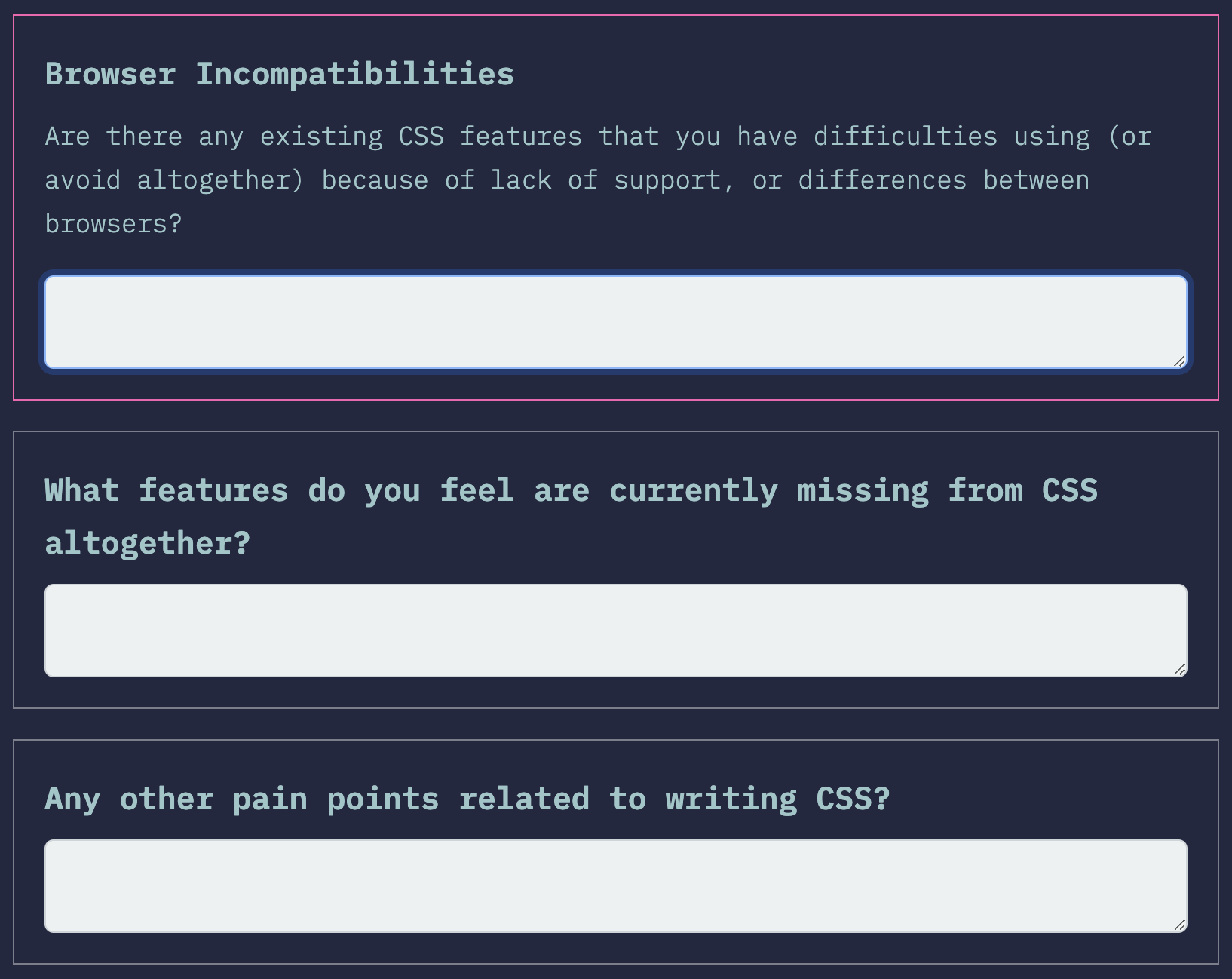
We hope the new wording makes it more clear that these are mutually exclusive, so that respondents do not feel they need to duplicate their answers.

One of the new questions I’m excited about is this question to gauge whether the respondent spends more time writing JS or CSS:
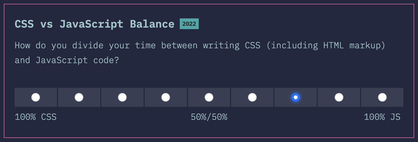
A focus of this year’s State of CSS survey is to reach a broader range of developers; a majority of respondents of past surveys has been JS developers who also write CSS, rather than developers that focus on CSS equally or even primarily. This is a natural consequence of this having been spun off the State of JS survey. To truly see what the State of CSS is in 2022, we need input from all types of developers, as developers with different focus have different needs and priorities. This question will allow us to evaluate how well we have reached this goal, and going forward, whether we are improving every year.

Another thing I’m excited about in this year’s survey is the ability to add freeform comments to any question.
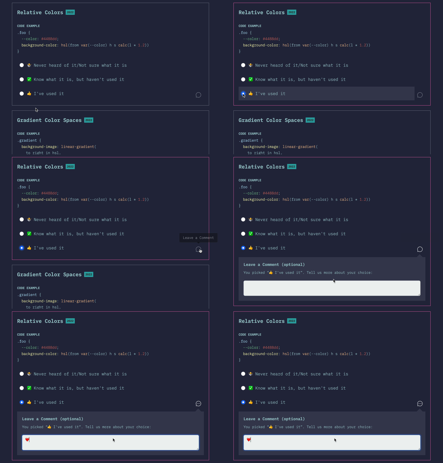
Adding freeform comments to a question

It’s often hard to tell what the background is behind each of the three answers: are people not using a given feature due to poor browser support, poor ergonomics, or some other reason? When people do use a feature, was their experience good or bad? Would they use it again?

We went back and forth many times about having a more structured followup question there, but in the end settled on a simple freeform field for this first iteration. Maybe next year it will be more structured, depending on how people use it this year.

So, without further ado, the survey is finally open for responses:

Take State of CSS 2022 survey

This survey is not just for fun: the results actually inform what browsers prioritize for implementation. So by spending a few minutes on a thoughtful and comprehensive response, you can actually make both your and other developers’ lives better! What are you waiting for?

Categories
News

Help design the State of CSS Survey 2022!

Reading Time: 2 minutes

Since 2019, the annual State of CSS survey has collected feedback from web developers from across the world to try and take the pulse of the CSS ecosystem, and it’s become a valuable resource not only for CSS developers, but also for browser vendors. This summer, one of my side projects is helping out with survey design and outreach for the State of CSS survey, thanks to a generous Google UI fund grant.

The target is for the survey to launch in mid September, and we are currently working on the outline. So far we have created a preliminary outline based on last year’s survey and early research. All our work happens is in the open, in this repo. Here are some of the changes from last year’s survey:

  • Removed the Pre-processors category as it feels like there isn’t too much debate around that area.
  • Got rid of “which browser do you primarily develop in?” question as we already ask which browsers people test in.
  • Merged “Opinions” and “Environments” sections into new “Usage” section.
  • Moved browsers question to “Other Tools”.
  • New features:
    • currentcolor
    • color-mix()
    • Wide gamut colors
    • scroll-behavior
    • scroll-padding
    • font-palette
    • :focus-visible
    • :has() pseudo-class
    • :where() pseudo-class
    • Cascade Layers
    • Houdini Paint API
    • and there are several others we are considering

We are currently looking for feedback from the community, including suggesting CSS features to ask about, libraries and tools, or even new questions altogether.

There are also some design issues to flesh out, you’re welcome to weigh in there too.

If you want to quickly vote on which features are most important for you to make it into the survey, you can do that either via GitHub 👍🏼reactions, or here (which uses GitHub reactions behind the scenes). Do note that reactions are only one metric among many we will use to consider items.

The feedback period will be open until August 20, then we will start working on launching the survey.

Do note that browser makers are looking at this and similar surveys to prioritize what to implement. This is why Google is sponsoring this project. So any effort you put into survey outline feedback, and on responding to the survey when it’s ready, could come back to you tenfold when your favorite CSS features get implemented faster!

Categories
Articles Original Tutorials

Custom properties with defaults: 3+1 strategies

Reading Time: 4 minutes

When developing customizable components, one often wants to expose various parameters of the styling as custom properties, and form a sort of CSS API. This is still underutlized, but there are libraries, e.g. Shoelace, that already list custom properties alongside other parts of each component’s API (even CSS parts!).

Note: I’m using “component” here broadly, as any reusable chunk of HTML/CSS/JS, not necessarily a web component or framework component. What we are going to discuss applies to reusable chunks of HTML just as much as it does to “proper” web components.

Let’s suppose we are designing a certain button styling, that looks like this:

Categories
Tips

Simple pie charts with fallback, today

Reading Time: 4 minutes

Five years ago, I had written this extensive Smashing Magazine article detailing multiple different methods for creating simple pie charts, either with clever use of transforms and pseudo-elements, or with SVG stroke-dasharray. In the end, I mentioned creating pie charts with conic gradients, as a future technique. It was actually a writeup of my “The Missing Slice” talk, and an excerpt of my CSS Secrets book, which had just been published.

I was reminded of this article today by someone on Twitter:

https://twitter.com/sam_kent_/status/1326805431390531584

I suggested conic gradients, since they are now supported in >87% of users’ browsers, but he needed to support IE11. He suggested using my polyfill from back then, but this is not a very good idea today.

Indeed, unless you really need to display conic gradients, even I would not recommend using the polyfill on a production facing site. It requires -prefix-free, which re-fetches (albeit from cache) your entire CSS and sticks it in a <style> element, with no sourcemaps since those were not a thing back when -prefix-free was written. If you’re already using -prefix-free, the polyfill is great, but if not, it’s way too heavy a dependency.

Pie charts with fallback (modern browsers)

Instead, what I would recommend is graceful degradation, i.e. to use the same color stops, but in a linear gradient.

Categories
Original Tips

The -​-var: ; hack to toggle multiple values with one custom property

Reading Time: 3 minutes

What if I told you you could use a single property value to turn multiple different values on and off across multiple different properties and even across multiple CSS rules?

What if I told you you could turn this flat button into a glossy skeuomorphic button by just tweaking one custom property --is-raised, and that would set its border, background image, box and text shadows in one fell swoop?

Categories
Original Releases

Parsel: A tiny, permissive CSS selector parser

Reading Time: 3 minutes

I’ve posted before about my work for the Web Almanac this year. To make it easier to calculate the stats about CSS selectors, we looked to use an existing selector parser, but most were too big and/or had dependencies or didn’t account for all selectors we wanted to parse, and we’d need to write our own walk and specificity methods anyway. So I did what I usually do in these cases: I wrote my own!

You can find it here: https://projects.verou.me/parsel/

Categories
Tips

Introspecting CSS via the CSS OM: Getting supported properties, shorthands, longhands

Reading Time: 4 minutes

For some of the statistics we are going to study for this year’s Web Almanac we may end up needing a list of CSS shorthands and their longhands. Now this is typically done by maintaining a data structure by hand or guessing based on property name structure. But I knew that if we were going to do it by hand, it’s very easy to miss a few of the less popular ones, and the naming rule where shorthands are a prefix of their longhands has failed to get standardized and now has even more exceptions than it used to. And even if we do an incredibly thorough job, next year the data structure will be inaccurate, because CSS and its implementations evolve fast. The browser knows what the shorthands are, surely we should be able to get the information from it …right? Then we could use it directly if this is a client-side library, or in the case of the Almanac, where code needs to be fast because it will run on millions of websites, paste the precomputed result into whatever script we run.

Categories
Original Releases

Releasing MaVoice: A free app to vote on repo issues

Reading Time: 3 minutes

First off, some news: I agreed to be this year’s CSS content lead for the Web Almanac! One of the first things to do is to flesh out what statistics we should study to answer the question “What is the state of CSS in 2020?”. You can see last year’s chapter to get an idea of what kind of statistics could help answer that question.

Of course, my first thought was “We should involve the community! People might have great ideas of statistics we could study!”. But what should we use to vote on ideas and make them rise to the top?

Categories
Articles Original

The Cicada Principle, revisited with CSS variables

Reading Time: 4 minutes

Many of today’s web crafters were not writing CSS at the time Alex Walker’s landmark article The Cicada Principle and Why it Matters to Web Designers was published in 2011. Last I heard of it was in 2016, when it was used in conjunction with blend modes to pseudo-randomize backgrounds even further.

So what is the Cicada Principle and how does it relate to web design in a nutshell? It boils down to: when using repeating elements (tiled backgrounds, different effects on multiple elements etc), using prime numbers for the size of the repeating unit maximizes the appearance of organic randomness. Note that this only works when the parameters you set are independent.

When I recently redesigned my blog, I ended up using a variation of the Cicada principle to pseudo-randomize the angles of code snippets. I didn’t think much of it until I saw this tweet:

Categories
Tips Tutorials

Hybrid positioning with CSS variables and max()

Reading Time: 4 minutes
Notice how the navigation on the left behaves wrt scrolling: It’s like absolute at first that becomes fixed once the header scrolls out of the viewport.

One of my side projects these days is a color space agnostic color conversion & manipulation library, which I’m developing together with my husband, Chris Lilley (you can see a sneak peek of its docs above). He brings his color science expertise to the table, and I bring my JS & API design experience, so it’s a great match and I’m really excited about it! (if you’re serious about color and you’re building a tool or demo that would benefit from it contact me, we need as much early feedback on the API as we can get! )

For the documentation, I wanted to have the page navigation on the side (when there is enough space), right under the header when scrolled all the way to the top, but I wanted it to scroll with the page (as if it was absolutely positioned) until the header is out of view, and then stay at the top for the rest of the scrolling (as if it used fixed positioning).