Categories
Tips

Simpler CSS typing animation, with the ch unit

Reading Time: 2 minutes
A while ago, I posted about how to use steps() as an easing function to create a typing animation that degrades gracefully.

Today I decided to simplify it a bit and make it more flexible, at the cost of browser support. The new version fully works in Firefox 1+ and IE10, since Opera and WebKit don’t support the ch unitΒ and even though IE9 supports it, it doesn’t support CSS animations.

Categories
Original Tips

Checkerboard pattern with CSS3

Reading Time: < 1 minute

A while ago, I wrote a post on creating simple patterns with CSS3 gradients. A common pattern I was unable to create was that of a regular, non-rotated checkerboard. However, I noticed today that by giving a different background-position to every triangle in the pattern tile, a checkerboard can be easily created:

View in Gecko or Webkit.
Webkit seems to have an odd rendering bug, so it needed a background-size override and it still doesn’t look perfect. Oh well, reported the bug and moved on.

Categories
Original Tips

Checkerboard, striped & other background patterns with CSS3 gradients

Reading Time: 2 minutes

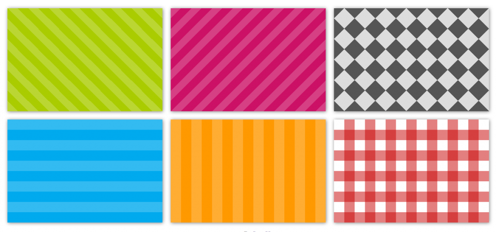
Screenshot of the CSS3 patterns I came up withYou’re probably familiar with CSS3 gradients by now, including the closer to the standard Mozilla syntax and the ugly verbose Webkit one. I assume you know how to add multiple color stops, make your gradients angled or create radial gradients. What you might not be aware of, is that CSS3 gradients can be used to create many kinds of commonly needed patterns, including checkered patterns, stripes and more.

View demo (Works in Webkit, Firefox 3.6+, Opera 11.50+ and IE10+)

The main idea behind the technique is the following, taken from the CSS3 Images spec:

If multiple color-stops have the same position, they produce an infinitesimal transition from the one specified first in the rule to the one specified last. In effect, the color suddenly changes at that position rather than smoothly transitioning.

I guess this makes it obvious how to create the tile for the stripes (unless you’ve never created a striped background before, but teaching you this is beyond the scope of this post). For example the gradient for the horizontal stripes is:

background-color: #0ae;
background-image: -webkit-gradient(linear, 0 0, 0 100%, color-stop(.5, rgba(255, 255, 255, .2)), color-stop(.5, transparent), to(transparent));
background-image: -moz-linear-gradient(rgba(255, 255, 255, .2) 50%, transparent 50%, transparent);
background-image: -o-linear-gradient(rgba(255, 255, 255, .2) 50%, transparent 50%, transparent);
background-image: linear-gradient(rgba(255, 255, 255, .2) 50%, transparent 50%, transparent);

Why transparent instead of the actual colors we want? For flexibility. background-color serves two purposes here: Setting the color of half the stripes and serving as a fallback for browsers that don’t support gradients.

However, without anything else, the tile will occupy the whole container. To control the size of each tile, you can use background-size:

-webkit-background-size: 50px 50px;
-moz-background-size: 50px 50px;
background-size: 50px 50px;

To create the picnic-style pattern, you just overlay horizontal stripes on vertical stripes.

The hardest one to figure out was the checkered pattern. It consists of two 45Β° linear gradients and two -45Β° linear gradients, each containing ΒΌ of the dark squares. I still haven’t managed to think of a way to create a regular checkerboard (not at 45Β°) without needing an unacceptably large number of gradients. It will be very easily possible if conical gradients start being supported (currently they’re not even in the spec yet).

Can you think of any other popular patterns that can be created with CSS3 and no images? If so, let me know with a comment. Cheers! πŸ™‚

Added afterwards: Other patterns

There are far more pattern designs possible with CSS3 gradients than I originally thought. For more details, see this later post.

Categories
News Original

rgba.php v1.2: Improved URL syntax, now at Github

Reading Time: < 1 minute

I wrote the first version of rgba.php as a complement to an article on RGBA that I posted on Februrary 2009.
Many people seemed to like the idea and started using it. With their valuable input, I made many changes and released v.1.1 (1.1.1 shortly after I posted the article due to another little fix) on October 2009.
More than a year after, quite a lot of people still ask me about it and use it, so I decided to make a github repo for it and release a new version, with a much easier to use syntax for the URL, which lets you just copy and paste the color instead of rewriting it:

background: url('rgba.php/rgba(255, 255, 255, 0.3)');
background: rgba(255, 255, 255, 0.3);

instead of:

background: url('rgba.php?r=255&g=255&b=255&a=30');
background: rgba(255, 255, 255, 0.3);

I also made a quick about/demo page for it.
Enjoy πŸ™‚

Categories
Articles

The curious case of border-radius:50%

Reading Time: 4 minutes

Admittedly, percentages in border-radius are not one of the most common use cases. Some even consider them an edge case, since most people seem to set border-radius in pixels or –rarely– ems. And since it’s not used very frequently, it’s still quite buggy. A bit of a chicken and egg case actually: Is it buggy because it’s used rarely or is it used rarely because it’s buggy? My vote would go to the first, so the purpose of this post is to let people know about why percentages in border-radius are incredibly useful and to highlight the various browser whims when it comes to rendering them.

Categories
Thoughts

On attr() and calc()

Reading Time: 3 minutes

I recently posted my first suggestion to www-style, the official W3 mailing list for CSS development. It was about allowing attr() values inside calc(). In this post I’ll describe in greater detail why I believe this is necessary, since not everyone follows www-style. If anyone has something to add in the discussion, you may post in the list, it’s public.

Categories
Original

New version of rgba.php is out!

Reading Time: 2 minutes

It’s been a while since I posted my little server-side solution for cross-browser RGBA colors (in a nutshell: native rgba for the cool browsers that support it, a PHP-generated image for those that don’t). For features, advantages, disadvantages etc, go see the original post. In this one I’ll only discuss the new version.

So, since it’s release I’ve received suggestions from many people regarding this script. Some other ideas were gathered during troubleshooting issues that some others faced while trying to use it. I hope I didn’t forget anything/anyone πŸ™‚

Categories
News Personal

CSS3 colors, today (MediaCampAthens session)

Reading Time: < 1 minute

Yesterday, I had a session at MediaCampAthens (a BarCamp-style event), regarding CSS3 colors. If you’ve followed my earlier posts tagged with “colors”, my presentation was mostly a sum-up of these.

It was my first presentation ever, actually, the first time I talked to an audience for more than 1 minute πŸ˜› . This caused some goofs:

  • When introducing myself, I said completely different things than I intended to and ended up sounding like an arrogant moron πŸ˜›
  • I tried not to look at the audience too much, in order to avoid sounding nervous, and this caused me to completely ignore 2 questions (as I found out afterwards)! How embarrasing!
  • At a certain point, I said “URL” instead of “domain” πŸ˜›

Also, I had prepared some screenshots (you’ll see them in the ppt) and the projector completely screwed them up, as it showed any dark color as black.

Apart from those, I think it went very well, I received lots of positive feedback about it and the audience was paying attention, so I guess they found it interesting (something that I didn’t expect πŸ˜› ).

Here is the presentation:

Please note that Slideshare messed up slide #8 and the background seems semi-transparent grey instead of semi-transparent white.

By the way, I also thought afterwards that I had made a mistake: -ms-filter is not required if we combine the gradient filter with Data URIs, since IE8 supports Data URIs (for images at least). Oops, I hate making mistakes that I can’t correct.

Here are some photos from my session. If I did it correctly, every facebook user can see them. If I messed things up, tell me πŸ˜›

Categories
Thoughts

CMYK colors in CSS: Useful or useless?

Reading Time: 3 minutes

As someone who dealed a bit with print design in the past, I consider CMYK colors the easiest color system for humen to understand and manipulate. It’s very similar to what we used as children, when mixing watercolors for our drawings. It makes perfect sense, more than HSL and definately more than RGB. I understand that most of us are so accustomed to using RGB that can’t realise that, but try to think for a moment: Which color system would make more sense to you if you had no idea and no experience at all with any of them?

Categories
Original Tips

Check whether the browser supports RGBA (and other CSS3 values)

Reading Time: 2 minutes

When using CSS, we can just include both declarations, one using rgba, and one without it, as mentioned in my post on cross-browser RGBA backgrounds. When writing JavaScript however, it’s a waste of resources to do that (and requires more verbose code), since we can easily check whether the browser is RGBA-capable, almost as easily as we can check whether it suppports a given property. We can even follow the same technique to detect the support of other CSS3 values (for instance, multiple backgrounds support, HSLA support, etc).