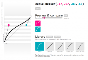
Reading Time: 3 minutes A few days ago, I had a talk at a conference in Zurich (I’m going to write more about it in another post). The talk was about “10 things you might not know about CSS3”. The first of those things was how you can do bouncing transitions with cubic-bezier() instead of an easing keyword. As usual, my slides included a few live demos of the functionality, in which I edited the cubic-bezier() parameters and the audience could see the transition produced.
However, in the case of cubic-bezier() that’s not enough. No matter how much you see someone changing the parameters, if you don’t picture it in a 2D plane, it’s very hard to understand how it works. So, the night before, I searched for a tool I could use to show them how bezier curves are formed. I found plenty, but all of them restricted the the coordinates to the 0-1 range. I’m not sure if the cause is ignorance about the spec changes or that Webkit hasn’t caught up with those changes yet (but it will, soon). The only one that supported values out of range was this one from the Opera Dragonfly developers, but I found it kinda impossible to adapt.
For my talk, I tried to adapt one of them but it was late so I gave up after a while and ended up just showing them a screenshot. And the day after the talk, I started adapting this to my needs (ever tried coding at a conference? It’s awesome, you get to ask questions from very knowledgeable people and ger replies straight away). And then I started cleaning up the code, changing how it worked, adding features. At this point, I think the only thing that’s left from that tool is …the HTML5 doctype. After 3-4 days, I finished it, and got it its own domain, cubic-bezier.com (I was surprised it was still free).
So, in a nutshell, what makes this better?
Lots of things:
- It supports y values out of range, as per the latest version of the spec (and shows a warning for Webkit)
- It’s fully accessible from the keyboard
- You can move the handles not only by dragging but also by clicking on the plane or using the keyboard arrow keys
- You can mouse over the plane and see the progression and time percentages that correspond to every point
- You can save curves you like in your “Library” (uses localStorage to persist them)
- You can import and export curves to/from your library to share them with others
- You can share a permalink to every curve. For example, here’s a bouncing transition (FF & Opera only)
- You can compare the current curve with any in your library, setting the duration yourself
- Custom favicon that reflects the current curve
Cool stuff used
Given that this tool is not only for developers, but for badass developers that care about stuff like cubic-bezier(), I think I can safely assume they’re using a top notch browser. So, I went crazy with using cool modern stuff:
- HTML5: Canvas, localStorage, History API, range inputs, oninput event, output, classList, data- attributes
- ES5: Accessors, Array#map, Array#forEach
- Selectors API
- JSON
- CSS3: Transitions, gradients, media queries, border-radius, shadows, :in-range pseudoclass, box-sizing, transforms, text-overflow
I also used my tiny chaining framework,
Chainvas throughout this project.
Browser support
So far, I’ve tested it in modern versions of Chrome, Firefox, Opera and Safari and it seems to work. I haven’t tested it in IE10 (too lazy to open vm), although I want it to work there too, so if it doesn’t let me know. 🙂
Enjoy! cubic-bezier.com
 What kind of transitions can you create with only one property? This is what my new experiment, animatable aims to explore.