Posts that hold POTENTIALLY original content, partially or totally. Content that I came up and haven’t read about somewhere else. It might not be actually original, as people often have the same ideas, it’s just original as far as my knowledge goes, which isn’t infinite :P. IF it its actually original, then it’s licensed through the MIT license.
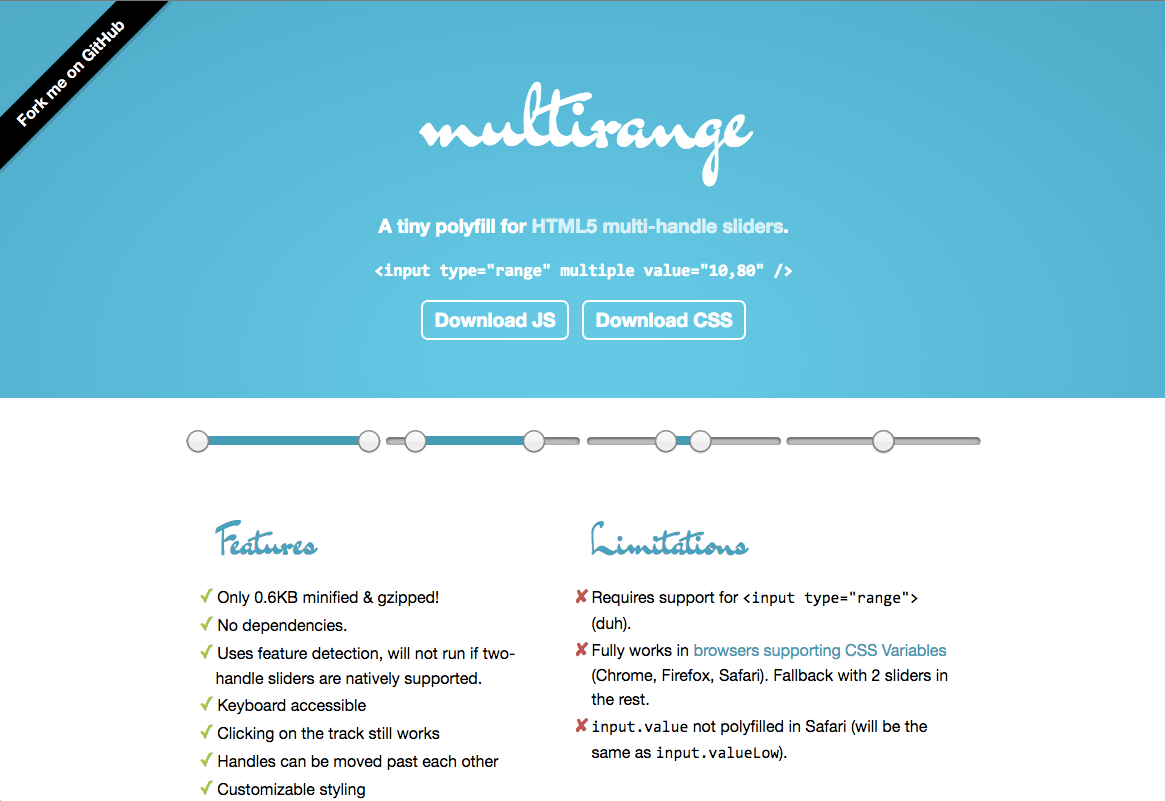
As part of my preparation for my talk at CSSDay HTML Special, I was perusing the most recent HTML specs (WHATWG Living Standard, W3C HTML 5.1) to see what undiscovered gems lay there. It turns out that HTML sliders have a lot of cool features specced that aren’t very well implemented:
Ticks that snap via the list attribute and the <datalist> element. This is fairly decently implemented, except labelled ticks, which is not supported anywhere.
Vertical sliders when height > width, implemented nowhere (instead, browsers employ proprietary ways for making sliders vertical: An orient=vertical attribute in Gecko, -webkit-appearance: slider-vertical; in WebKit/Blink and writing-mode: bt-lr; in IE/Edge). Good ol’ rotate transforms work too, but have the usual problems, such as layout not being affected by the transform.
Two-handle sliders for ranges, via the multiple attribute.
I made a quick testcase for all three, and to my disappointment (but not to my surprise), support was extremely poor. I was most excited about the last one, since I’ve been wanting range sliders in HTML for a long time. Sadly, there are no implementations. But hey, what if I could create a polyfill by cleverly overlaying two sliders? Would it be possible? I started experimenting in JSBin last night, just for the lolz, then soon realized this could actually work and started a GitHub repo. Since CSS variables are now supported almost everywhere, I’ve had a lot of fun using them. Sure, I could get broader support without them, but the code is much simpler, more elegant and customizable now. I also originally started with a Bliss dependency, but realized it wasn’t worth it for such a tiny script.
Anyone who follows this blog, my twitter, or my work probably is aware that I’m not a huge fan of big libraries. I think wrapper objects are messy, and big libraries are overkill for smaller projects. On large projects, one uses frameworks like React or Angular anyway, not libraries.
Anyone who writes Vanilla JS on a daily basis probably is aware that it can sometimes be, ahem, somewhat unpleasant to work with. Sure, the situation is orders of magnitude better than it was when I started. Back then, IE6 was the dominant browser and you needed a helper function to even add event listeners to an element (remember element.attachEvent?) or to get elements by a class!
Fun fact: I learned JavaScript back then by writing my own library, called jAsset. I had not heard of jQuery when I started it in 2007, so I had even coded my own selector engine! (Anyone remember slickspeed?) jAssset had plenty of nice helper functions, its own UI library and a cool logo. I had even started to make a website for its UI components, seen on the right.
Sadly, jAsset died the sad inevitable death of all unreleased projects: Without external feedback, I had nobody to hold me back from adding to its API every time I personally needed a helper function. And adding, and adding, and adding… Until it became 5000+ loc long and its benefit of being lightweight or comprehensible had completely vanished. It collapsed under its own weight before it even saw the light of day. I abandoned it and went through a few years of using jQuery as my preferred helper library. Eventually, my distaste for wrapper objects, the constantly improving browser support for new APIs that made Vanilla JS more palatable, and the decline of overly conspicuous browser bugs led me to give it up.
It was refreshing, and educational, but soon I came to realize that while Vanilla JS is orders of magnitude better than it was when I started, certain APIs are still quite unwieldy, which can be annoying if you use them often. For example, the Vanilla JS for creating an element, with other elements inside it, events and inline styles is so commonly needed, but also so verbose and WET, it can make one suicidal.
However, Vanilla JS does not mean “use no abstractions”. Programming is all about abstractions! The Vanilla JS movement, is about favoring speed, smaller abstractions and understanding of the Web Platform, over big libraries that we treat as a black box. It’s about using libraries to save time, not to skip learning.
So, I used my own tiny helpers, on every project. They were small and easy to understand, instead of several KB of code aiming to fix browser bugs I will likely never encounter and let me create complex nested DOM structures with a single JSON-like object. Over time, their API solidified and improved. On larger projects it was a separate file which I had tentatively codenamed Utopia (due to the lack of browser bug fixes and optimistic use of modern APIs). On smaller ones just a few helper methods (I could not live without at least my tiny 2 sloc $() and $$() helpers!). Here is a sample from my open source repos:
I never mentioned Utopia.js anywhere, besides silently including it in my projects, so it went largely unnoticed. Sometimes people would look at it, ask me to release it, I’d promise them I would and then nothing. A few years ago, someone noticed it, liked it and documented it a bit (site is down now it seems). However, it was largely my little secret, hidden in public view.
For the past half year, I’ve been working hard on my research project at MIT. It’s pretty awesome and is aimed at helping people who know HTML/ CSS but not JS, achieve more with Web technologies (and that’s all I can say for now). It’s also written in JS, so I used Utopia as a helper library, naturally. Utopia evolved even more with this project, got renamed to Bliss and got chainability via my idea about extending DOM prototypes without collisions (can be disabled and the property name is customizable).
All this worked fine while I was the only person working on the project. Thankfully, I might get some help soon, and it might be rather inexperienced (the academia equivalent of interns). Help is very welcome, but it did raise the question: How will these people, who likely only know jQuery, work on the project? [1]
The answer was that the time has come to polish, document and release Bliss to the world. My plan was to spend a weekend documenting it, but it ended up being a little over a week on and off, when procrastinating from other tasks I had to do. However, I’m very proud of the resulting docs, so much that I gifted myself a domain for it. They are fairly extensive (though some functions still need work) and has two things I always missed in other API docs:
Recommendations about what Vanilla JS to use instead when appropriate, instead of guiding people into using library methods even when Vanilla JS would have been perfectly sufficient.
A “Show Implementation” button showing the implementation, so you can both learn, and judge whether it’s needed or not, instead of assuming that you should use it over Vanilla JS because it has magic pixie dust. This way, the docs also serve as a source viewer!
So, enjoy Bliss. The helper library for people who don’t like helper libraries. 🙂 In a way, it feels that a journey of 8 years, finally ends today. I hope the result makes you blissful too.
Oh, and don’t forget to follow @blissfuljs on twitter!
[1]: Academia is often a little behind tech-wise, so everyone uses jQuery here — hardly any exceptions. Even though browser support doesn’t usually even matter to research projects!
As you might be aware, these days a good chunk of my time is spent working on research, at MIT. Although it’s still too early to talk about my research project, I can say that it’s related to the Web and it will be open source, both of which are pretty awesome (getting paid to work on cool open source stuff is the dream, right?).
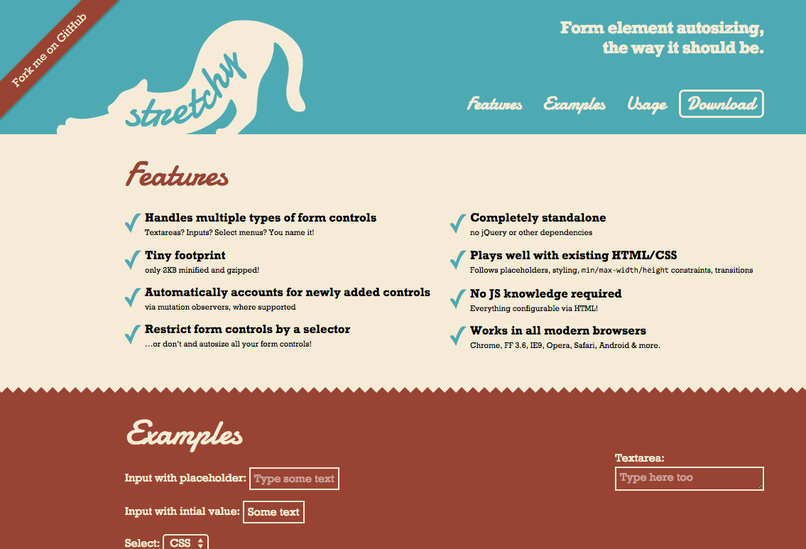
The one thing I can mention about my project is that it involves a lot of editing of Web content. And since contentEditable is a mess, as you all know, I decided to use form controls styled like the content being edited. This meant that I needed a good script for form control autosizing, one that worked on multiple types of form controls (inputs, textareas, even select menus). In addition, I needed the script to smoothly work for newly added controls, without me having to couple the rest of my code with it and call API methods or fire custom events every time new controls were added anywhere. A quick look at the existing options quickly made it obvious that I had to write my own.
After writing it, I realized this could be released entirely separately as it was a standalone utility. So Stretchy was born 🙂 I made a quick page for it, fixed a few cross-browser bugs that needed fixing anyway, put it up on Github and here it is!
PS: You can also use it as a bookmarklet, to autosize form controls on an existing page, if a form is bothering you with its poor usability. You will find it in the footer.
After getting fed up with too many “promotional” emails and newsletters with incredibly obscure unsubscribe links, I decided to make this tumblr to point out such examples of digital douchebaggery. This annoying dark pattern is so widespread that Google even added a feature to Gmail for making those unsubscribe links obvious!
Unsubscribe links are crucial to promotional emails. They are not just another menu item. They are not something that should be hidden in a blurb of tiny low contrast text. Unsubscribe links should be immediately obvious to anyone looking for them. You want people to be reading your email because they’re interested, not because they can‘t find the way out. Otherwise you are the digital equivalent of those annoying door-to-door salesmen who just won’t go away.
On the spur of the moment, after yet another email newsletter with a hard to find Unsubscribe link, I decided to quickly put together a tumblog about this UX pet peeve of mine, called Spot the Unsubscribe!. In less than an hour, it was ready and had a few posts as well 🙂
Hopefully if this bothers others as well, there will be submissions. Otherwise, new posts will be rather infrequent.
It’s no secret that I like conical gradients. In as early as 2011, I wrote a draft for conical-gradient() in CSS, that Tab later said helped him when he added them in CSS Image Values Level 4 in 2012. However, almost three years later, no progress has been made in implementing them. Sure, the spec is still relatively incomplete, but that’s not the reason conical gradients have gotten no traction. Far more underspecified features have gotten experimental implementations in the past. The reason conical gradients are still unimplemented, is because very few developers know they exist, so browsers see no demand.
Another reason was that Cairo, the graphics library used in Chrome and Firefox had no way of drawing a conical gradient. However, this changed a while ago, when they supported mesh gradients, of which conical gradients are a mere special case.
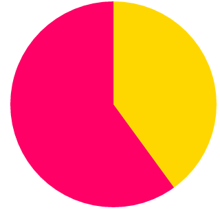
Recently, I was giving a talk on creating pie charts with CSS on a few conferences, and yet again, I was reminded of how useful conical gradients can be. While every CSS or SVG solution is several lines of code with varying levels of hackiness, conical gradients can give us a pie chart with a straightforward, DRY, one liner. For example, this is how to create a pie chart that shows 40% in gold and 60% in #f06:
padding: 5em; /* size */
background: conic-gradient(gold 40%, #f06 0);
border-radius: 50%; /* make it round */
So, I decided to take matters in my own hands. I wrote a polyfill, which I also used in my talk to demonstrate how awesome conical gradients can be and what cool things they can do. Today, during my CSSConf talk, I released it publicly.
In addition, I mention to developers how important speaking up is for getting their favorite features implemented. Browsers prioritize which features to implement based on what developers ask for. It’s a pity that so few of us realize how much of a say we collectively have in this. This is more obvious with Microsoft and their Uservoice forum where developers can vote on which features they want to see worked on, but pretty much every major browser works in a similar way. They monitor what developers request and what other browsers implement, and decide accordingly. The squeaky wheel will get the feature, so if you really want to see something implemented, speak up.
Since “speaking up” can be a bit vague (“speak up where?” I can hear you asking), I also filed bug reports with all major browsers, that you can also find in the polyfill page, so that you can comment or vote on them. That doesn’t mean that speaking up on blogs or social media is not useful though: That’s why browsers have devrel teams. The more noise we collectively make about the features we want, the more likely it is to be heard. However, the odds are higher if we all channel our voices to the venues browser developers follow and our voice is stronger and louder if we concentrate it in the same places instead of having many separate voices all over the place.
Also, I’m using the term “noise” here a bit figuratively. While it’s valuable to make it clear that we are interested in a certain feature, it’s even more useful to say why. Providing use cases will not only grab browsers’ attention more, but it will also convince other developers as well.
So go ahead, play with conic gradients, and if you agree with me that they are fucking awesome and we need them natively on the Web, make noise.
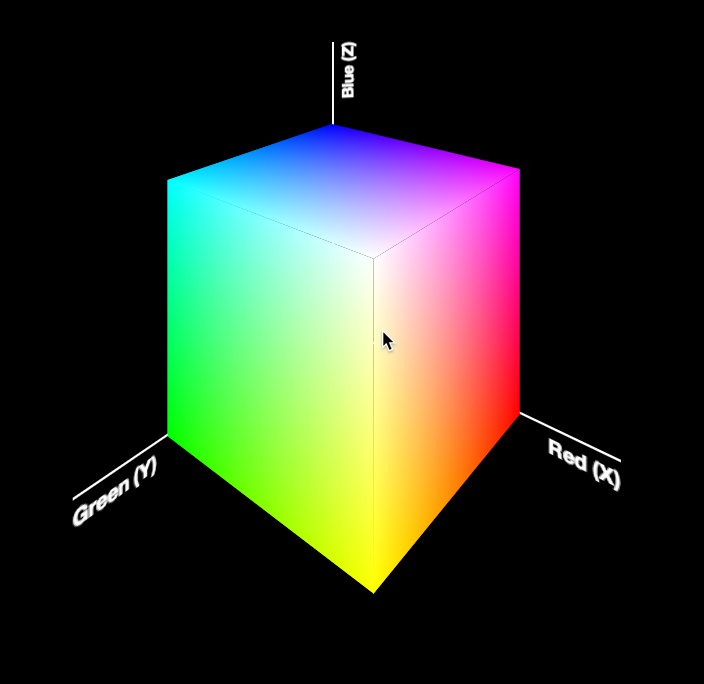
Today, I was giving the opening keynote at Codemania in Auckland, New Zealand. It was a talk about color from a math/dev perspective. It went quite well, despite my complete lack of sleep. I mean that quite literally: I hadn’t slept all night. No, it wasn’t the jetlag or the nervousness that kept me up. It was my late minute decision to replace the static, low-res image of an RGB cube I was using until then with a 3D cube generated with CSS and animated with CSS animations. Next thing I knew, it was light outside and I had to start getting ready. However, I don’t regret literally losing sleep to make a slide that is only shown for 20 seconds at most. Not only it was super fun to develop, but also yielded a few things that I thought were interesting enough to blog about.
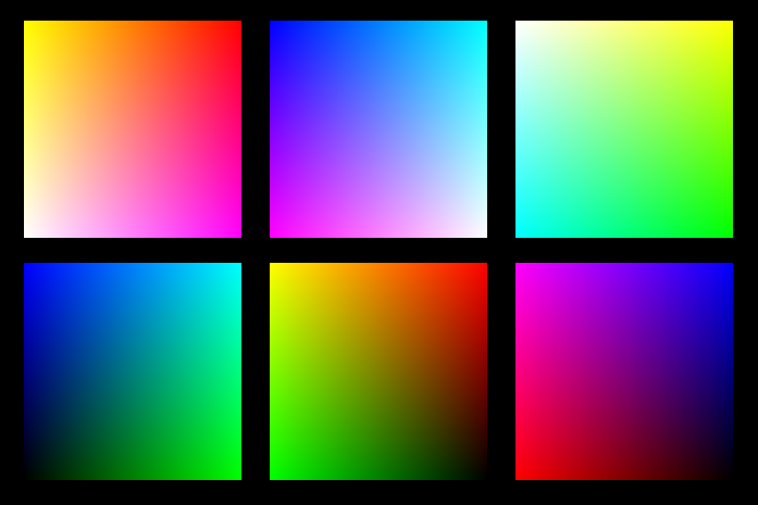
The most challenging part wasn’t actually the 3D cube. This has been done tons of times before, it was probably the most common demo for CSS 3D transforms a couple of years ago. The only part of this that could be of interest is that mine only used 2 elements for the cube. This is a dabblet of the cube, without any RGB gradients on it:
The challenging part was creating the gradients for the 6 sides. These are not plain gradients, as you can see below:
These are basically two linear gradients from left to right, with the topmost one being masked with a gradient from top to bottom. You can use CSS Masking to achieve this (for Chrome/Safari) and SVG Masks for Firefox, but this masks the whole element, which would hide the pseudo-elements needed for the sides. What I needed was masks applied to backgrounds only, not the whole element.
However, I didn’t want to have 6 separate SVG files, especially with this kind of repetition (cross-linking to reuse gradients and masks across different files is still fairly buggy in certain browsers). I wanted to be able to edit this straight from my CSS. And then it hit me: I was using SASS already. I could code SASS functions that generate SVG data URIs!
Here’s the set of SVG generating SASS functions I ended up writing:
Warning: Keep in mind that IE9 and some older versions of other browsers have issues with unencoded SVG data URIs. Also, you still need to escape hashes (%23 instead of #), otherwise Firefox fails.
I’ve been interested in digital color for a long time, and this year I decided to risk giving a technical talk about color some of the conferences I’m speaking at. “Why is that risky?” you might ask. Well, it might end up being really interesting, or it may end up alienating both designers because it’s too technical and developers because it’s about a “designery” topic.
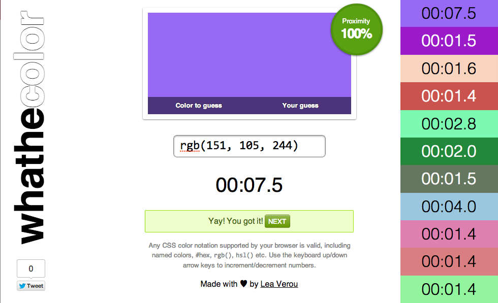
In preparation for this talk, I decided to make a simple game to see how well I and other web developers understand color, and especially CSS notations of color. Meet Whathecolor!
The idea is simple: You are presented with a color and you try to type in a CSS color that matches it. It could be anything, from hsl() or rgb() to even named colors (although that would be stupid). It would be interesting to see what averages people get by trying hsl() vs rgb() and whether the former is as easier for web developers as we think. Feel free to post your results here or on twitter! Perhaps in the future, something like this could be used by the CSS WG to test the usability of color notations we’re thinking of adding to CSS instead of speculating about it.
Disclaimer: This is a quick hack. Please don’t complain that it doesn’t look great on your phone and stuff like that.
Also, yes, if you want to cheat, it’s super easy, but I have no idea why somebody would cheat on something like this.
A challenging part in developing this was calculating the proximity of two colors to show the user how close they are getting. My first thought was to use the Euclidean distance of the two colors in the RGB cube and divide it by the maximum distance the color could have from any other RGB color. However, this proved out to be inaccurate in many cases, probably due to the lack of perceptual uniformity in RGB. As an example, try #f0f and #ff80ff. Although they are quite similar visually, the reported proximity was around 66% (1 – 128/382).
So I researched existing algorithms to get the proximity of two colors. Like most things color-related, it looks like Color Difference is not quite as simple as I thought, and is considered a topic of interest in Color Science. However, converting to L*a*b* and using the CIE94 and CIEDE2000 formulas seemed a bit of an overkill for this and I wasn’t terribly impressed with the CIE76 formula after trying the results out online for some sample pairs (e.g. it gives ~60% for the aforementioned pair, which is even lower than what I got with my naïve RGB method!).
So I experimented a bit and ended up using an average of my original idea and a sum of the HSL differences (divided by the max differences), which seems to work relatively ok. There are still cases where it’s off, but ho hum. After all, the proximity is mainly useful when you get close enough to the color (>90%), as until then you tend to play it by eye. Any improvements on the algorithm used are welcome. Or if enough people think it’s not working very well, I’ll bite the bullet and end up using DeltaE.
Other notes
You do not need a proximity of 100% to win, since rounding errors might prevent you from matching the exact color if you’re using HSL. Also, because matching the exact same color isn’t really important, as long as you get close enough that any difference is imperceptible.
I wrote a Color “class” for this, which you can find in color.js. Like most of my open source stuff, it’s MIT licensed. Maybe it could be useful in some other color-related project, who knows.
My original idea was to have “levels”, where the color would get increasingly more difficult to get. For example, in the first level, you’d only have to guess simple colors whose RGB coordinates were either 0, 128 or 255. So, my Color.random() method accepts an entropy parameter, for that level. However, when I tested the game with truly random colors (any integer from 0 to 255), it turned out it wasn’t really that hard (it took me about a minute to guess each color), so I ditched the idea of levels early on. The code is still there though.
An idea about making it harder in the future would be to introduce semi-transparent (RGBA/HSLA) colors. That would be fun :evil_grin:
PS: The times in this screenshot aren’t real, I wanted to take one quickly, so I used the dev tools.
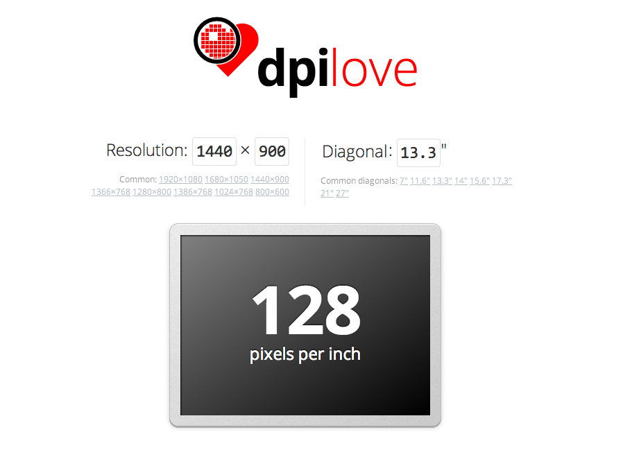
Yesterday (Sunday) I was on a 9.5 hour flight from Canada with no inflight entertainment (well, thanks Air Canada), so I did what every bored human being would do instead of watching movies: I decided to code an app! And out of the infinite set of possible apps somebody can make, I decided to make an app to calculate screen DPI/PPI.
You might be wondering if I’m still (?) sane, but you might be surprised to hear I found myself calculating screen PPIs quite frequently and wanted to save myself the hassle of doing the math every time. I’m a curious person and I wanted to know, even about products I would never buy and even when it wasn’t listed in the tech specs. Yes, my hobbies are somewhat weird. 😮
I first thought about doing such an app a while ago, but never found the time to code it. The last time I had thought about it was a few days ago at the SF Apple Store with a friend. We were looking at the 27″ Apple Thunderbolt displays in awe and thought they must have huge pixel density. After a few calculations in the console (which ironically produced a result faster than the Apple guy my friend asked), it turned out it was only …102. “I need to code an app to make this sort of calculation easy! People are being misled by marketing!” I thought.
Fast forward to my flight. You didn’t expect my laptop battery to last for 9.5 hours, right? Yeah, MacBook Air batteries are good, but not *that* good. Of course it eventually died so I had to find other ways to pass my time (I ended up sleeping — or trying to). However, by the time it died, I had gone over the threshold of being able to give it up, so I spent the rest of the day finishing it, despite my obvious jetlag and sleepiness. I was in the zone — You don’t just go sleeping when you’re in the zone, right?
Besides the DPI/PPI calculator, I added a few other fun things too:
A list of devices with pre-calculated data (stored in a separate JSON file, which makes it easy to update — *hint, hint*)
Wrote a few FAQ items about DPI/PPI.
Like many of my apps, it supports link sharing through URL hashes (for examples, check the screens section).
I even bought a proper domain for it (dpi.lv) and drew a logo! The logo took hours by itself. Not just to draw it, but to simplify Illustrator’s ugly, repetitive SVG output (which is still better than what most other tools spit out). Hand-simplifying SVG is a meditative experience that I thoroughly enjoy, to the bewilderment of everyone who read my tweet about it. Just for the lulz, here’s the before and the 66% smaller after (the small design tweaks were intentional)
The screen that displays the result resizes to reflect the aspect ratio of the resolution you’ve selected. It even animates to it, with CSS transitions! Oh, and it also uses FlexBox to center the text vertically.
Of course it’s open source (under an MIT license, as usual), and you can fork it on Github, as usual. The JS is a bit of a mess, but I’m too tired to refactor it now. Same goes for the lack of favicon and tagline. Oh well. I still like it. 🙂
Important: If you are on a display with multiple dots per pixel (e.g. Retina), the resolution (pixel width × pixel height) it tries to guess will be incorrect, so you’ll have to actually input the right one. The default resolution in there is just a hint, it doesn’t mean it’s “broken” if it doesn’t guess right, they’re editable fields. That said, it would be nice to guess right in those cases too, and I will look into it.
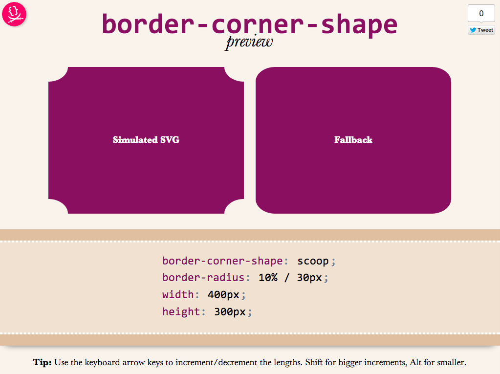
As an editor of the Backgrounds & Borders Level 4 spec, I am naturally a bit more interested in the cool features it will bring, once implementations start (it’s currently too early for that). One of the coolest features in it is corner-shape. While in Backgrounds & Borders 3, border-radius was only used for rounded (actually, elliptical) corners, with the help of corner-shape, it will be able to do so much more! Beveled corners, scoop-style corners (informally known as “negative border-radius”), even rectangular notches.
Unfortunately, until it’s implemented in browsers, it’s hard to play with it. Or, is it? I spent the weekend creating an app in which you can enter values for corner-shape, border-radius, width, and height, and see the result, simulated through SVG, as well as the fallback in browsers that don’t support border-corner-radius (which is currently all browsers).
Obviously, it’s not a full preview, since you can only play with a limited subset of CSS properties, but it should be good for seeing the kinds of shapes that will be possible.You could also copy the generated SVG from the Developer tools of your browser, and use it as a background in any website!
Tested to work in at least Chrome, IE9, Firefox, Safari and theoretically, should work in any SVG-enabled browser.
Enjoy! Hope you like it.
Important: Please note that corner-shape is still at a very early stage and might completely change before implementations. You can also help to make it better: Play with it and comment on what you think about its naming and functionality!
These days, we have a number of different ways to vertically align text in a container of variable dimensions:
Table display modes
Flexbox
inline-block hacks
Wrapping the text in an extra element and absolutely positioning it
…and probably many others I’m forgetting
However, often comes a time when neither is suitable, so here I am, adding yet another option to the list. Of course, it comes with its own set of drawbacks, but there are cases where it might be better than the existing solutions.

 As part of my preparation for my talk at CSSDay HTML Special, I was perusing the most recent HTML specs (WHATWG Living Standard, W3C HTML 5.1) to see what undiscovered gems lay there. It turns out that HTML sliders have a lot of cool features specced that aren’t very well implemented: