Categories
Tips

Use MathML today, with CSS fallback!

Reading Time: 3 minutes
These days, I’m working on the slides for my next talk, “The humble border-radius”. It will be about how much work is put into CSS features that superficially look as simple as border-radius, as well as what advances are in store for it in CSS Backgrounds & Borders 4 (of which I’m an editor). It will be fantastic and you should come, but this post is not about my talk.

As you may know, my slides are made with HTML, CSS & JavaScript. At some point, I wanted to insert an equation to show how border-top-left-radius (as an example) shrinks proportionally when the sum of radii on the top side exceeds the width of the element. I don’t like LaTeX because it produces bitmap images that don’t scale and is inaccessible. The obvious open standard to use was MathML, and it can even be directly embedded in HTML5 without all the XML cruft, just like SVG. I had never written MathML before, but after a bit of reading and poking around existing samples, I managed to write the following MathML code:

Categories
Original

iOS 6 switch style checkboxes with pure CSS

Reading Time: 3 minutes

I recently found myself looking at the Tools switch in Espresso:

Not because I was going to use it (I rarely do), but because I started wondering what would be the best way to replicate this effect in CSS. I set on to create something that adhered to the following rules:

  1. It should be keyboard accessible
  2. It should work in as many browsers as possible and degrade gracefully to a plain checkbox in the rest
  3. It shouldn’t depend on pseudo-elements in replaced elements (such as checkboxes), since that’s non-standard so not very dependable
  4. It shouldn’t require any extra HTML elements
  5. It shouldn’t use JS, unless perhaps to generate HTML that could be written by hand if the author wishes to do so.

Why you may ask? Some of them are good practices in general, and the rest make it easier to reuse the component (and they made it more challenging too!).

Categories
Speaking

W3Conf in San Francisco, February 21-22

Reading Time: < 1 minute

You might have heard about W3Conf, W3C’s conference for web designers and developers. This year, I have the pleasure of not only speaking there but also organizing it, along with Doug Schepers and designing the website for it.

Alongside with yours truly, it features an excellent lineup of amazing speakers like Eric Meyer, Alexis Deveria of caniuse.com fame, Nicolas Gallagher and many others. You can use coupon code VEROU to get $100 off the already affordable Early Bird price of $300. But hurry up, cause Early Bird prices are only valid until January 31st!

Hope to see you there!


Categories
Articles Thoughts

One year of pastries

Reading Time: 7 minutes

Last September, I was approached by Alex Duloz, who invited me to take part in his ambitious new venture, The Pastry Box Project. Its goal was to gather 30 people (“bakers”) every year who are influential in their field and ask them to share twelve thoughts — one per month. For 2012, that field would be the Web. I was honored by the invitation and accepted without a second thought (no pun intended). The project was quite successful and recently we all (almost) agreed for The Pastry Box Project to become a book, whose profits will be donated to charity.

The initial goal of the project was to gather thoughts somehow related to the bakers’ work. Although many stuck to that topic, for many others it quickly drifted away from that, with them often sending thoughts that were general musings about their lives or life in general. For me …well lets just say I was never good at sticking to the topic at hand. 😉

The Pastry Box showed me that I want a personal blog so I made one today. I will still publish personal stuff here, as long as it’s even remotely web-related, so not much will change. However, my interests range to more than the Web, so I will now have another medium to express myself in. 🙂

Since 2012 is now over, I decided to gather all my “pastries” and publish them in two blog posts: I will post the more techy/professional ones below and the more general/personal ones in my personal blog. Since most of them were somewhere in the middle, it wasn’t easy to pick which ones to publish where. I figured the best solution is to allow for some overlap and publish most of them in both blogs.

Categories
Tips

CSS Animations with only one keyframe

Reading Time: 2 minutes

This is a very quick tip, about a pet peeve of mine in almost every CSS animation I see. As you may know, I’m a sucker for reducing the amount of code (as long as it remains human readable of course). I demonstrated a very similar example in my “CSS in the 4th dimension” talk, but I recently realized I never blogged about it (or seen anyone else do so).

Lets assume you have a simple animation of a pounding heart, like so:

Categories
News

Lots of improvements coming to dabblet

Reading Time: 2 minutes

I posted about this in both the WebPlatform.org blog and Dabblet’s blog, but I thought it might be interesting to many readers of this blog as well:

As many of you probably know, I’ve started working for W3C Developer Relations since this August. Half of my time is devoted to WebPlatform.org, a very promising project to document the web with the help of all major players, in a vendor-neutral way. Even before I joined W3C, we discussed using a hosted, customized version of dabblet in WebPlatform.org, as a platform for live code examples. I recently started working towards making this happen.

A lot of changes and improvements need to be made to achieve this, but the good news is, most of these will be pushed to dabblet.com as well! In a nutshell, this is what I’m currently working on:

  • Adding JavaScript support — This will be a challenge UX-wise, as it shouldn’t run on every keystroke, like the HTML and CSS, but it should run on startup and it should be straight-forward how to get it to run. Perhaps it will also run after a significant pause in typing.
  • Dabblets that are not stored in Github, but get their data through POST requests.
  • Improving cross-browser support
  • Strengthening security
  • Integrating Prism. Dabblet’s syntax highlighter might have been Prism’s precursor, but currently Prism has solved many of its bugs, and these fixes need to be pushed to dabblet at some point.
  • General bug fixing

These will probably be gradually rolled out in dabblet.com and tested by the community, before we integrate dabblet into WebPlatform.org. If a new feature is significant enough, there will be a new blog post about it here, but don’t expect blog posts about bugfixes. I’m really excited to see dabblet flourish, and I believe you will be too, once these updates are out!

Categories
Releases

Easy color contrast ratios

Reading Time: 3 minutes

I was always interested in accessibility, but I never had to comply with any guidelines before. At W3C, accessibility is considered very important, so everything we make needs to pass WCAG 2.0 AA level. Therefore, I found myself calculating color contrast ratios very frequently. It was a very enlightening experience. I used to think that WCAG-mandated contrast ratios were too restrictive and basically tried to force you to use black and white, a sentiment shared by many designers I’ve spoken to. Surprisingly, in practice, I found that in most cases they are very reasonable: When a color combination doesn’t pass WCAG, it usually *is* hard to read. After all, the possible range for a contrast ratio is 1-21 but only ratios lower than 3 don’t pass WCAG AA (4.5 if you have smaller, non-bold text). So, effectively 90% of combinations will pass (82.5% for smaller, non-bold text).

There are plenty of tools out there for this. However, I found that my workflow for checking a contrast ratio with them was far from ideal. I had to convert my CSS colors to hex notation (which I don’t often use myself anymore), check the contrast ratio, then adjust the colors as necessary, covert again etc. In addition, I had to adjust the lightness of the colors with a blindfold, without being able to see the difference my adjustments would make to the contrast ratio. When using semi-transparent colors, it was even worse: Since WCAG only describes an algorithm for opaque colors, all contrast tools only expect that. So, I had to calculate the resulting opaque colors after alpha blending had taken place. After doing that for a few days, I got so fed up that I decided to make my own tool.

In addition, I discovered that there was no documented way of calculating the contrast ratio range that can be produced with a semi-transparent background, so I came up with an algorithm (after many successive failures to find the range intuitively), published it in the w3c-wai-ig mailing list and used the algorithm in my app, effectively making it the first one that can accept semi-transparent colors. If your math is less rusty than mine, I’d appreciate any feedback on my reasoning there.

Below is a list of features that make this tool unique for calculating color contrast ratios:

  • Accepts any CSS color the browser does, not just hex colors. To do this, it defers parsing of the color to the browser, and queries the computed style, which is always rgb() or rgba() with 0-255 ranges which be parsed much more easily than the multitude of different formats than modern browsers accept (and the even more that are coming in the future).
  • Updates as you type, when what you’ve typed can be parsed as a valid CSS color.
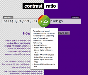
  • Accepts semi transparent colors. For semi-transparent backgrounds, the contrast ratio is presented with an error margin, since it can vary depending on the backdrop. In that case, the result circle will not have a solid background, but a visualization of the different possible results and their likelihood (see screenshot).
  • You can share your results by sharing the URL. The URL hashes have a reasonable structure of the form #foreground-on-background, e.g. #black-on-yellow so you can even adjust the URL as a form of input.
  • You can adjust the color by incrementing or decrementing its components with the keyboard arrow keys until you get the contrast right. This is achieved by including my Incrementable library.

Browser support is IE10 and modern versions of Firefox, Safari, Chrome, Opera. Basic support for IE9. No responsive version yet, sorry (but you can always send pull requests!)

Save the link: contrast-ratio.com

Edit 2022: Link updated to reflect current one. Original link was leaverou.github.com/contrast-ratio

Categories
Personal Speaking

Dive deep into CSS3 (and Bolognese!) in Bologna, Italy

Reading Time: 2 minutes

I don’t usually like to advertise my talks or workshops through blog posts, and even though I’ve given a lot, I’ve only posted about less a handful. However, this one is special: It might be my last. Don’t get me wrong: I LOVE giving workshops, teaching people new things and seeing them put them in use right away is fantastic. However, I also find them incredibly exhausting. Speaking for an entire day (or sometimes two!) is pretty much the most tiring thing I’ve done. So, given my new job at W3C, I’m not sure if I will do one again. Of course, it goes without saying that I will still do plenty of talks! 🙂

The last workshop on my schedule is in FromTheFront conference in Bologna, Italy on September 20th (in 7 days!). There are still some spots available, so grab yours while you still can! It only costs €329.00. It will be very hands-on, with interactive exercises that help you gain first-hand experience with small but advanced use cases. It will not be your usual CSS3-overview kind of workshop. Instead, we will dive really deep into a handful of CSS3 aspects that I think are most useful for your everyday work.

While you’re at it, I’d also recommend getting a conference ticket as well. The line-up has some excellent speakers and it’s only €110 more, so totally worth it!

Apologies that my last two blog posts were personal, the next one will be more technical: I have a very useful tool in the pipeline that I’m gonna release soon 😉

Categories
Personal

lea@w3․org

Reading Time: 2 minutes

In my recent post describing how I got into web development I wrote that I’m in the verge of some big changes in my life. The main one of them starts tomorrow. As of tomorrow, the above will be my professional email. Yes, you guessed it right; I’m joining the W3C team! Yes, the same W3C you all know and love 🙂 I decided to title this blog post with it, as I like how a 10 letter string manages to neatly summarize so much.

Working at W3C had been a dream of mine ever since I learned what a web standard is. As you probably know if you’ve been following my work, I’m a strong believer in open web standards. Even though proprietary technology might offer some short term benefits, in the long run only open standards can allow the Web to reach its full potential.

I’d like to especially thank the two people below (in chronological order). If it wasn’t for them, this dream would have never materialized:

  • Oli Studholme: I still remember our IRC conversation back in January. I was telling him how much I’d love to work for W3C, but “I’m not that good”. He repeatedly encouraged me to contact W3C and express my interest, despite my strong reluctance to do so. “Don’t be like the 15 year old boy that is too shy to ask the girl out” was the argument that finally convinced me. He even asked around to find which person I should contact.
  • Doug Schepers: If it wasn’t for Doug’s heroic efforts, this would have never happened. He believed in me from the start and did everything he could to for this to go through. He spent an incredible amount of time trying to help me, although I repeatedly bombarded him with a cornucopia of silly questions. 🙂 Over the course of these 6 months, he didn’t just become a colleague, but also a friend.
Thank you both. I’m deeply grateful.

I will be part of the W3C developer relations and web education efforts, working a lot with Doug (aka @shepazu). In practice, this means:

  • Help developers understand where standards are headed, and solicit early feedback on upcoming features.
  • Help Working Groups understand what developers need.
  • Help plan W3C developer events, including conferences
  • Speaking about open web technologies at conferences and other events
  • Writing articles and documentation about open web technologies
  • Making demos and tools that demonstrate and help authors understand web standards

In addition, I will be helping with the design of many W3C-related things, as I will be the only designer at W3C.

As you can see I’ll be wearing many hats, which is exactly what I love about this role! I had many tempting offers from big US companies that offered salaries with more digits and a lot of perks. However, my heart wanted W3C and this role was practically tailored to my talents and interests.

I’m honored to be a part of W3C and I’m looking forward to helping out.

<voice type=”fangirl”>I have to admit I’m also really looking forward to meeting Sir Tim Berners-Lee in person! :D</voice>


Categories
Original Releases

Introducing Prism: An awesome new syntax highlighter

Reading Time: 3 minutes

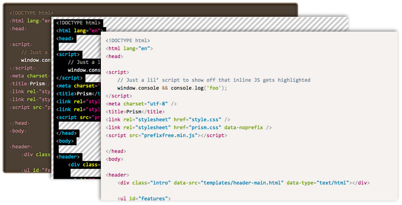
For the past three weeks, on and off, I’ve been working on releasing Dabblet’s syntax highlighter as standalone, since many people had requested it. Zachary Forrest  suggested the name “Prism” and I liked it so much I decided to go with it, even though there is an abandoned Mozilla project with the same name. I ended up refactoring and extending it so much that I will need to backport it to Dabblet one of these days! This doesn’t mean I bloated it, the core is still a tiny 1.5KB minified & gzipped. It just means it’s more awesome. 🙂

Seriously? The world needs another syntax highlighter?

In certain ways, Prism is better than any other syntax highlighter I’ve seen: