Categories
Tips

Cleanest CSS spinner, ever

Reading Time: < 1 minute

For some reason, I seem to have a fascination with CSS loaders these days. After recreating the Google loader with clean CSS recently, I set off to recreate the classic spinner with CSS. Yes, I know this has been done zillions of times, but I wanted a clean, maintainable, reusable solution, not just a proof of concept. Something with not tons of CSS and/or HTML elements.

I managed to recreate it with only 2 elements. I’m still not completely satisfied, as I was hoping to come up with a solution with just one element, but it’s still much better than all those solutions out there that use tons of elements and code.

So, how did I do it?

  • I use the ::before and ::after pseudoelements of the parent and child div to create the 4 first bars
  • I use box-shadow with no blur on all four of the above to create the remaining 4 bars
  • I rotate the whole element with a steps(8) timing function to create the animation

As with the Google-style loader, just changing the font-size on this scales the whole element, as everything is sized with ems. Also, there is fallback text, to make it accessible to screen readers. Tested in Chrome, Firefox, Safari, IE10. Should degrade gracefully on IE9 (spinner should look fine, just no animation).

Using a preprocessor for variables and calculations should simplify the code even further.

Enjoy šŸ™‚

Ideas for further improvement are welcome. Remember that it’s not just the size of the code that matters, but also its simplicity.

Categories
Tips

Flexible Google-style loader with CSS

Reading Time: 2 minutes

So, for a while I had noticed the nice sutble loader Google apps use and I was wondering if it would be easy to make with CSS and CSS animations: Googleā€™s loader

Yesterday, I realised that you can get this effect by increasing border size until about the middle of the element, as long as the total width stays the same (by using box-sizing: border-box):

However, as you can see above, after the midpoint, the border is not curved any more, so does not produce the desired effect. However, what if we split the background colour in half, and animated border-left until 50% of the width and then border-right from 50% of the width? That worked, but only gave us 25% of the effect. I could recreate the whole effect by then animating border-top/bottom instead etc, but it’s easier to apply animation-direction: alternate to alternate between showing and hiding the circle and and simultaneously rotate the loader by 90deg each time, by applying animation-timing-function: steps(4) to a rotate animation that runs over 4x the duration of the border animation.

This is the finished result:

The dimensions are all set in ems so that you can change the size in one place: Just change the font-size and the loader scales perfectly. Itā€™s also accessible to screen reader users, as there is still text there.

And yes, it’s not super useful as-is, there are tons of spinners on the Web that you can use instead. However, I decided to post it (instead of just tweeting it) as I thought the techniques involved in making it might be interesting for some of you šŸ™‚

Categories
Tips

Slanted tabs with CSS 3D transforms

Reading Time: < 1 minute

Not sure if I’m the first to come up with this idea, but I searched and didnā€™t find anything. So, for a long time, I was wondering if there’s an easy way to create trapezoid shapes in CSS, especially with borders etc. Eventually, I realized that I could use a pseudo-element for the background and 3D rotate it, so that it appears like a trapezoid. Then @krofdrakula suggested on twitter that I could even add border-radius so that it looks like a tab, so I added that as well:

Eventually I thought, why not actually turn this into a tab demo? So I made a dabblet with that. And then I realized that if you change the transform-origin, other interesting tab shapes appear! Enjoy:

The best part? It degrades pretty gracefully on browsers that don’t support transforms! You get nice rounded tabs that just aren’t slanted (although they have a pretty large top padding, but you can use Modernizr for that. Try it for yourself by commenting the transform out in the dabblet and see the result.

Another issue is that the angled lines look a bit aliased in Firefox, but that’s a bug that will eventually get fixed.

In general, itā€™s a bit rough around the edges, so treat it more as a proof of concept. But with a little more work, it could totally work in production. Tested in Chrome, Safari, Firefox, IE9 (fallback) and IE10.

Categories
Speaking Thoughts

What makes speakers happy

Reading Time: 3 minutes

I wish I could speak at CSSConf.eu, but unfortunately I had to decline the invitation, as it collided with a prior speaking engagement I had agreed on. I recently got another email from the organizers with an interesting question:

We want to make this event as stress-free for our speakers as possible. Since you spoke at a bunch of events, can you share a tip or two about what will make a speakersā€™ life easier, and their stay more pleasant? Any typical mistakes we can avoid?

I thought it was lovely that they care about their speakers enough to ask this, this already places them above average. I started writing a reply, but I soon realized this is information that could be useful for other conference organizers as well, so I decided to post it here instead. So, what makes speakers happy?

The baseline

These are things every good conference is doing for their speakers, although they often miss one or two. They keep speakers happy, but they ‘re not out of the ordinary.

  • Cover their flights, accommodation for the entire conference and ground transportation from/to the airport (with a car, not public transport!).
  • Do not expect them to go through the hassle of booking all those themselves and then sending you receipts. Offer it as an option, but book them yourself by default.
  • Do not book flights without confirming the itinerary and personal info with them first. Also, this sounds obvious, but it’s surprising how many conferences have made this mistake with me: Type their name correctly when booking flights!
  • If hotel WiFi is not free, make sure itā€™s covered and included in their reservation. Same goes for breakfast.
  • Offer a honorarium, at least to those who have to take time off work to speak at your event (e.g. freelancers). Even if your budget is small and can only give a tiny honorarium, it will at least cover their meals, cabs etc while there. If the honorarium is small and mainly intended to coverĀ miscellaneousĀ expenses of the trip, don’t ask them to submit an invoice to claim it.
  • Have a speakers dinner before the event, where they can meet and socialize with the other speakers. This is also good for the conference, as they get the chance to catch up with their speaker friends (there aren’t that many people on the conference circuit, so we often know each other and want to catch up) Ā so they will talk more to the attendees during the conference.Ā Make sure the speakers dinner does not overlap with the pre-party, if you have one.
  • Do a tech check before their talk to make sure everything is smooth. Have dongles for Mac laptops. Have clickers they could use. Use wireless lapel microphones. Have a reliable private wifi network for speakers to use if they need an internet connection for their talk.
  • Have breaks between talks so they have some margin of going overtime without impacting the schedule. If they are too stressed about going through their talk fast, it won’t be a very good talk.

Going the extra mile

These are all things one or more conferences have done for me, but they are not generally common so they are a positive surprise when they happen, not something expected.

  • Book Business class flights, especially for longer flights where passengers are expected to sleep. Itā€™s so much more comfortable to sleep in a seat that fully reclines! I was incredibly grateful to the one conference that did this.
  • Cover incidentals in the hotel. Yes, itā€™s a bit risky but come on, weā€™re not rockstars. We wonā€™t screw you over. In most cases it will be a pretty small extra cost and it looks really good, it tells speakers you trust them and want them to have a good time.
  • Offer a speaker gift bag. It can contain all kinds of things: Stuff that will make their stay more comfortable (stain remover, travel toothbrush etc), souvenirs from the place since we rarely have time to do touristy stuff, alcohol for impromptu get togethers with other speakers, snacks to eat during a late night craving in the hotel room, anything goes and Iā€™ve seen conferences put all kinds of stuff in there. Itā€™s a nice welcome gesture. Bonus points if theyā€™re personalized based on what youā€™ve researched about the speaker.
  • Send out a survey to the audience after the conference andĀ let the speakers know how they did. Let them know what comments their talk got and how well they did compared to other speakers.

Also, make sure you read PPKā€™s excellent Conference Organizerā€™s Handbook.

Categories
Personal

Leaving W3C

Reading Time: 4 minutes

About a year ago, I announced I was joining W3C as a full-time staff member, to work on Developer Relations and education. Working at W3C was a dream come true and I canā€™t say I was disappointed. Over the past year I’ve worked with some amazingly brilliant people, hopefully increased awareness for web standards in the developer community and helped materialize the vision behind WebPlatform.org. Itā€™s been a fun ride and working for a non-profit was veryĀ fulfilling. If somebody told me a year ago that I would decide to leave W3C on my own free will, I wouldā€™ve asked them what they were smoking. However, our future selves often surprise us and although it was the most difficult decision of my life, I recently decided to leave. July 31st will be my last day at W3C. I will attempt to describe the reasons below for anyone interested, but in no way does me leaving mean that I don’t deeply appreciate W3C or that I regretted joining. If I could go a year back, I would make the same choice.

Reason #1: I want to focus on other projects

I didn’t have much time to work on my pet projects, as my job was consuming pretty much the entire me. This is absolutely not W3Cā€™s fault, it’s mine and a pretty common side effect of working from home. Pull requests kept piling up on Github, I didn’t have many ideas for new side projects or time for research & to come up with new techniques. I was able to work a bit on Dabblet and a WPD Prism plugin, as they were useful for WebPlatform.org, but for the most part, I wanted to work more on open source projects, do more research, blog more etc. I also recently signed a book deal with O’ReillyĀ for a book on advanced CSS techniques (“CSS Secrets”, ETA Spring 2014) and I wanted to take some time off and write a great inaugural book, not just a decent one (and design it too!). I also kinda missed doing workshops or even client work, who knew!

Having more time will also mean I will be able to focus more on standards work, which is a huge passion of mine. I know it sounds odd to leave W3C to work more on …standards, but standards work was never a part of my job at W3C. If I wanted to devote time to actively participate in the CSS WG beyond the weekly telcon, or to the specification I edit, I would have to do it outside work hours. Obviously, I will still have to do it in my free time, but I recall having more of that when I was self-employed.

Reason #2: I want to grow

I want to be in a job thatā€™s a challenge, that helps me grow and become a better professional. While I appreciate WebPlatform.org, I didnā€™t feel that doing front-end development & design on it made me particularly better at what I do, at least compared to other things I could have been doing in the past year. It could be a perfect opportunity to grow for someone else, but it wasnā€™t for me.

I did become a better public speaker over the past year, but I would likely be doing as many talks anyway. I got some valuable conference organizing experience from W3Conf, which I thoroughly enjoyed working on, but that was only a small part of my work.

Reason #3: Different direction

Had I stayed, my job description for the upcoming year would have a slightly different focus.Ā Since W3C Developer Relations was a new activity, neither Doug (my manager) nor I were quite sure how we could make the biggest impact, so we were experimenting to some degree.Ā A few months after I joined, WebPlatform.org launched and we slowly concentrated our efforts on that. If I had stayed for another year, my job would have an even stronger WebPlatform.org focus. Half of it would be front-end design & development and even writing documentation for a day per week.Ā That meant I would have to cut down many parts of my job that I enjoyed and wanted to concentrate more on, such as public speaking and event planning, and though it includes some public-facing activities like gathering feedback from developers, I’d like to do even more of that. This was not a bad decision on W3Cā€™s part ā€” WebPlatform.org needs somebody concentrating on those aspects of it. However, although I strongly believe in the vision behind the project, this was not what I would personally enjoy doing.

Thank you, W3C

Even though I’m leaving W3C, it will always have a very special place in my heart. I met & worked with the most brilliant people I have ever met. Special mention to Amy, who did not just prove to be an intelligent, interesting and kind person, but also a great friend in the past couple of weeks that I got to know her better. I got to visit MIT and work from there for a while, which was an incredible experience. I got to contribute to WebPlatform.org which is a very ambitious and honorable project that I strongly believe in. I got to co-organize W3Conf, which turned out to a successful and fun conference.

Me leaving is a personal decision that has less to do with W3C and more to do with what I want out of life. But Iā€™m going to sorely miss the W3C Team, the culture, the technical discussions. It’s been a fun ride and I’m grateful for the chance and the trust W3C placed in me. In fact, I wouldn’t be surprised to find myself working for W3C again at some point in the future, in some way or in a different role.

But for now, hereā€™s to the future! I’m thrilled.

Want to work at W3C?

As you can imagine, there is one more opening now. šŸ™‚ Are you a great designer with front-end development skills? Are you passionate about creating the best open web platform documentation on the Web? Apply now!Ā You will be able to work from wherever in the world you want, whatever hours in the day you want, you will have great autonomy and a pretty cool boss. Sweet, huh?

Categories
Original Releases

Meet dpi.lv: More than you probably wanted to know about screen DPI

Reading Time: 3 minutes


Screen Shot 2013-06-10 at 13.41.39

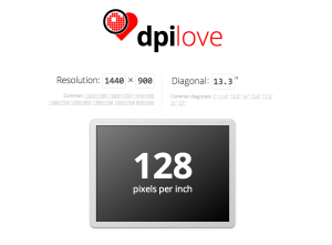
Yesterday (Sunday) I was on a 9.5 hour flight from Canada with no inflight entertainment (well, thanks Air Canada), so I did what every bored human being would do instead of watching movies: I decided to code an app! And out of the infinite set of possible apps somebody can make, I decided to make an app to calculate screen DPI/PPI.

You might be wondering if Iā€™m still (?) sane, but you might be surprised to hear I found myself calculating screen PPIs quite frequently and wanted to save myself the hassle of doing the math every time. Iā€™m a curious person and I wanted to know, even about products I would never buy and even when it wasnā€™t listed in the tech specs. Yes, my hobbies are somewhat weird. šŸ˜®

I first thought about doing such an app a while ago, but never found the time to code it. The last time I had thought about it was a few days ago at the SF Apple Store with a friend. We were looking at the 27″ Apple Thunderbolt displays in awe and thought they must have huge pixel density. After a few calculations in the console (which ironically produced a result faster than the Apple guy my friend asked), it turned out it was only …102. “I need to code an app to make this sort of calculation easy! People are being misled by marketing!” I thought.

Fast forward to my flight. You didnā€™t expect my laptop battery to last for 9.5 hours, right? Yeah, MacBook Air batteries are good, but not *that* good. Of course it eventually died so I had to find other ways to pass my time (I ended up sleeping ā€” or trying to). However, by the time it died, I had gone over the threshold of being able to give it up, so I spent the rest of the day finishing it, despite my obvious jetlag and sleepiness. I was in the zone ā€” You donā€™t just go sleeping when youā€™re in the zone, right?

Besides the DPI/PPI calculator, I added a few other fun things too:

  • A list of devices with pre-calculated data (stored in a separate JSON file, which makes it easy to update ā€” *hint, hint*)
  • Wrote a few FAQ items about DPI/PPI.
  • Like many of my apps, it supports link sharing through URL hashes (for examples, check the screens section).
  • I even bought a proper domain for it (dpi.lv) and drew a logo! The logo took hours by itself. Not just to draw it, but to simplify Illustratorā€™s ugly, repetitive SVG output (which is still better than what most other tools spit out). Hand-simplifying SVG is a meditative experience that I thoroughly enjoy, to the bewilderment of everyone who read my tweet about it. Just for the lulz, hereā€™s the before and the 66% smallerĀ afterĀ (the small design tweaks were intentional)
  • The screen that displays the result resizes to reflect the aspect ratio of the resolution youā€™ve selected. It even animates to it, with CSS transitions! Oh, and it also uses FlexBox to center the text vertically.

Enjoy!

Of course itā€™s open source (under an MIT license, as usual), and you canĀ fork it on Github, as usual.Ā The JS is a bit of a mess, but Iā€™m too tired to refactor it now. Same goes for the lack of favicon and tagline. Oh well. I still like it. šŸ™‚

Important: If you are on a display with multiple dots per pixel (e.g. Retina), the resolution (pixel width ƗĀ pixel height) it tries to guess will be incorrect, so youā€™ll have to actually input the right one. The default resolution in there is just a hint, it doesnā€™t mean itā€™s “broken” if it doesnā€™t guess right, theyā€™re editable fields. That said, it would be nice to guess right in those cases too, and I will look into it.

Categories
News

Can we get rid of gradient prefixes?

Reading Time: 2 minutes

I recently realized that unprefixed gradients finally propagated to stable Chrome, and after tweeting about it, I decided to do some research on which browsers support unprefixed gradients, and what percentage of users needs them.

Currently, unprefixed gradients are supported in:

  • Chrome 26+
  • Firefox 16+
  • Opera 12.10+
  • IE10+

Lets have a look at which prefixes we actually need to use for gradients today.

-ms-

There was never a stable release of IE that supported -ms- prefixed gradients, those were only in preview versions (stable IE10 supports both prefixed and unprefixed gradients). So, -ms- is most definitely not required.

-moz-

Firefox versions >= 3.6 and < 16 account for 4% of the global user base*. This might or might not be significant, depending on how good the fallback is that these users will see. If the gradient only adds a subtle shadow or something like that, Iā€™d say ditch -moz-. If itā€™s more crucial to the design & branding, it might be wise to still keep it. More tech-focused websites probably have a much lower percentage than 4%, so it might be a good idea to drop it there completely.

-o-

Opera unprefixed gradients in 12.10. Opera Mini never supported them. Opera versions < 12.10 currently account to a total of 0.25% of the global user base*. Iā€™d say itā€™s safe to ditch -o- in gradients in most cases.

-webkit-

Chrome only very recently unprefixed gradients and Safari is a long way from doing so. Not to mention all the mobile browsers using WebKit. Unfortunately, we canā€™t ditch -webkit- in CSS gradients just yet.

My opinion

Donā€™t use -ms- prefixed gradients, thereā€™s absolutely zero point in doing so. Include -moz- for the less subtle gradients. No significant need for -o- gradients. -webkit- is still needed and probably will be at least until the end of 2013.Ā Or, of course, just use -prefix-free and donā€™t bother. šŸ˜›

Keep in mind that your stats might differ from global stats, so which prefixes you need to include might differ on a case by case basis. The purpose of this post is to alert you that maybe you donā€™t need all these prefixes, not to prescriptively tell you which ones to keep. Except -ms-, please donā€™t use that. Thereā€™s absolutely zero reason whatsoever.

Last but not least, no matter which prefixes you include, always have a good solid color fallback!


* Global market share statistics from StatCounter, for a 3 month period of January 2013 – March 2013. The graph on the website only displays the most popular browser versions, but downloading the CSV file gives you all of them.

Categories
News

border-corner-shape is in danger, and you can help!

Reading Time: 3 minutes

Remember my previous post about an app I made to preview border-corner-shape? It stirred a lot of discussion in the CSS WG, and David Baron posted this:

http://dev.w3.org/csswg/css4-background/#border-corner-shape appears
to me to be an example of a feature that’s addressing a problem that
we don’t have — or at least that we don’t have enough to be worth
adding such a feature. I think it should be removed.

In particular, if there were demand for the bevel | curve | notch
values, we’d be seeing authors using the equivalents of such values
on significant numbers of Web sites. So before agreeing to accept
this new feature, I’d like to see examples of Web sites that are
doing what these values would do. Not something similar to what
these values would do, but exactly what these values would do, or at
least close enough that the author wouldn’t care about the
difference.

You can read the whole discussion in the thread I linked to, above.

I might be wrong, but I believe border-corner-shape would greatly simplify many common effects, especially its “bevel” value, which can even create triangles and other polygons, that we go to great lengths to make with CSS today, and it would degrade much more nicely than border-image or backgrounds. I think it was one of fantasaiā€™s many great ideas and Iā€™m glad she added it to the Editorā€™s Draft of Backgrounds & Borders 4.

I posted aĀ list of tutorials and questions from web designers & developers, to illustrate that these effects are needed. However, David argued that ā€œQuestions from authors don’t give you enough information to be sureĀ that the feature being added is sufficient for the author’s needsā€. He did have a point, so with some help from the community, I posted a few links to websites using such effects, and use cases. Nicole Sullivan, Liam Quin,Ā fantasaiĀ and Lev Solntsev posted a couple more.

However, the more real examples we have, the more likely it is to retain the feature in some form. This is where you come in: If you think border-corner-shape has merit, provide use cases, either by links to websites whose design elements it would simplify, screenshots of websites or descriptions of cases where you needed such a thing (in that order of preference). You can either post to the thread directly, or comment here and Iā€™ll post them to the list in batches.

If you think it has merit but it could be improved, feel free to post about that as well. If you donā€™t think itā€™s a good idea, any alternatives you can think of are welcome as well. Or, if you donā€™t think itā€™s useful, say that too (but make sure you first fully understand what it can do). If youā€™re not sure how it can be used, play around with the demo app I madeĀ and be creative!

Below are a few examples of shapes:

bevel-1scoop-1notch-1 notch-2Ā scoop-2 bevel-4 bevel-3 bevel-2

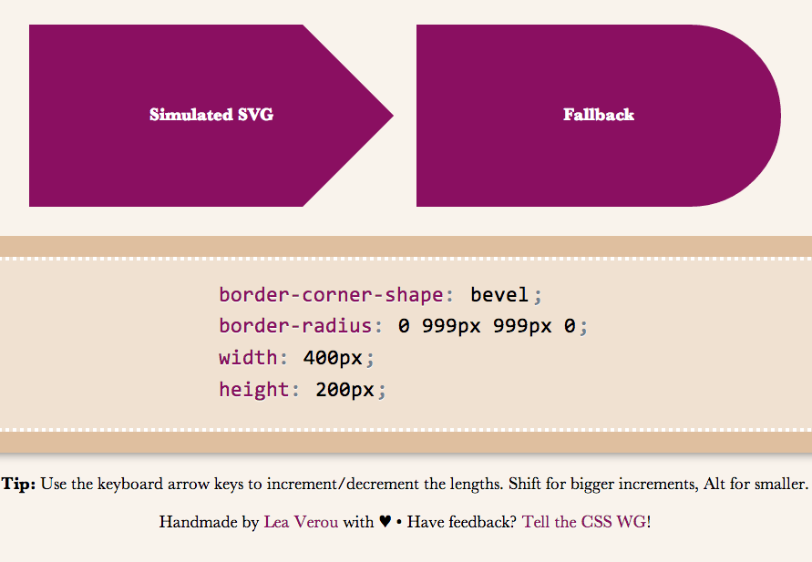
I wanted to demo triangles and trapezoids as well, but it seems thereā€™s a bug in my app, so Iā€™ll have to debug it first šŸ™Ā If we allow border-corner-shape to have different values for all four corners, even more possibilites open (e.g. arrows).

Spend a few minutes to help the CSS WG help you. Thanks!

Categories
Original Releases

Preview corner-shape, before implementations!

Reading Time: 2 minutes

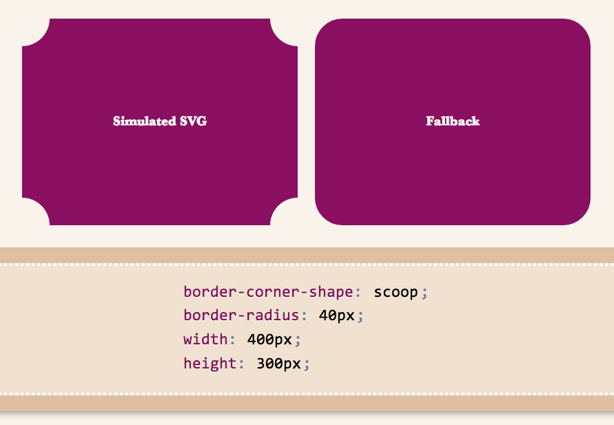
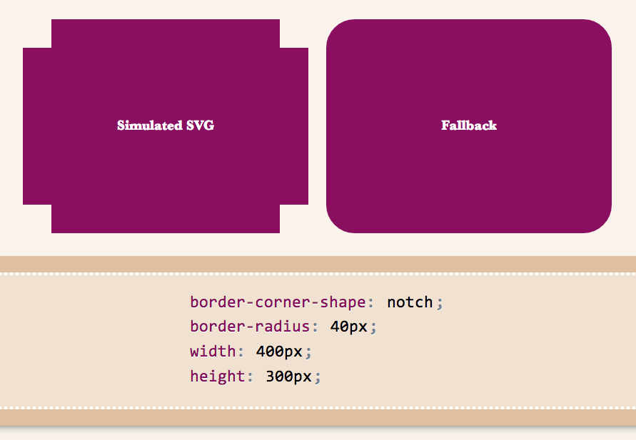
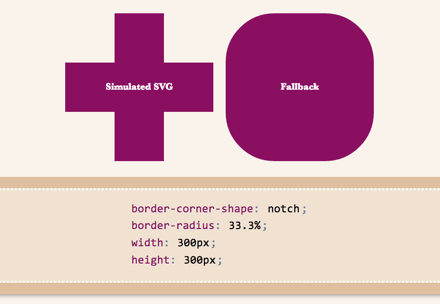
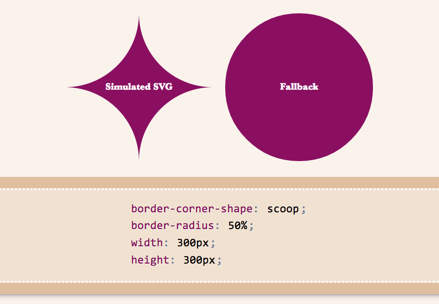
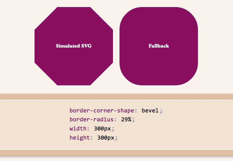
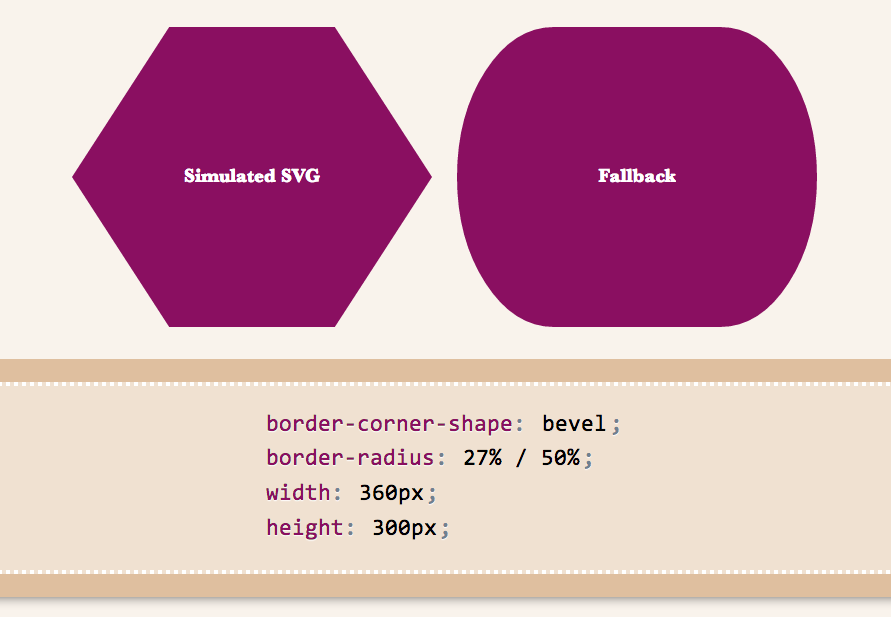
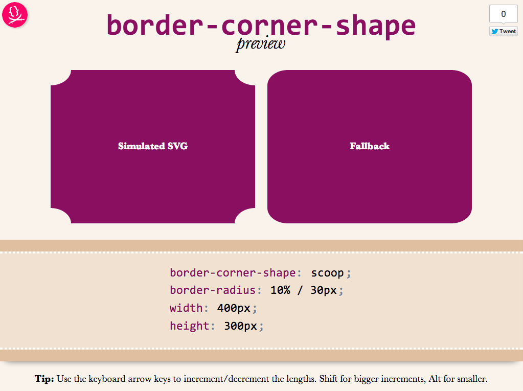
As an editor of the Backgrounds & Borders Level 4 spec, I am naturally a bit more interested in the cool features it will bring, once implementations start (itā€™s currently too early for that). One of the coolest features in it is corner-shape. While in Backgrounds & Borders 3, border-radius was only used for rounded (actually, elliptical) corners, with the help of corner-shape, it will be able to do so much more! Beveled corners, scoop-style corners (informally known as ā€œnegative border-radiusā€), even rectangular notches.

Unfortunately, until itā€™s implemented in browsers, itā€™s hard to play with it. Or, is it? I spent the weekend creating an app in which you can enter values for corner-shape, border-radius, width, and height, and see the result, simulated through SVG, as well as the fallback in browsers that donā€™t support border-corner-radius (which is currently all browsers).

corner-shape preview

Obviously, itā€™s not a full preview, since you can only play with a limited subset of CSS properties, but it should be good for seeing the kinds of shapes that will be possible.You could also copy the generated SVG from the Developer tools of your browser, and use it as a background in any website!

Use it here:Ā corner-shape preview

Tested to work in at least Chrome, IE9, Firefox, Safari and theoretically, should work in any SVG-enabled browser.

Enjoy! Hope you like it.

Important: Please note that corner-shape is still at a very early stage and might completely change before implementations. You can also help to make it better: Play with it and comment on what you think about its naming and functionality!

Categories
Original Tips

Easily center text vertically, with SVG!

Reading Time: 2 minutes

These days, we have a number of different ways to vertically align text in a container of variable dimensions:

  • Table display modes
  • Flexbox
  • inline-block hacks
  • Wrapping the text in an extra element and absolutely positioning it
  • …and probably many others Iā€™m forgetting

However, often comes a time when neither is suitable, so here I am, adding yet another option to the list. Of course, it comes with its own set of drawbacks, but there are cases where it might be better than the existing solutions.