Categories
Releases

Awesomplete: 2KB autocomplete with zero dependencies

Reading Time: 3 minutes

awesompleteSorry for the lack of posts for the past 7 (!) months, I’ve been super busy working on my book, which up to a certain point, I couldn’t even imagine finishing, but I’m finally there! I’ve basically tried to cram all the CSS wisdom I’ve accumulated over the years in it 😛 (which is partly why it took so long, I kept remembering more things that just *had* to be in it. Its page count on the O’Reilly website had to be updated 3 times, from 250 to 300 to 350 and it looks like the final is gonna be closer to 400 pages) and it’s gonna be super awesome (preorder here!) 😀 . I have been posting a few CSS tricks now and then on my twitter account, but haven’t found any time to write a proper blog post.

Anyhow, despite being super busy with MIT (which btw is amazing, challenging in a good way, and full of fantastic people. So glad to be here!) and the book, I recently needed an autocomplete widget for something. Surprisingly, I don’t think I ever had needed to choose one in the past. I’ve worked with apps that had it, but in those cases it was already there.

At first, I didn’t fret. Finally, a chance to use the HTML5 <datalist>, so exciting! However, the more I played with it, the more my excitement was dying a slow death, taking my open web standards dreams and hopes along with it. Not only it’s incredibly inconsistent across browsers (e.g. Chrome matches only from the start, Firefox anywhere!), it’s also not hackable or customizable in any way. Not even if I got my hands dirty and used proprietary CSS, I still couldn’t do anything as simple as changing how the matching happens, styling the dropdown or highlighting the matching text!

So, with a heavy heart, I decided to use a script. However, when I looked into it, everything seemed super bloated for my needs and anything with half decent usability required jQuery, which results in even more bloat.

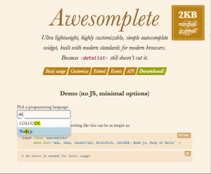
So, I did what every crazy person with a severe case of NIH Syndrome would: I wrote one. It was super fun, and I don’t regret it, although now I’m even more pressed for time to meet my real deadlines. I wrote it primarily for myself, so even if nobody else uses it, ho hum, it was more fun than alternative ways to take a break. However, it’s my duty to put it on Github, in case someone else wants it and in case the community wants to take it into its loving, caring hands and pull request the hell out of it.

To be honest, I think it’s both pretty and pretty useful and even though it won’t suit complex needs out of the box, it’s pretty hackable/extensible. I even wrote quite a bit of documentation at some point this week when I was too sleepy to work and not sufficiently sleepy to sleep — because apparently that’s what was missing from my life: even more technical writing.

I saved the best for last: It’s so lightweight you might end up chasing it around if there’s a lot of wind when you download it. It’s currently a little under 1.5KB minified & gzipped (the website says 2KB because it will probably grow with commits and I don’t want to have to remember to update it all the time), with zero dependencies! 😀

And it’s even been verified to work in IE9 (sorta), IE10+, Chrome, Firefox, Safari 5+, Mobile Safari!

’Nuff said. Get it now!

PS: If you’re about to leave a comment on how it’s not called “autocomplete”, but “typeahead”, please go choke on a bucket of cocks instead. 😛

Categories
CSS WG

An easy notation for grayscale colors

Reading Time: 2 minutes

These days, there is a lengthy discussion in the CSS WG about how to name a function that produces shades of gray (from white to black) with varying degrees of transparency, and we need your feedback about which name is easier to use.

The current proposals are:

1. gray(lightness [, alpha])

In this proposal gray(0%) is black, gray(50%) is gray and gray(100%) is white. It also accepts numbers from 0-255 which correspond to rgb(x,x,x) values, so that gray(255) is white and gray(0) is black. It also accepts an optional second argument for alpha transparency, so that gray(0, .5) would be equivalent to rgba(0,0,0,.5).

This is the naming of the function in the current CSS Color Level 4 draft.

2. white(lightness [, alpha])

Its arguments work in the same way as gray(), but it’s consistent with the expectation that function names that accept percentages give the “full effect” at 100%. gray(100%) sounds like a shade of gray, when it’s actually white. white(100%) is white, which might be more consistent with author expectations. Of course, this also accepts alpha transparency, like all the proposals listed here.

3. black(lightness [, alpha])

black() would work in the opposite way: black(0%) would be white, black(100%) would be black and black(50%,.5) would be semi-transparent gray. The idea is that people are familiar thinking that way from grayscale printing.

4. rgb() with one argument and rgba() with two arguments

rgb(x) would be a shorthand to rgb(x, x, x) and rgba(x, y) would be a shorthand to rgba(x, x, x, y). So, rgb(0) would be black and rgb(100%) or rgb(255) would be white. The benefit is that authors are already accustomed to using rgb() for colors, and this would just be a shortcut. However, note how you will need to change the function name to get a semi-transparent version of the color. Also, if in the future one needs to change the color to not be a shade of gray, a function name change is not needed.

I’ve written some SCSS to emulate these functions so you can play with them in your stylesheets and figure out which one is more intuitive. Unfortunately rgb(x)/rgba(x,a) cannot be polyfilled in that way, as that would overwrite the native rgb()/rgba() functions. Which might be an argument against them, as being able to polyfill through a preprocessor is quite a benefit for a new color format IMO.

You can vote here, but that’s mainly for easy vote counting. It’s strongly encouraged that you also leave a comment justifying your opinion, either here or in the list.

Vote now!

Also tl;dr If you can’t be bothered to read the post and understand the proposals well, please, refrain from voting.

Categories
Replies Tips

Image comparison slider with pure CSS

Reading Time: 2 minutes

As a few of you know, I have been spending a good part of this year writing a book for O’Reilly called “CSS Secrets” (preorder here!). I wanted to include a “secret” about the various uses of the resize property, as it’s one of my favorite underdogs, since it rarely gets any love. However, just mentioning the typical use case of improving the UX of text fields didn’t feel like enough of a secret at all. The whole purpose of the book is to get authors to think outside the box about what’s possible with CSS, not to recite widely known applications of CSS features. So I started brainstorming: What else could we do with it?

Then I remembered Dudley’s awesome Before/After image slider from a while ago. While I loved the result, the markup isn’t great and it requires scripting. Also, both images are CSS backgrounds, so for a screen reader, there are no images there. And then it dawned on me: What if I overlaid a <div> on an image and made it horizontally resizable through the resize property? I tried it, and as you can see below, it worked!

The good parts:

  • More semantic markup (2 images & 2 divs). If object-fit was widely supported, it could even be just one div and two images.
  • No JS
  • Less CSS code

Of course, few things come with no drawbacks. In this case:

  • One big drawback is keyboard accessibility. Dudley’s demo uses a range input, so it’s keyboard accessible by design.
  • You can only drag from the bottom right corners. In Dudley’s demo, you can click at any point in the slider. And yes, I did try to style ::webkit-resizer and increase its size so that at least it has smoother UX in Webkit. However, no matter what I tried, nothing seemed to work.

Also, none of the two seems to work on mobile.

It might not be perfect, but I thought it’s a pretty cool demo of what’s possible with the resize property, as everybody seems to only use it in textareas and the like, but its potential is much bigger.

And now if you’ll excuse me, I have a chapter to write 😉

Edit: It looks like somebody figured out a similar solution a few months ago, which does manage to make the resizer full height, albeit with less semantic HTML and more flimsy CSS. The main idea is that you use a separate element for the resizing (in this case a textarea) with a height of 15px = the height of the resizer. Then, they apply a scaleY() transform to stretch that 15px to the height of the image. Pretty cool! Unfortunately, it requires hardcoding the image size in the CSS.

Categories
Original Tips

Dynamically generated SVG through SASS + A 3D animated RGB cube!

Reading Time: 3 minutesScreenshot of the cubeToday, I was giving the opening keynote at Codemania in Auckland, New Zealand. It was a talk about color from a math/dev perspective. It went quite well, despite my complete lack of sleep. I mean that quite literally: I hadn’t slept all night. No, it wasn’t the jetlag or the nervousness that kept me up. It was my late minute decision to replace the static, low-res image of an RGB cube I was using until then with a 3D cube generated with CSS and animated with CSS animations. Next thing I knew, it was light outside and I had to start getting ready. However, I don’t regret literally losing sleep to make a slide that is only shown for 20 seconds at most. Not only it was super fun to develop, but also yielded a few things that I thought were interesting enough to blog about.

The most challenging part wasn’t actually the 3D cube. This has been done tons of times before, it was probably the most common demo for CSS 3D transforms a couple of years ago. The only part of this that could be of interest is that mine only used 2 elements for the cube. This is a dabblet of the cube, without any RGB gradients on it:

The challenging part was creating the gradients for the 6 sides. These are not plain gradients, as you can see below:

RGB cube sidesThese are basically two linear gradients from left to right, with the topmost one being masked with a gradient from top to bottom. You can use CSS Masking to achieve this (for Chrome/Safari) and SVG Masks for Firefox, but this masks the whole element, which would hide the pseudo-elements needed for the sides. What I needed was masks applied to backgrounds only, not the whole element.

It seemed obvious that the best idea would be to use SVG background images. For example, here is the SVG background needed for the top left one:

<svg xmlns="http://www.w3.org/2000/svg" width="200px" height="200px">

<linearGradient id="yellow-white" x1="0" x2="0" y1="0" y2="1">
	<stop stop-color="yellow" />
	<stop offset="1" stop-color="white" />
</linearGradient>
<linearGradient id="magenta-red" x1="0" x2="0" y1="0" y2="1">
	<stop stop-color="red" />
	<stop offset="1" stop-color="magenta" />
</linearGradient>
<linearGradient id="gradient" x1="0" x2="1" y1="0" y2="0">
	<stop stop-color="white" />
	<stop offset="1" stop-color="black" />
</linearGradient>
<mask id="gradient-mask">
	<rect width="100%" height="100%" fill="url(#gradient)"/>
</mask>

<rect width="100%" height="100%" fill="url(#yellow-white)"/>
<rect width="100%" height="100%" fill="url(#magenta-red)" mask="url(#gradient-mask)"/>

</svg>

However, I didn’t want to have 6 separate SVG files, especially with this kind of repetition (cross-linking to reuse gradients and masks across different files is still fairly buggy in certain browsers). I wanted to be able to edit this straight from my CSS. And then it hit me: I was using SASS already. I could code SASS functions that generate SVG data URIs!

Here’s the set of SVG generating SASS functions I ended up writing:

@function inline-svg($content, $width: $side, $height: $side) {
	@return url('data:image/svg+xml,#{$content}');
}

@function svg-rect($fill, $width: '100%', $height: $width, $x: '0', $y: '0') {
	@return unquote('');
}

@function svg-gradient($id, $color1, $color2, $x1: 0, $x2: 0, $y1: 0, $y2: 1) {
	@return unquote('

	');
}

@function svg-mask($id, $content) {
	@return unquote('#{$content}');
}

And then I was able to generate each RGB plane with another function that made use of them:

@function rgb-plane($c1, $c2, $c3, $c4) {
	@return inline-svg(
		svg-gradient('top', $c1, $c2) +
		svg-gradient('bottom', $c3, $c4) +
		svg-gradient('gradient', white, black, 0, 1, 0, 0) +
		svg-mask('gradient-mask', svg-rect('url(%23gradient)')) +
		svg-rect('url(%23bottom)') +
		svg-rect('url(%23top)" mask="url(%23gradient-mask)')
	);
}

/* ... */

.cube {
	background: rgb-plane(blue, black, aqua, lime);

	&::before {
		background: rgb-plane(blue, fuchsia, aqua, white);
	}

	&::after {
		background: rgb-plane(fuchsia, red, blue, black);
	}
}

.cube .sides {
	background: rgb-plane(yellow, lime, red, black);

	&::before {
		background: rgb-plane(yellow, white, red, fuchsia);
	}

	&::after {
		background: rgb-plane(white, aqua, yellow, lime);
	}
}

However, the same functions can be used for all sorts of SVG backgrounds and it’s very easy to add a new one. E.g. to make polygons:

@function svg-polygon($fill, $points) {
	@return unquote('');
}

@function svg-circle($fill, $r: '50%', $cx: '50%', $cy: '50%') {
	@return unquote('');
}

You can see the whole SCSS file here and its CSS output here.

Warning: Keep in mind that IE9 and some older versions of other browsers have issues with unencoded SVG data URIs. Also, you still need to escape hashes (%23 instead of #), otherwise Firefox fails.

Categories
Personal

I’m going to MIT!!

Reading Time: 2 minutesLast year, I did something crazy, that I’ve been wanting to do since I was little: I applied to MIT’s PhD program in Electrical Engineering and Computer Science.

One of the letters

It was not only crazy because I have been working for several years already, but also because I only applied to MIT, as I decided I did not want to go to any other university, both for pragmatic and emotional reasons. As any prospective grad student will tell you, applying to only one top university is recipe for failure. I didn’t tell many people, but everyone who knew thought I’d get in — except me. You see, I wasn’t a typical candidate. Sure, I have done lots of things I’m proud of, but I didn’t have an amazing GPA or publications in prestigious academic conferences.

It felt like a very long shot, so you can imagine my excitement when I received the letters of acceptance, about a week ago. I will remember that moment forever. I was watching Breaking Bad, feeling miserable over a breakup that happened only a few hours earlier. About a minute into the episode (s05e09), I saw an email notification titled “Your application to MIT EECS”. My first thought was that there was some problem with my application. And then I read the first few lines:

Dear Michailia Verou:

If you have not already heard from them, you will shortly receive a letter from the EECS department at MIT, informing you that you have been admitted to the graduate program in Computer Science at MIT next fall. Congratulations!!

WHAAAA? Was it a scam? But then, how did they have all my details? Holy mother of the Flying Spaghetti Monster, I got in!!! Soon thereafter, a letter from CSAIL followed (where I said I wanted to work, specifically in the UID), and then even more letters. I started calling everyone who knew I applied to share the news, though it proved quite hard to form sentences instead of uncontrollably screaming in joy. I was (and am!) so excited about the future, that it completely overshadows any other life problems (at least for the time being).

Of course, my happiness is mixed with sheer terror. I keep worrying that I will be the dumbest person in the room, or that I don’t remember as much from my undergrad studies as the others will. I’m even terrified of meeting my future advisor(s) in case getting to know me better makes them wonder why I was accepted. But I try to remind myself about impostor syndrome, and from what I’ve read in forums & blogs, it seems that I’m not alone in having such fears.

I held off blogging about it until I felt I was able to write something coherent, but I can’t wait to share my excitement any longer.

To the future!

To real life plot twists!

To MIT!

Boy, I’m thrilled. 😀

Categories
Original Releases

Introducing Whathecolor: A color game for web developers!

Reading Time: 3 minutesI’ve been interested in digital color for a long time, and this year I decided to risk giving a technical talk about color some of the conferences I’m speaking at. “Why is that risky?” you might ask. Well, it might end up being really interesting, or it may end up alienating both designers because it’s too technical and developers because it’s about a “designery” topic.

In preparation for this talk, I decided to make a simple game to see how well I and other web developers understand color, and especially CSS notations of color. Meet Whathecolor!

The idea is simple: You are presented with a color and you try to type in a CSS color that matches it. It could be anything, from hsl() or rgb() to even named colors (although that would be stupid). It would be interesting to see what averages people get by trying hsl() vs rgb() and whether the former is as easier for web developers as we think. Feel free to post your results here or on twitter! Perhaps in the future, something like this could be used by the CSS WG to test the usability of color notations we’re thinking of adding to CSS instead of speculating about it.

Disclaimer: This is a quick hack. Please don’t complain that it doesn’t look great on your phone and stuff like that.

Also, yes, if you want to cheat, it’s super easy, but I have no idea why somebody would cheat on something like this.

Play

Color proximity

A challenging part in developing this was calculating the proximity of two colors to show the user how close they are getting. My first thought was to use the Euclidean distance of the two colors in the RGB cube and divide it by the maximum distance the color could have from any other RGB color. However, this proved out to be inaccurate in many cases, probably due to the lack of perceptual uniformity in RGB. As an example, try #f0f and #ff80ff. Although they are quite similar visually, the reported proximity was around 66% (1 – 128/382).

So I researched  existing algorithms to get the proximity of two colors. Like most things color-related, it looks like Color Difference is not quite as simple as I thought, and is considered a topic of interest in Color Science. However, converting to L*a*b* and using the CIE94 and CIEDE2000 formulas seemed a bit of an overkill for this and I wasn’t terribly impressed with the CIE76 formula after trying the results out online for some sample pairs (e.g. it gives ~60% for the aforementioned pair, which is even lower than what I got with my naïve RGB method!).

So I experimented a bit and ended up using an average of my original idea and a sum of the HSL differences (divided by the max differences), which seems to work relatively ok.  There are still cases where it’s off, but ho hum. After all, the proximity is mainly useful when you get close enough to the color (>90%), as until then you tend to play it by eye. Any improvements on the algorithm used are welcome. Or if enough people think it’s not working very well, I’ll bite the bullet and end up using DeltaE.

Other notes

  • You do not need a proximity of 100% to win, since rounding errors might prevent you from matching the exact color if you’re using HSL. Also, because matching the exact same color isn’t really important, as long as you get close enough that any difference is imperceptible.
  • I wrote a Color “class” for this, which you can find in color.js. Like most of my open source stuff, it’s MIT licensed. Maybe it could be useful in some other color-related project, who knows.
  • My original idea was to have “levels”, where the color would get increasingly more difficult to get. For example, in the first level, you’d only have to guess simple colors whose RGB coordinates were either 0, 128 or 255. So, my Color.random() method accepts an entropy parameter, for that level. However, when I tested the game with truly random colors (any integer from 0 to 255), it turned out it wasn’t really that hard (it took me about a minute to guess each color), so I ditched the idea of levels early on. The code is still there though.
  • An idea about making it harder in the future would be to introduce semi-transparent (RGBA/HSLA) colors. That would be fun :evil_grin:

ScreenshotPS: The times in this screenshot aren’t real, I wanted to take one quickly, so I used the dev tools.


Categories
Personal

Vote for me in the net awards 2014!

Reading Time: < 1 minuteI was excited and surprised to find out I’ve been in the 10 finalists for two (2!) categories in the net awards this year:

You can vote for me by clicking the above links and have my eternal gratitude 🙂

Furthermore, the CERN line mode browser project, of which I was a part of, has been nominated in “Best Collaborative Project”!

I’ve given “The humble border-radius” more than once, so you can pick one to watch below (in the net awards page they’ve linked to the FOWD London one):

I would recommend the CSSDay one, as it changes every time and that one is newer.

Thanks again to anyone who nominated me and everyone who votes for me. You’re all wonderful. <3

Categories
Tips

Smooth state animations with animation-play-state

Reading Time: 2 minutesWhen a CSS animation is applied from the beginning of the page load, things are easy. You just use the animation property with appropriate parameters, and you’re done. However, what if the animation is applied on a certain state, e.g. :hover, :active, :focus or a JS-triggered class change?

A naïve approach would be to try something like this:

However, this means that when you hover out of the element, it abruptly snaps to its original state (no rotation). In many cases, it would be a more desirable to have it freeze in the last shown frame, until we hover over it again. To achieve that, we can apply the animation from the beginning, with animation-play-state: paused; and just change it on :hover to animation-play-state: running;. This is what happens then:

I figured this out when I was recently helping my good friend Julian with his one page website*. When you hover over the figure, it starts scrolling, but when you hover out of it, it doesn’t snap back to its original position, which would’ve looked awful.

*Beware it’s still a bit rough around the edges, e.g. the result has some rendering bugs on Firefox & IE plus some unsupported features messing it up (e.g. baseline-shift in SVG), but those are for another day as I had work to do and this ended up taking longer than the few hours I expected. Beyond the animation, you might want to explore the CSS-only buttons (see what I did there?) or the leather figure frame. Credits to Laura Kalbag for the tweed background & color scheme. I also experimented with SASS on this one and found it much smoother to work with than LESS, so I might stick with it for those cases where I need a preprocessor.

Screenshot

Categories
Speaking

Simple script: Automatic talks list

Reading Time: < 1 minuteI guess this will not be useful to many, but thought I’d open source it anyway, in case someone else finds it useful. I mostly wrote it because after 50+ conferences, I got seriously fed up updating the list by editing the HTML manually. Now I will only have to edit a JSON file manually! 😛

Admittedly, it’s not my best code (more like a quick hack), but it should be pretty easy to adapt to your needs, even to adapt it to lists of different things instead of talks. Using it for talks is very straight forward: Include the CSS and JS, add a list with a class of “talks” where you want it, done.

Hope you enjoy it 🙂

Links: Live demo | Github repo | Script page

Categories
Thoughts

CSS is for developers

Reading Time: 3 minutesQuite often people assume that because the language I focus on is CSS, I must be a web designer. Don’t get me wrong, I love visual design with a passion. I have studied it a lot over the years and I’ve worked on several design projects for clients. Heck, I even have a dribbble profile!

However, if I had to pick one role, I would definitely consider myself more of a developer than a designer. I discovered coding on my own when I was 12 and so far it has been the most long lasting love of my life. Although I lost my coding virginity to Visual Basic (something I’m still embarrassed about), over the years I’ve coded in Java, C, C++, C#, PHP, JavaScript before I even got to CSS. I’ve actually studied Computer Science at university, graduated 4th in my class and I’m gonna be doing research at MIT towards a PhD, starting fall 2014. Regarding design, I’m completely self-taught. My personality is more similar to the developers I know than the designers I know. Coding comes naturally, but I have to struggle to get better at design. I’m a better developer than I will ever be a designer.

Still, the assumption often is that I can’t possibly be a developer and interested in CSS, when there are all these amazing programming languages to focus my energy on instead. Therefore I must be a designer …right? There are even people who know about my open source projects, and still think that I can’t code in JavaScript or any other programming language (not sure how you can make most of these tools with pure CSS, but since CSS is Turing complete, I guess there must be a way!).

If you think I’m an exception, you’re mistaken. Everyone else in the W3C CSS Working Group, the group which defines the future of CSS, fits the profile of a developer much more than that of a designer. In fact, I might be the most designer-y person in it! Even outside the WG, the people I know who are really good at CSS, are either developers or hybrids (designers & developers).

This is no coincidence. The skills required to write good CSS code are by and large the same skills required to write good code in general. CSS code also needs to be DRY, maintainable, flexible etc. CSS might have a visual output, but is still code, just like SVG, WebGL/OpenGL or the JavaScript Canvas API. It still requires the same kind of analytical thinking that programming does. Especially these days that most people use preprocessors for their CSS, with variables, math, conditionals and loops, it’s almost starting to look like programming!

I find it counter-productive that CSS in most jobs is assigned to designers. Designers should be doing what they do best and love: Design. Sure, they should be aware of the practical limitations of the medium and should be able to read and lightly edit CSS or hack together a prototype to show how their design behaves in different conditions, but it shouldn’t be their job to write CSS for production. The talents required to be a good designer and a good coder are very different and it’s unreasonable to expect both from everyone. Also, when you know you’re gonna have to implement the design you’re working on, it’s tempting to produce designs that can be easily converted to CSS, instead of pushing the boundaries. We don’t usually expect developers to design, even though it’s an added bonus when they have an eye for design as well. It should be the same for designers.

And if you’re a designer who writes amazing CSS and is about to tell me off in the comments, hold your horses. I’m not saying you shouldn’t be coding CSS. I’m saying that if you’re good at it, it means you’re both a designer AND a developer. Own it! 😀