Categories
Original

Convert standard gradient syntax to -webkit-gradient and others

Reading Time: < 1 minute

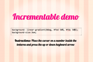
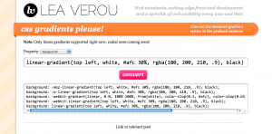
Screenshot of the demoI hate -webkit-gradient() with a passion. Its syntax is cumbersome and it’s really limited: No angle support, no <length>s in color stop positions, no implied color stop positions, no elliptical gradients… So, I was really happy, when Webkit implemented the standard syntax this January. However, we’re still stuck with the horrid -webkit-gradient() for quite a while, since older Webkit browsers that don’t support it are widely used at this time.

Today, I decided to finally spare myself the hassle of converting my standard gradient syntax to -webkit-gradient() by hand. Tasks like that shouldn’t be handled by a human. So, I coded a little script to do the chore. Hope it helps you too:
View demo

It currently only supports linear gradients, but I plan to add radial ones in the future. Also, when I get around to cleaning up the code a bit, I’ll add it on Github.

(Hope I didn’t leave in any very stupid bug, it’s really late here and I’m half asleep.)

Categories
Original Tips

Beveled corners & negative border-radius with CSS3 gradients

Reading Time: < 1 minute

Just found out how to do beveled corners and simulate negative border radius without images, by utilizing CSS gradients once again. It’s amazing how many CSS problems can be solved with gradients alone. Read the text in the dabblet below to find out how (or just check the code):

It also falls back to a solid color background if CSS gradients are not supported. It will work on Firefox 3.6+, Chrome, Safari, Opera 11.10+ and IE10+.

PS: For my twitter friends, I had already written this when the robbers came and I was about to post it. I might have been really calm, but not as much as making CSS experiments the same day I was robbed and threatened by a gun 😛

Categories
Rants

On CSS preprocessors

Reading Time: 4 minutes

Lately there has been a rise in the usage of CSS preprocessors such as LESS and SASS, which makes sense given the simultaneous increase of CSS3 usage. I’ve frequently argued with fellow front-end web developers about whether they should be used or not and I decided to finally put my thoughts in writing.

To start, I can fully understand the advantage of using such preprocessors over vanilla CSS3. I hate listing all the vendor prefixes, and not being able to use variables, mixins or nesting just like the next web developer. All this syntactic sugar can simplify your workflow by a great deal and make writing CSS3 incredibly fun. However, I still refrain from using them, and I’ll explain why below.

Categories
Personal

WD @media talk subject change

Reading Time: < 1 minute

I recently changed my Web Directions @media talk title & abstract to something more specialized. Instead of discussing under-hyped CSS3 features in general I will only focus on one CSS3 feature (more hyped than the ones I was planning to show, but all the hype is only about very basic use cases): CSS3 Gradients:

Mastering CSS3 Gradients

With most browsers adding increasing support, and the simplicity of providing fallbacks for those that don’t, CSS3 gradients are something we can start to use right now. They benefit our users with faster websites and ourselves with more time in our hands to spend in other things, since they are easy to create, edit and update. A very powerful feature that can also be utilized for a surprising number of design effects, even ones that don’t resemble gradients at all. In this talk, Lea will explore CSS3 gradients in great depth and it’s almost guaranteed that no matter your expertise level, you will walk out having learned new things.

I tested a draft of this talk with a meetup group in Oslo (Framsia) and it went very well. I got reviews like “I was amazed that you managed to speak almost an hour of CSS3 gradients and still keep the crowd interested” (thanks Legendre!). Even Bruce Lawson, who happened to be there, told me he didn’t know like 70% of the material presented! 🙂

I’m looking forward to it since it’s a topic I’m passionate about, and I hope to see you there! Don’t forget that you can use the coupon code WDVEROU when registering to take £50 off the current price.

PS: I don’t like the title very much, so if you have anything more witty to suggest, feel free. 😉

Categories
Original Tips

Custom <select> drop downs with CSS3

Reading Time: 2 minutes

The CSS3 Basic UI module defines pointer-events as:

The pointer-events property allows authors to control whether or when an element may be the target of user pointing device (pointer, e.g. mouse) events. This property is used to specify under which circumstance (if any) a pointer event should go “through” an element and target whatever is “underneath” that element instead. This also applies to other “hit testing” behaviors such as dynamic pseudo-classes (:hover, :active, :focus), hyperlinks, and Document.elementFromPoint().

The property was originally SVG-only, but eventually browsers and the W3C adopted a more limited version for HTML elements too.

It can be used in many use cases that weren’t possible before (or the solution was overly complicated), one of them being to create custom-looking <select> drop downs, by overlaying an element over the native drop down arrow (to create the custom one) and disallowing pointer events on it. Here’s a quick example:

-webkit-appearance: none was needed in Webkit to turn off the native OSX appearance (in OSX and maybe Safari on Windows, I didn’t test that). However, since that also removes the native drop down arrow, our custom arrow now obscures part of the text, so we had to add a 30px padding-right to the select element, only in Webkit.

Categories
Original Tips

Checkerboard pattern with CSS3

Reading Time: < 1 minute

A while ago, I wrote a post on creating simple patterns with CSS3 gradients. A common pattern I was unable to create was that of a regular, non-rotated checkerboard. However, I noticed today that by giving a different background-position to every triangle in the pattern tile, a checkerboard can be easily created:

View in Gecko or Webkit.
Webkit seems to have an odd rendering bug, so it needed a background-size override and it still doesn’t look perfect. Oh well, reported the bug and moved on.

Categories
Original Releases

Incrementable length values in text fields

Reading Time: < 1 minute

I always loved that Firebug and Dragonfly feature that allows you to increment or decrement a <length> value by pressing the up and down keyboard arrows when the caret is over it. I wished my Front Trends slides supported it in the editable examples, it would make presenting so much easier. So, I decided to implement the functionality, to use it in my next talk.

If you still have no idea what I’m talking about, you can see a demo here:
View demo

You may configure it so that it only does that when modifiers (alt, ctrl and/or shift) are used by providing a second argument to the constructor and/or change the units supported by filling in the third argument. However, bear in mind that holding down the Shift key will make it increment by ±10 instead of ±1 and that’s not configurable (it would add too much unneeded complexity, I’m not even sure whether it’s a good idea to make the other thing configurable either).

You may download it or fork it from it’s Github repo.

And if you feel creative, you may improve it by fixing an Opera bug I gave up on: When the down arrow is pressed, the caret moves to the end of the string, despite the code telling it not to.

Categories
Original Tips

Convert PHP serialized data to Unicode

Reading Time: 2 minutes

I recently had to convert a database of a large greek website from single-byte greek to Unicode (UTF-8). One of the problems I faced was the stored PHP serialized data: As PHP stores the length of the data (in bytes) inside the serialized string, the stored serialized strings could not be unserialized after the conversion.

I didn’t want anyone to go through the frustration I went through while searching for a solution, so here is a little function I wrote to recount the string lengths, since I couldn’t find anything on this:

function recount_serialized_bytes($text) {
	mb_internal_encoding("UTF-8");
	mb_regex_encoding("UTF-8");

	mb_ereg_search_init($text, 's:[0-9]+:"');

	$offset = 0;

	while(preg_match('/s:([0-9]+):"/u', $text, $matches, PREG_OFFSET_CAPTURE, $offset) ||
		  preg_match('/s:([0-9]+):"/u', $text, $matches, PREG_OFFSET_CAPTURE, ++$offset)) {
		$number = $matches[1][0];
		$pos = $matches[1][1];

		$digits = strlen("$number");
		$pos_chars = mb_strlen(substr($text, 0, $pos)) + 2 + $digits;

		$str = mb_substr($text, $pos_chars, $number);

		$new_number = strlen($str);
		$new_digits = strlen($new_number);

		if($number != $new_number) {
			// Change stored number
			$text = substr_replace($text, $new_number, $pos, $digits);
			$pos += $new_digits - $digits;
		}

		$offset = $pos + 2 + $new_number;
	}

	return $text;
}

My initial approach was to do it with regular expressions, but the PHP serialized data format is not a regular language and cannot be properly parsed with regular expressions. All approaches fail on edge cases, and I had lots of edge cases in my data (I even had nested serialized strings!).

Note that this will only work when converting from single-byte encoded data, since it assumes the stored lengths are the string lengths in characters. Admittedly, it’s not my best code, it could be optimized in many ways. It was something I had to write quickly and was only going to be used by me in a one-time conversion process. However, it works smoothly and has been tested with lots of different serialized data. I know that not many people will find it useful, but it’s going to be a lifesaver for the few ones that need it.

Categories
Replies Tips

Styling elements based on sibling count

Reading Time: < 1 minute

The original idea belongs to André Luís, but I think it could be improved to be much less verbose.

André’s solution is like this:

/* one item */
li:nth-child(1):nth-last-child(1) {
	width: 100%;
}

/* two items */
li:nth-child(1):nth-last-child(2),
li:nth-child(2):nth-last-child(1) {
	width: 50%;
}

/* three items */
li:nth-child(1):nth-last-child(3),
li:nth-child(2):nth-last-child(2),
li:nth-child(3):nth-last-child(1) {
	width: 33.3333%;
}

/* four items */
li:nth-child(1):nth-last-child(4),
li:nth-child(2):nth-last-child(3),
li:nth-child(3):nth-last-child(2),
li:nth-child(4):nth-last-child(1) {
	width: 25%;
}

It’s based on the relationship between :nth-child and :nth-last-child. As you can see, the number of total rules is O(N) and the number of selectors in every rule is also O(N).

However, what you really want, is to just target the first element. The others can be targeted with just a sibling selector. With my improvement, the number of total rules is still O(N), but the number of selectors in every rule becomes just 2, making this trick practical for far larger numbers of children:

/* one item */
li:first-child:nth-last-child(1) {
	width: 100%;
}

/* two items */
li:first-child:nth-last-child(2),
li:first-child:nth-last-child(2) ~ li {
	width: 50%;
}

/* three items */
li:first-child:nth-last-child(3),
li:first-child:nth-last-child(3) ~ li {
	width: 33.3333%;
}

/* four items */
li:first-child:nth-last-child(4),
li:first-child:nth-last-child(4) ~ li {
	width: 25%;
}

And here’s a fiddle to prove it:

Yes, I know that with Flexbox and the other layout modules, techniques such as these are soon becoming obsolete, but I think they are still useful right now.
I’m also aware that you can emulate this particular example with table display modes, but a) Table display modes have other implications that are sometimes undesirable and b) Widths are just an example, you could come up with other ways to style the elements based on their total count, which can’t be emulated by CSS tables.
Categories
News Personal

I’m speaking at @media Web Directions ’11!

Reading Time: < 1 minute

Just a quick note to let you know I’m speaking at this year’s @media Web Directions conference, which will take place during May 26–27 in London, UK. I’m very excited about this, since I always considered @media one of the top front-end conferences in the industry 🙂

The title and abstract of my talk is as follows:

CSS3 at the Outer Rim

By now most of you know how to use the core CSS3 features in your designs to embed custom fonts and easily create rounded corners, drop shadows, and scalable designs with media queries. But there is still a large area of CSS3 that remains unexplored by most web designers and developers. In this talk Lea will present many CSS3 features that are useful but underrated, as well as uncommon ways of utilising the CSS3 features you already know about, in order to do much more with even fewer images and less code.

Although it’s on the design track, I expect it to appeal to both developers and designers.

You can use the coupon code WDVEROU to take £50 off the current price. 😉

Hope to see you there! 😀