Categories
Replies

Better “CSS3 ticket-like tags”

Reading Time: < 1 minute

Today I stumbled upon this tutorial, which from the screenshot, looked very interesting. So, I read on, and to my horror I noticed the author suggesting some questionable practices, the worst of which was using 3 HTML elements for every tag, including nonsense markup like <span class="circle"></span>.

So, I thought I’d take a chance at trying to recreate this effect without any extra markup. And it turned out to be quite easy, although using CSS gradients limits browser support a bit (IE10, Firefox 3.6+, Chrome, Safari 5.1).

They have the same disadvantage as the originals: They depend on the background color. However, unlike the originals, they come at less code, they’re scalable without changing a million values (as shown in the “bigger” section) and of course, no extra markup.

You can see the results in the fiddle below:

Disclaimer: webdesign tuts+ occasionally has some nice tutorials. I didn’t write this post to attack them in any way.

Categories
Original Personal Releases

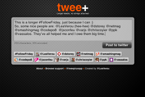
twee+: Longer tweets, no strings attached

Reading Time: 4 minutes

As some people that have been following me for a while know, the 140 character limit on twitter bugs me a lot sometimes, and I’ve tried to find a way to overcome it previously as well. The most common ways these days seems to be either cutting down the long tweet into multiple pieces (yuck) or using a service to host the longer tweet and post a summary with a link to it.

The latter isn’t an entirely horrible option. However, I see 3 big downsides:

  1. I’m not very comfortable with the idea of some external service hosting my content which could close down any time due to failure to monetize their website. In that case, I’d be left with some dead links that are of no value and my content would be lost forever. Yes, they usually warn you in advance in such cases, but such news could be missed for a number of reasons.
  2. People (including yours truly) don’t plan those things in advance. They just seek services like that at the exact moment when they want to post a long tweet. Being greeted with a prompt to use Twitter Connect is NOT nice. For starters, it slows me down. Also, I don’t want to give permission to every website on the effing interwebs to post on my twitter timeline. I owe it to my followers to be responsible and not risk filling their timelines with crap.
  3. Most of these websites look like someone puked and what came out happened to be HTML and CSS. The only exception I’ve found is twtmore, but it still suffers from #1 and #2.
So, like every developer with a healthy amount of NIH syndrome, I decided to write my own 😀
My goals were:
  1. It had to be entirely client-side (except initially getting downloaded from the server of course). This way, whoever is concerned can download the full website and decode their tweets with it if it ever goes down. Also, being entirely client side allows it to scale very easily, as serving files is not a very resource intensive job (compared to databases and the like).
  2. No Twitter Connect, the tweets would get posted through Twitter Web Intents.
  3. It had to look good. I’m not primarily a designer, so I can’t make something that looks jaw-droppingly amazing, but I can at least make it look very decent.
  4. If I was gonna go through all the hassle of making this, I may as well try to keep it under 10K, so that I could take part in the 10K apart contest. (I haven’t submitted it yet, I’ll submit a few days before the deadline, as it seems you can’t make changes to your submission and I want to polish the code a bit, especially the JS — I’m not too proud about it)
I managed to succeed in all my goals and I really liked the result. I ended up using it for stuff I never imagined, like checking if a twitter username corresponds to the account I think (as it shows the avatars). So I went ahead and came up with a name, bought a domain for it, and tweeplus.com was born 🙂

twee+? Seriously?

Yes, I like it. The plus means “more”, which is fitting and + kinda looks like a t, so it could be read as “tweet” as well. Yes, I know that the word “twee” has some negative connotations, but oh well, I still like the name. Whoever doesn’t can just not use it, I won’t get depressed, I promise. 😛

Geeky stuff

How it works

  • A relatively new feature, Twitter automatically wraps URLs in t.co links, making them only 20 characters long.
  • All the text of the tweet is stored in the URL hash (query string will also work, although the output uses a hash). Some research revealed that actually browsers can handle surprisingly long URLs. Essentially, the only limit (2083 characters) is enforced by Internet Explorer. I decided to limit tweets to 2000 characters (encoded length), not only because of the IE limit, but also because I wouldn’t like people to post whole books in t.co links. We don’t want Twitter to start taking measures against this, do we? 🙂
  • A hard part was deciding which encoding to use (twitter is quite limited in the characters it parses as part of a URL).
    • My first thought was base64, but I quickly realized this was not a very good idea:
      • The encoding & decoding functions (btoa() and atob() respectively) are relatively new and therefore not supported by older browsers. I’m fine with the app hardly working in old browsers, but existing links must as a minimum be readable.
      • It uses approximately 1.34 characters per ASCII character. Unicode characters need to be URL-encoded first, otherwise an Exception is thrown. URL-encoding them uses 6 characters, which would result in 8 characters when they’re base64 encoded.
    • Then I thought of using URL-encoding for the whole thing. The good thing with it is that for latin alphanumeric characters (which are the most) it doesn’t increase the string length at all. For non-alphanumeric characters it takes up 3 characters and 6 characters for Unicode ones. Also, it’s much more readable.
    • Still, implementing it was tricky. It doesn’t encode some characters (like the dot), even though twitter doesn’t accept them as part of a URL. Also, escape() and encodeURI() behave differently and the Unicode encoding returned by the former isn’t accepted by Twitter. So I had to combine the two and do some substitutions manually.
  • When the textarea changes, the hash does too. The whole thing is a form with action=”http://twitter.com/intent/tweet”, so submitting it does the right thing naturally. I keep a hidden input with the tweet and the textarea has no name, so it doesn’t get submitted.
  • Usernames, hashtags and URLs get extracted and linkified. Usernames also get an avatar (it’s dead easy: Just use twitter.com/api/users/profile_image?screen_name={username} where {username} is the user’s username)
  • Internal “pages” (like “About” or “Browser support”) are essentially long “tweets” too.
  • A little easter egg is that if the browser supports radial gradients, the gradient follows the mouse, creating a spotlight effect. This looks nice on Chrome and Firefox, and really shitty on IE10, probably due to bugs in the gradient implementation (which I have to reduce & report sometime).

Buzzword compliance

This little app demonstrates quite a lot new open web technologies (HTML5, CSS3 etc), such as:

  • textarea maxlength
  • placeholder
  • autofocus (edit: I had to remove it cause it triggered a Webkit bug in Safari)
  • required inputs
  • New input types (url)
  • History API
  • oninput event (with keyup fallback)
  • hashchange event
  • SVG
  • Common CSS3 (border-radius, shadows, transitions, rgba, media queries)
  • CSS3 gradients
  • CSS3 animations
  • CSS3 resize
  • :empty
Let me know if I forgot something.
Oh yeah, I did forget something. There it is: twee+
Categories
Benchmarks

CSS gradients are faster than SVG backgrounds

Reading Time: 2 minutes

Which is really sad, because SVG is awesome. It lets you do what CSS gradients do and much more, in quite a small filesize, as it’s just text too. However, the browser needs to generate a DOM for every SVG graphic, which results in sluggishness.

Here’s my test case

Mouse over the 2 divs. They both use a spotlight effect that’s dynamically updated according to the position of the mouse cursor. One of them does it with an SVG (through a data URI), the other one through a CSS radial gradient.

The test only works in Chrome, Firefox nightlies and perhaps IE10 (haven’t tested in Windows). Why? Because Opera doesn’t support radial gradients yet (however you can see how slow SVG is in it too), and Firefox before the nightlies used to have a bug with gradients in SVG through data URIs. Also, jsFiddle seems not to work in Webkit nightlies for some reason, but I’m too lazy right now to make a self-hosted test case.

Thanks a lot to Christian Krebs (lead developer of Opera Dragonfly) who inspired these tests after a discussion we had today regarding CSS gradient performance.

Edit: According to some commenters, they’re the same speed on Windows and Linux, so it could be an OSX issue. The only way to know for sure is to post more results, so go ahead and post yours!

Also, some commenters say that this is not a fair comparison, because it generates a new SVG every time. I have several arguments to reply to this:

  1. We also generate a new gradient every time, so it is fair.
  2. You can’t manipulate an SVG used for a background, so it’s not an option for backgrounds. JS doesn’t run in it and you don’t have access to its DOM. The only way to do that would be to use an inline SVG embedded in HTML and the element() CSS3 function. However, that’s only supported by Firefox, so not really a pragmatic option.
Categories
Personal Speaking

CSS3 for developers: My Fronteers 2011 workshop

Reading Time: 3 minutes

In case you haven’t noticed, in addition to my talk at Fronteers 2011, I’ll also be holding a full day workshop the day before the conference. The title of that workshop is “CSS3 for developers” and I wanted to explain a bit what it’s going to be about and why I chose to target web developers only.

Categories
Personal Speaking

My experience from the CSS Summit 2011

Reading Time: 2 minutes

It’s been a few days since this year’s CSS Summit and my talk there. Where most people would assume that public speaking in a “real” conference is more daunting, I was much more nervous about this one, since it was my first talk at an online conference. I wouldn’t be able to see the faces of the audience, so how would I be able to tell if they like it or are bored shitless? Also, the whole idea of me, alone in a room, giving a talk to my laptop sounded kind of awkward, to say the very least.

Contrary to my fears, it was a very pleasant experience. In some ways, it’s much better than real-life conferences, the main one being the number of questions you get. In most real-life conferences you should be lucky to get more than 3 or 4 questions. Also, they’re usually at the end, so most attendees forget the questions they had at the beginning and middle of the talk (it happens to me a lot too, when I attend others’ talks). In the CSS Summit, I answered questions after every section of my talk, and there were quite a lot of them.

The attendees had a group chat in which they talked about the presentation, posted questions and discussed many other stuff. That group chat was the other thing I really liked. It might surprise some people, but even though I’m not afraid of public speaking, I’m quite shy in some ways and I almost never talk to someone first. So, if I didn’t know anyone at a conference and vice versa, I’d probably sit in a corner alone with nobody to talk to during the breaks. The chat makes it much easier for attendees to get to know each other. On the minus side however, “meeting” somebody in a chat is not by any means the same as really meeting someone f2f in a real-life conference.

Regarding my talk, it went surprisingly well. No technical hiccups like some of the other talks, no me going overtime as I was afraid I would (since I had to be slower), no internet connection failing on my part (like it sometimes does lately). I received lots of enthusiastic feedback on both the chat and twitter. I couldn’t even favorite them all, as the tweets were so many! That’s the 3rd good thing about online conferences: People tweet more, since they’re at home with their regular connection and not with a crappy conference wifi or a smartphone on expensive roaming.

Here’s a small sample of the feedback I got:

Categories
Personal

Vote for me in The .net awards 2011!

Reading Time: < 1 minute

I don’t usually post shameless plugs like that, but I’m so excited about this I decided to make an exception. A few minutes ago I found out that I’m shortlisted in the “Brilliant newcomer” category of The .net awards!!!

Thank you so much @ everyone that nominated me and/or plans to vote for me. I really appreciate it guys*! 🙂

* “guys” in that context is used in a gender neutral fashion, I’m not only thanking the men 😛

Categories
News Original Personal

Detecting CSS selectors support + my JSConf EU talk

Reading Time: 3 minutes

I’ll start with a little backstory, if you want to jump straight to the meat, skip the next 4 paragraphs.

In the past few months, my CSS research has been getting some attention and I’ve been starting to become somewhat well-known in the CSS industry. A little known fact about me is that JavaScript has always been one of my loves, almost as much as CSS (even more than it in the past). Ironically, the first time I was asked to speak in a big conference, it was about JavaScript, even though I ended up choosing to speak about CSS3 instead.

Lately, I’ve started wanting to get more into the JavaScript industry as well. I’m quite reluctant to submit speaking proposals myself (every conference or meetup I’ve given a talk so far has asked me to speak, not the other way around) and most JavaScript conferences expect you to submit a proposal yourself. I also couldn’t think of a good topic, something I was passionate about and hasn’t already been extensively covered.

This changed a few weeks ago. While I was writing my <progress> polyfill, it dawned on me: Polyfills is something that’s JS-related and I’m passionate about! I love studying them, writing them, talking about them. I quickly searched if there were any talks about polyfill writing already and I couldn’t find any. So, I decided to submit a proposal to JSConf EU, even though the call for speakers had passed 10 days ago. When I read @cramforce’s tweet that they had decided on most of the speakers, I spent a few days stressed as hell, checking my inbox every few minutes and hoping that my gut feeling that I would get accepted was right.

And it was! 3 days ago I received an email from JSConf EU that my proposal was accepted!! I can’t even begin to describe how happy and excited I am about it. And nervous too: What if they know everything I’m going to say? What if they hate my talk? What if the JavaScript industry is really as sexist as some people claim and they dismiss me because of my gender? I decided to put my fears aside and start working on my slides, as I couldn’t wait until later (even though I have multiple deadlines creeping up on me right now…).

A big part of writing polyfills is feature detection. Before trying to implement a feature with JavaScript, you first have to check if it’s already supported. So, a substantial portion of my talk will be about that. How to detect if APIs, HTML elements, CSS properties/values/selectors etc are supported. There are already established solutions and techniques about most of these, except CSS selectors. Modernizr doesn’t detect any, and judging from my Google search nobody has written about any techniques for doing so in a generic fashion.

A really simple way to detect CSS selectors support is using document.querySelector() in a try...catch statement. If the selector is not supported, an error will be thrown. However, that’s not really reliable, as the Selectors API is not supported in IE < 8. So, I thought of another idea: What if I turn the hassle of reading out a stylesheet via the DOM methods (browsers drop stuff they don’t understand) into a feature detection method?

The basic idea is creating a new <style> element with an empty rule and the selector we want to test support for, and then read out the stylesheet through the DOM methods to see if a rule actually exists. I’ve so far tested it in Firefox, Opera and Chrome and it seems to work. I haven’t tested it in IE yet, as I currently have too many apps running to turn on the vm, so it might need a few fixes to work there (or I might be unlucky and the idea might not work at all).

You can test it out yourself in this fiddle, just check the console: http://fiddle.jshell.net/leaverou/Pmn8m/show/light/

Apologies if this has already been documented elsewhere, I really couldn’t find anything.

Edit: James Long worked on fixing my example’s issues with IE
Categories
Original Releases

A polyfill for HTML5 progress element, the obsessive perfectionist way

Reading Time: 7 minutes

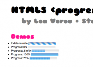
Yesterday, for some reason I don’t remember, I was looking once more at Paul Irish’s excellent list of polyfills on Github. I was really surprised to see that there are none for the <progress> element. It seemed really simple: Easy to fake with CSS and only 4 IDL attributes (value, max, position and labels). “Hey, it sounds fun and easy, I’ll do it!”, I thought. I have no idea how in only 1 day this turned into “OMG, my brain is going to explode”. I’ve documented below all the pitfalls I faced. And don’t worry, it has a happy ending: I did finish it. And published it. So, if you’re not interested in long geeky stories, just jump straight to its page.

Categories
Original

CSS reflections for Firefox, with -moz-element() and SVG masks

Reading Time: 2 minutes

We all know about the proprietary (and imho, horrible) -webkit-box-reflect. However, you can create just as flexible reflections in Firefox as well, by utilizing -moz-element(), some CSS3 and Firefox’s capability to apply SVG effects to HTML elements. And all these are actually standards, so eventually, this will work in all browsers, unlike -webkit-box-reflect, which was never accepted by the CSS WG.

First and foremost, have a look at the demo:

How it works

  • For every element, we generate an ::after pseudoelement with the same dimensions and a position of being right below our original element.
  • Then, we make it appear the same as our element, by giving it a background of ‑moz-element(#element-id) and no content.
  • Reflections are flipped, so we flip it vertically, by applying transform: scaleY(‑1);
  • If we want the reflection to have a little distance from the element (for example 10px like the demo), we also apply a transform of translateY(10px)
  • We want the reflection to not be as opaque as the real element, so we give it an opacity of around 0.3-0.4
  • At this point, we already have a decent reflection, and we didn’t even need SVG masks yet. It’s essentially the same result -webkit-box-reflect gives if you don’t specify a mask image. However, to really make it look like a reflection, we apply a mask through an SVG and the mask CSS property. In this demo, the SVG is external, but it could be a data URI, or even embedded in the HTML.

Caveats

  • Won’t work with replaced elements (form controls, images etc).
  • If you have borders, it gets a bit more complicated to size it properly
  • Doesn’t degrade gracefully, you still get the pseudoelement in other browsers, so you need to filter it out yourself
  • Bad browser support (currently only Firefox 4+)
  • You need to set the reflection’s background for every element and every element needs an id to use it (but this could be done automatically via script)

Further reading

Credits: Thanks to Christian Heilmann for helping me debug why SVG masks for HTML elements weren’t originally working for me.

Categories
Original

Pure CSS Tic Tac Toe

Reading Time: < 1 minute

It’s supposed to be used by 2 people taking turns (click twice for the other sign).

Basic idea:

  • It uses hidden checkboxes for the states (indeterminate means empty, checked means X, not checked means O) and labels for the visible part
  • When it starts, a little script (the only js in the demo) sets the states of all checkboxes to indeterminate.
  • It uses the :checked and :indeterminate pseudo-classes and sibling combinators to change the states and show who won.
  • Once somebody clicks on a checkbox (or in this case, its label) they change it’s state from indeterminate to either checked or not checked, depending on how many times they click on it.