Categories
Original Releases

Major update to Chainvas: modularity, a client side build script & more

Reading Time: 2 minutes

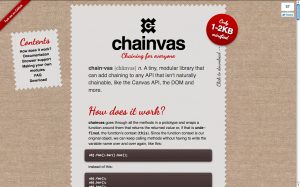
A week ago, I released Chainvas. It was a spin-off script I wrote while developing my cubic-bezier tool, to make using the Canvas API a bit less painful. However, unlike similar attempts to make the Canvas API chainable, most of my code was written in a very generic manner, and was actually able to make every API chainable. However, when I released it, even though I mentioned that it can be used for other APIs and provided some examples, practically everyone that shared the link on twitter or other means (thank you .net magazine for the newsletter mention btw!) focused on what Chainvas did for Canvas.

Actually, while using Chainvas myself, I found it immensely more useful for chaining DOM methods and setting multiple element properties at once. Chainvas had a lot of potential, that most people were missing. And then it dawned on me: I should modularize the library! A generic chaining library at its core and additional modules for making the different APIs chainable. And I did it.

On the way to that, I added IE8 compatibility, and tested in many other browsers, thanks to Browserstack. I actually found that Chainvas’ core even works in IE6! I also wrote unit tests, a much more extensive documentation, added a script generated table of contents and designed a logo and a Chainvas pride banner.

Also, since it was now modular, it needed a build script. I badly wanted to make this client side, so I followed this architecture:

  • Every module is included in chainvas.js and chainvas.min.js, along with a header comment that follows a specific syntax.
  • The user selects a compression level and then, the relevant script is downloaded through XHR and split into parts according to the module headers. Then a module list is generated with checkboxes for the user to select the ones they want to include.
  • When the user checks and unchecks those checkboxes, the URL of the download link changes to a data URI that contains the script.
This approach has the disadvantage that there is no default filename, and the “Save page as…” link is deactivated in Chrome (why Chrome??). However, I like the idea so much, I don’t mind these shortcomings.
That’s about it. Enjoy and let me know about any bugs.
Categories
Original Releases

A better tool for cubic-bezier() easing

Reading Time: 3 minutes

A few days ago, I had a talk at a conference in Zurich (I’m going to write more about it in another post). The talk was about “10 things you might not know about CSS3”. The first of those things was how you can do bouncing transitions with cubic-bezier() instead of an easing keyword. As usual, my slides included a few live demos of the functionality, in which I edited the cubic-bezier() parameters and the audience could see the transition produced.

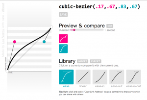
However, in the case of cubic-bezier() that’s not enough. No matter how much you see someone changing the parameters, if you don’t picture it in a 2D plane, it’s very hard to understand how it works. So, the night before, I searched for a tool I could use to show them how bezier curves are formed. I found plenty, but all of them restricted the the coordinates to the 0-1 range. I’m not sure if the cause is ignorance about the spec changes or that Webkit hasn’t caught up with those changes yet (but it will, soon). The only one that supported values out of range was this one from the Opera Dragonfly developers, but I found it kinda impossible to adapt.

For my talk, I tried to adapt one of them but it was late so I gave up after a while and ended up just showing them a screenshot. And the day after the talk, I started adapting this to my needs (ever tried coding at a conference? It’s awesome, you get to ask questions from very knowledgeable people and ger replies straight away). And then I started cleaning up the code, changing how it worked, adding features. At this point, I think the only thing that’s left from that tool is …the HTML5 doctype. After 3-4 days, I finished it, and got it its own domain, cubic-bezier.com (I was surprised it was still free).

So, in a nutshell, what makes this better?

Lots of things:

  • It supports y values out of range, as per the latest version of the spec (and shows a warning for Webkit)
  • It’s fully accessible from the keyboard
  • You can move the handles not only by dragging but also by clicking on the plane or using the keyboard arrow keys
  • You can mouse over the plane and see the progression and time percentages that correspond to every point
  • You can save curves you like in your “Library” (uses localStorage to persist them)
  • You can import and export curves to/from your library to share them with others
  • You can share a permalink to every curve. For example, here’s a bouncing transition (FF & Opera only)
  • You can compare the current curve with any in your library, setting the duration yourself
  • Custom favicon that reflects the current curve

Cool stuff used

Given that this tool is not only for developers, but for badass developers that care about stuff like cubic-bezier(), I think I can safely assume they’re using a top notch browser. So, I went crazy with using cool modern stuff:

  • HTML5: Canvas, localStorage, History API, range inputs, oninput event, output, classList, data- attributes
  • ES5: Accessors, Array#map, Array#forEach
  • Selectors API
  • JSON
  • CSS3: Transitions, gradients, media queries, border-radius, shadows, :in-range pseudoclass, box-sizing, transforms, text-overflow
I also used my tiny chaining framework, Chainvas throughout this project.

Browser support

So far, I’ve tested it in modern versions of Chrome, Firefox, Opera and Safari and it seems to work. I haven’t tested it in IE10 (too lazy to open vm), although I want it to work there too, so if it doesn’t let me know. 🙂

Enjoy! cubic-bezier.com

Categories
Original

Chainvas: Make APIs chainable, enhance the canvas API

Reading Time: < 1 minute

It’s definitely not the first time someone writes a script to make the canvas API chainable, as a quick Google search will confirm.

However, I think my attempt has merit, because it’s not really focused in chaining canvas methods, but just about every API you use it on and because it’s super small, only 1KB!

You can find it here: chainvas
Enjoy!
Categories
Articles Personal

Help the community: report browser bugs

Reading Time: < 1 minute

Thought I’d let you know that my Smashing Magazine article with that title was published today. It discusses why, how, when and where to report browser bugs, as well as how to make a good bug report.

Get comfortable and make a big cup of coffee before you dive in, as it’s quite long (4000 words).

Categories
Original

Pure CSS3 typing animation with steps()

Reading Time: < 1 minute

steps() is a relatively new addition to the CSS3 animations module. Instead of interpolating the values smoothly, it allows us to define the number of “frames” precisely. So I used it to create headers that have the well-known animated “typing effect”:

As you can see, the number of characters is hardcoded in the steps() function, but that’s the only place. Everything else is totally flexible. Apart from the font: It has to be monospace, so that every character has the same width.

Also, this particular way requires a solid background and an extra <span>. You can avoid these limitations by directly animating the width of the heading itself, but this requires a fixed target width hardcoded in the animation, so 2 things that need to be changed for every heading:

If you’re having trouble understanding how it works, take a look at this simpler example, with just the cursor.

Gecko (Firefox) and Webkit only at the moment, since other engines haven’t implemented CSS animations yet. However, both examples degrade very gracefully in other browsers (IMO at least).

Categories
Original Releases

CSS.coloratum: Convert and share CSS colors

Reading Time: 2 minutes

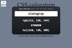
Whenever I wanted to convert a CSS named color to RGB, I used to open the CSS3 colors spec in a new tab, search in the page and copied the values. Every time it felt even more tedious. I didn’t want to search in long tables, I wanted to type the color somewhere and get the values back, in an easy to copy format. So, after yet another color lookup earlier today, I decided to scratch my own itch and do it myself.

Of course, I didn’t plan to include a whole database of CSS colors in the website. My idea was much simpler: Use the named color to draw a rectangle in a <canvas> and then read the R,G,B values through ctx.getImageData().

I got the core functionality done in under 10 minutes, so I started adding stuff. I added a hex and HSL representation, I used canvas.toDataURL() to get a data URI of the rectangle and use it as a dynamic favicon*, I made the colors sharable and bookmarkable by using an old-fashioned hash. Also, I realized it actually supports any CSS supported color represenation by design, not just named colors.

Regarding the color conversions themselves, I took extra care to avoid redundancy. So values < 1 don’t have leading zeroes (.5 instead of 0.5) and when the hex color is in the format #xxyyzz it gets converted to #xyz. When it’s an RGBA color, it still converts it to hex, since those values will be supported in CSS4.

Since it’s for developers, I didn’t bother at all with fallbacks.

Cool stuff used:

  • HTML5: canvas, autofocus, output, oninput event, hashchange event
  • CSS3: gradients, media queries, box-sizing, background-clip, border-radius, shadows, RGBA
  • ES5: Array#map()
  • Selectors API

The reason the input’s border appears weird on Webkit is this long standing Webkit bug. Also, for some reason my nice dynamic favicons don’t display on Firefox, although they display fine in Webkit and Opera.

Enjoy: CSS.coloratum
Happy color sharing! Let me know of any problems or suggestions you may have.
PS: In case you’re wondering about the domain, I’ve had it for ages for another project and I thought it was quite fitting.

*Thanks to @milo for giving me the idea of using a dynamic favicon

Categories
Thoughts

On URL readability

Reading Time: 2 minutes

Yesterday, I was watching some season 6 episodes of Futurama (btw, this is their best season ever!) and I noticed the URLs in the website I was in (let’s call it foo.com). They were like:

http://foo.com/futurama/season/6/episode/9

I thought to myself “hey, this looks very clean and readable”. And then I noticed that it only has 1 less character than its non-rewritten counterpart:

http://foo.com/?futurama&season=6&episode=9

However, I’m pretty sure you agree that the second one is much harder to read. I asked for opinions on twitter, and got many interesting replies. Apart from the ones that completely missed the point, these were the core explanations:

  • = and especially & are more complex and look more like letters, so our brain has trouble tuning them out (@feather @robert_tilt @rexxars @mrtazz @manchurian)
  • Slashes have more whitespace around them, so they are less obtrusive (@feather @stevelove @kenny1987 @janl)
  • They’re all visual noise, but we always have slashes in a URL, so using the slash to separate keys and values as well only introduces 1 separator instead of 3 (@bugster @craigpatik @nyaray)
  • Slashes imply hierarchy, which our brains process easier than key-value pairs. Key-value pairs could be in any order, paths have a specified order. (@sggottlieb @edwelker @stevenhay @jwasjsberg @stazybohorn)
  • Ampersands and equal signs are harder to type than slashes. They’re both in the top row and ampersands even need the Shift key as well. (@feather)
  • Ampersands and equal signs have semantic meaning in our minds, whereas slashes not as much (@snadon)
Regarding hierarchy and RESTful design, the first example isn’t exactly correct. If it was hierarchical, it should be foo.com/futurama/seasons/6/episodes/9. As it currently stands, it’s key-value pairs, masquerading as hierarchical. However, it still reads better.
So I’m leaning towards the first three explanations, although I think all of them have a grain of truth. Which makes me wonder: Did we choose the wrong characters for our protocol? Could we have saved ourselves the hassle and performance overhead of URL rewriting if we were a bit more careful in choosing the separators back then?
Also, some food for thought: Where do you think the following URLs stand in the legibility scale?
http://foo.com/futurama/season=6/episode=9
http://foo.com/futurama/season:6/episode:9
http : //foo.com/futurama-season-6-episode-9  (suggested by Ben Alman)
Do you think there are there any explanations that I missed?
Categories
Tips

To write good code, you sometimes have to write bad code

Reading Time: < 1 minute

And I’m not referring to learning.

For example, yesterday I was trying to write code for something and it ended up beng harder than I expected. It’s one of those rare cases where you can fully imagine how the solution should work, enough to tell it to another person, but you can’t put your thoughts to code and you feel you’re not smart enough.

I find that in those cases, it helps a lot to open a new editor window and try to write code that just works. Without being elegant, fast or maintainable. Just something that works properly. And after you manage to put your thoughts into (bad) code, it’s easy to refine it from there and end up with good code.

Just don’t stop at the bad code, like many beginners do. It’s like when designers sketch a rough draft for a logo, before drawing the digital version. Could you imagine how horrible it would be if they wanted to stop there and give the rough sketches to the client instead? 🙂

Categories
Original

Accessible star rating widget with pure CSS

Reading Time: 2 minutes

For ages, we couldn’t utilize the sibling combinators (~ and +) to ease the pain of creating star rating widgets, because of this stupid Webkit bug. Nowadays, not only it’s fixed, but the fix has already propagated to Chrome and Safari 5.1. So, we can at least use the sibling combinator to make coloring the stars easier.

But can we use no JavaScript for a rating widget and make it just with CSS?

Actually, we can. By adapting Ryan Seddon’s technique for custom radio buttons with CSS, we can turn a series of radio buttons into stars that change colors (for the purposes of this demo they’re just unicode characters that change colors, but in your case they may as well be images) and use the sibling combinator to color the previous stars. A series of radio buttons is what many people use as a star rating widget fallback anyway, so the markup required is not necessarily more than usual. The only thing that needs to be done differently is their reverse ordering: The highest ratings need to go first, due to the way CSS3 selectors work (this limitation might be removed in CSS4, but that’s a long way ahead).

Of course, you’d still need JS to attach an event handler if you want the votes to be registered through AJAX, but that’s not part of the rating widget per se (it could still work as part of a regular form).

What’s best is that it’s fully keyboard accessible (focus and then use keyboard arrows) and screen reader accessible (although VoiceOver will also pronounce the generated stars, but that won’t happen if you use images instead of unicode stars). I’m guessing it could become even more accessible with proper ARIA, but I’ll leave that as an exercise to the commenter 😀

In browsers that don’t support :checked (essentially only IE < 9), it degrades to a series of radio buttons (haven’t verified that it does, but it should do).

So, here it is:

Legal note, for those who need it: This code is MIT licensed.

Categories
Personal

Why I love our industry

Reading Time: 2 minutes

I was thinking today how blessed I feel for being a part of the worldwide web development community (and the broader programming community). In a world where throwing shit at others is an acceptable way of climbing to the top, our industry is a breeze of fresh air. Here are a few reasons why I find our industry unique, in a very good way:

  • In which other industry is it common for people to spend several hours, days or in some cases even months, working on something to give it away for free, just to help people?
  • In which other industry do people help you and promote you just because they think you’re good, without getting anything out of it?
  • In which other industry do people listen to you, not because of your titles, degrees and “decades of experience”, but because of what you actually know?
  • In which other industry can you go to a big professional conference with jeans and a t-shirt and be in the majority? (And the best part is, even if you don’t like that kind of outfit and you prefer to wear a suit, you still fit in, cause appearances just don’t matter)
  • Judging whether someone’s work is good is a very rational and objective process (unlike arts). Sure, the various criteria have different weights for every person, but the criteria are the same for everyone, more or less (correctness, speed, maintainability, readability etc).
  • Even though it’s a male dominated field, I’ve never* experienced any discrimination or lack of respect due to my gender. Quite the contrary actually.
  • I’ve yet to meet a developer that lacks a sense of humor.
  • Work for us is our passion, not a chore. Yes, there are passionate people in every field, but in our industry it’s the norm, not the exception.
  • You don’t need to hide your geekiness. Instead, you’re encouraged to embrace it.

Yes, I know that not all of them are true for every single person that happened to be a web developer. I’m talking about the part of the industry that’s active and that I meet in conferences, meetups, twitter etc.

So, what are your reasons for liking our industry, if any? Lets keep this post happy and not whine about what we DON’T like please. 🙂

*Well, except one bad joke once, but he recently said he’s sorry and his intentions were good throughout, so I don’t count it.