Recently, when I was making the minisite for markapp.io, I realized a neat trick one can do with CSS variables, precisely due to their dynamic nature. Let’s say you want to use a property that has multiple versions: an unprefixed one and one or more prefixed ones. In this example we are going to use clip-path, which currently needs both an unprefixed version and a -webkit- prefixed one, however the technique works for any property and any number of prefixes or different property names, as long as the value is the same across all variations of the property name.
The first part is to define a --clip-path property on every element with a value of initial. This prevents the property from being inherited every time it’s used, and since the * has zero specificity, any declaration that uses --clip-path can override it. Then you define all variations of the property name with var(--clip-path) as their value:
Even !important should work, because it affects the cascading of CSS variables. Furthermore, if for some reason you want to explicitly set -webkit-clip-path, you can do that too, again because * has zero specificity. The main downside to this is that it limits browser support to the intersection of the support for the feature you are using and support for CSS Variables. However, all browsers except Edge support CSS variables, and Edge is working on it. I can’t see any other downsides to it (except having to use a different property name obvs), but if you do, let me know in the comments!
I think there’s still a lot to be discovered about cool uses of CSS variables. I wonder if there exists a variation of this technique to produce custom longhands, e.g. breaking box-shadow into --box-shadow-x, --box-shadow-y etc, but I can’t think of anything yet. Can you? 😉
If, like me, you try to avoid using heavy libraries when not needed, you must have definitely written a helper to copy properties from one object to another at some point. It’s needed so often that it’s just silly to write the same loops over and over again.
These days, most of my time is spent working on my research project at MIT, which I will hopefully reveal later this year. In that, I’m using a lightweight homegrown helper library, which I might release separately at some point as I think it has potential in its own right, for a number of reasons.
Of course, it needed to have a simple extend() method as well, to copy properties from one object to another. Let’s assume for the purposes of this article that we’re talking about shallow copying, that overwrites are allowed, and let’s omit hasOwnProperty() checks to make code easier to read.
It’s a simple task, right? Our first attempt might look like this:
$.extend = function (to, from) {
	for (var property in from) {
		to[property] = from[property];
	}

	return to;
}
This works fine, until you try it on objects with accessors or other types of properties defined via Object.defineProperty() or get/set keywords. What do you do then? Our next iteration could look like this:
$.extend = function (to, from) {
	for (var property in from) {
		Object.defineProperty(to, property, Object.getOwnPropertyDescriptor(from, property));
	}

	return to;
}
This works much better, until it fails, and it can fail pretty epically. Try this:
Both in Chrome and Firefox, the results are super weird. Even though reading document.body.style.backgroundColor will return "red", no style will have actually been applied. In Firefox it even destroyed the native setter entirely and any future attempts to set document.body.style.backgroundColor in the console did absolutely nothing.
In contrast, the previous naïve approach worked fine for this. It’s clear that we need to somehow combine the two approaches, using Object.defineProperty() only when actually needed. But when is it actually not needed?
One obvious case is if the descriptor is undefined (such as with some native properties). Also, in simple properties, such as those in our object literal, the descriptor will be of the form {value: somevalue, writable: true, enumerable: true, configurable: true}. So, the next obvious step would be:
This works perfectly, but is a little clumsy. I’ve currently left it at that, but any suggestions for making it more elegant are welcome 🙂
FWIW, I looked at jQuery’s implementation of jQuery.extend() after this, and it seems it doesn’t even handle accessors at all, unless I missed something. Time for a pull request, perhaps…
Edit: As MaxArt pointed out in the comments, there is a similar native method in ES6, Object.assign(). However, it does not deal with copying accessors, so does not deal with this problem either.
As a few of you know, I have been spending a good part of this year writing a book for O’Reilly called “CSS Secrets” (preorder here!). I wanted to include a “secret” about the various uses of the resize property, as it’s one of my favorite underdogs, since it rarely gets any love. However, just mentioning the typical use case of improving the UX of text fields didn’t feel like enough of a secret at all. The whole purpose of the book is to get authors to think outside the box about what’s possible with CSS, not to recite widely known applications of CSS features. So I started brainstorming: What else could we do with it?
Then I remembered Dudley’s awesome Before/After image slider from a while ago. While I loved the result, the markup isn’t great and it requires scripting. Also, both images are CSS backgrounds, so for a screen reader, there are no images there. And then it dawned on me: What if I overlaid a <div> on an image and made it horizontally resizable through the resize property? I tried it, and as you can see below, it worked!
The good parts:
More semantic markup (2 images & 2 divs). If object-fit was widely supported, it could even be just one div and two images.
No JS
Less CSS code
Of course, few things come with no drawbacks. In this case:
One big drawback is keyboard accessibility. Dudley’s demo uses a range input, so it’s keyboard accessible by design.
You can only drag from the bottom right corners. In Dudley’s demo, you can click at any point in the slider. And yes, I did try to style ::webkit-resizer and increase its size so that at least it has smoother UX in Webkit. However, no matter what I tried, nothing seemed to work.
Also, none of the two seems to work on mobile.
It might not be perfect, but I thought it’s a pretty cool demo of what’s possible with the resize property, as everybody seems to only use it in textareas and the like, but its potential is much bigger.
And now if you’ll excuse me, I have a chapter to write 😉
Edit: It looks like somebody figured out a similar solution a few months ago, which does manage to make the resizer full height, albeit with less semantic HTML and more flimsy CSS. The main idea is that you use a separate element for the resizing (in this case a textarea) with a height of 15px = the height of the resizer. Then, they apply a scaleY() transform to stretch that 15px to the height of the image. Pretty cool! Unfortunately, it requires hardcoding the image size in the CSS.
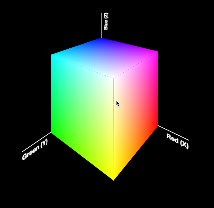
Reading Time: 3minutesToday, I was giving the opening keynote at Codemania in Auckland, New Zealand. It was a talk about color from a math/dev perspective. It went quite well, despite my complete lack of sleep. I mean that quite literally: I hadn’t slept all night. No, it wasn’t the jetlag or the nervousness that kept me up. It was my late minute decision to replace the static, low-res image of an RGB cube I was using until then with a 3D cube generated with CSS and animated with CSS animations. Next thing I knew, it was light outside and I had to start getting ready. However, I don’t regret literally losing sleep to make a slide that is only shown for 20 seconds at most. Not only it was super fun to develop, but also yielded a few things that I thought were interesting enough to blog about.
The most challenging part wasn’t actually the 3D cube. This has been done tons of times before, it was probably the most common demo for CSS 3D transforms a couple of years ago. The only part of this that could be of interest is that mine only used 2 elements for the cube. This is a dabblet of the cube, without any RGB gradients on it:
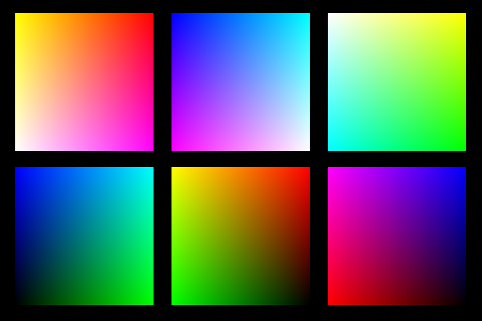
The challenging part was creating the gradients for the 6 sides. These are not plain gradients, as you can see below:
These are basically two linear gradients from left to right, with the topmost one being masked with a gradient from top to bottom. You can use CSS Masking to achieve this (for Chrome/Safari) and SVG Masks for Firefox, but this masks the whole element, which would hide the pseudo-elements needed for the sides. What I needed was masks applied to backgrounds only, not the whole element.
However, I didn’t want to have 6 separate SVG files, especially with this kind of repetition (cross-linking to reuse gradients and masks across different files is still fairly buggy in certain browsers). I wanted to be able to edit this straight from my CSS. And then it hit me: I was using SASS already. I could code SASS functions that generate SVG data URIs!
Here’s the set of SVG generating SASS functions I ended up writing:
Warning: Keep in mind that IE9 and some older versions of other browsers have issues with unencoded SVG data URIs. Also, you still need to escape hashes (%23 instead of #), otherwise Firefox fails.
Reading Time: 2minutesWhen a CSS animation is applied from the beginning of the page load, things are easy. You just use the animation property with appropriate parameters, and you’re done. However, what if the animation is applied on a certain state, e.g. :hover, :active, :focus or a JS-triggered class change?
A naïve approach would be to try something like this:
However, this means that when you hover out of the element, it abruptly snaps to its original state (no rotation). In many cases, it would be a more desirable to have it freeze in the last shown frame, until we hover over it again. To achieve that, we can apply the animation from the beginning, with animation-play-state: paused; and just change it on :hover to animation-play-state: running;. This is what happens then:
I figured this out when I was recently helping my good friend Julian with his one page website*. When you hover over the figure, it starts scrolling, but when you hover out of it, it doesn’t snap back to its original position, which would’ve looked awful.
*Beware it’s still a bit rough around the edges, e.g. the result has some rendering bugs on Firefox & IE plus some unsupported features messing it up (e.g. baseline-shift in SVG), but those are for another day as I had work to do and this ended up taking longer than the few hours I expected. Beyond the animation, you might want to explore the CSS-only buttons (see what I did there?) or the leather figure frame. Credits to Laura Kalbag for the tweed background & color scheme. I also experimented with SASS on this one and found it much smoother to work with than LESS, so I might stick with it for those cases where I need a preprocessor.
Reading Time: < 1minuteFor some reason, I seem to have a fascination with CSS loaders these days. After recreating the Google loader with clean CSS recently, I set off to recreate the classic spinner with CSS. Yes, I know this has been done zillions of times, but I wanted a clean, maintainable, reusable solution, not just a proof of concept. Something with not tons of CSS and/or HTML elements.
I managed to recreate it with only 2 elements. I’m still not completely satisfied, as I was hoping to come up with a solution with just one element, but it’s still much better than all those solutions out there that use tons of elements and code.
So, how did I do it?
I use the ::before and ::after pseudoelements of the parent and child div to create the 4 first bars
I use box-shadow with no blur on all four of the above to create the remaining 4 bars
I rotate the whole element with a steps(8) timing function to create the animation
As with the Google-style loader, just changing the font-size on this scales the whole element, as everything is sized with ems. Also, there is fallback text, to make it accessible to screen readers. Tested in Chrome, Firefox, Safari, IE10. Should degrade gracefully on IE9 (spinner should look fine, just no animation).
Using a preprocessor for variables and calculations should simplify the code even further.
Enjoy 🙂
Ideas for further improvement are welcome. Remember that it’s not just the size of the code that matters, but also its simplicity.
Reading Time: 2minutesSo, for a while I had noticed the nice sutble loader Google apps use and I was wondering if it would be easy to make with CSS and CSS animations:
Yesterday, I realised that you can get this effect by increasing border size until about the middle of the element, as long as the total width stays the same (by using box-sizing: border-box):
However, as you can see above, after the midpoint, the border is not curved any more, so does not produce the desired effect. However, what if we split the background colour in half, and animated border-leftuntil 50% of the width and then border-rightfrom 50% of the width? That worked, but only gave us 25% of the effect. I could recreate the whole effect by then animating border-top/bottom instead etc, but it’s easier to apply animation-direction: alternate to alternate between showing and hiding the circle and and simultaneously rotate the loader by 90deg each time, by applying animation-timing-function: steps(4) to a rotate animation that runs over 4x the duration of the border animation.
This is the finished result:
The dimensions are all set in ems so that you can change the size in one place: Just change the font-size and the loader scales perfectly. It’s also accessible to screen reader users, as there is still text there.
And yes, it’s not super useful as-is, there are tons of spinners on the Web that you can use instead. However, I decided to post it (instead of just tweeting it) as I thought the techniques involved in making it might be interesting for some of you 🙂
Reading Time: < 1minuteNot sure if I’m the first to come up with this idea, but I searched and didn’t find anything. So, for a long time, I was wondering if there’s an easy way to create trapezoid shapes in CSS, especially with borders etc. Eventually, I realized that I could use a pseudo-element for the background and 3D rotate it, so that it appears like a trapezoid. Then @krofdrakula suggested on twitter that I could even add border-radius so that it looks like a tab, so I added that as well:
Eventually I thought, why not actually turn this into a tab demo? So I made a dabblet with that. And then I realized that if you change the transform-origin, other interesting tab shapes appear! Enjoy:
The best part? It degrades pretty gracefully on browsers that don’t support transforms! You get nice rounded tabs that just aren’t slanted (although they have a pretty large top padding, but you can use Modernizr for that. Try it for yourself by commenting the transform out in the dabblet and see the result.
Another issue is that the angled lines look a bit aliased in Firefox, but that’s a bug that will eventually get fixed.
In general, it’s a bit rough around the edges, so treat it more as a proof of concept. But with a little more work, it could totally work in production. Tested in Chrome, Safari, Firefox, IE9 (fallback) and IE10.
Reading Time: 2minutesThese days, we have a number of different ways to vertically align text in a container of variable dimensions:
Table display modes
Flexbox
inline-block hacks
Wrapping the text in an extra element and absolutely positioning it
…and probably many others I’m forgetting
However, often comes a time when neither is suitable, so here I am, adding yet another option to the list. Of course, it comes with its own set of drawbacks, but there are cases where it might be better than the existing solutions.
Reading Time: 3minutesThese days, I’m working on the slides for my next talk, “The humble border-radius”. It will be about how much work is put into CSS features that superficially look as simple as border-radius, as well as what advances are in store for it in CSS Backgrounds & Borders 4 (of which I’m an editor). It will be fantastic and you should come, but this post is not about my talk.
As you may know, my slides are made with HTML, CSS & JavaScript. At some point, I wanted to insert an equation to show how border-top-left-radius (as an example) shrinks proportionally when the sum of radii on the top side exceeds the width of the element. I don’t like LaTeX because it produces bitmap images that don’t scale and is inaccessible. The obvious open standard to use was MathML, and it can even be directly embedded in HTML5 without all the XML cruft, just like SVG. I had never written MathML before, but after a bit of reading and poking around existing samples, I managed to write the following MathML code: