Categories
News

Contrast Ratio has a new home — and this is great news!

Reading Time: 2 minutes

It has been over a decade when I launched contrast-ratio.com, an app to calculate the WCAG 2.1 contrast ratio between any two CSS colors. At the time, all similar tools suffered from several flaws when being used for CSS editing:

  • No support for semi-transparent colors (Since WCAG included no guidance for alpha transparency — I had to do original research to calculate the contrast ratio range for that case)
  • No support for color formats other than hex or (at best) RGB with sliders. I wanted something where I could just paste a CSS color just like I had it specified in my code (e.g. hsl(220 10% 90%), possibly tweak it a bit to pass, then paste it back. I didn’t want to use unintuitive hex colors, and I didn’t want to fiddle with sliders.
  • Poor UX, often calculating the actual ratio required further user actions, making iteration tedious

Over the years, contrast-ratio.com grew in popularity: it was recommended in several books, talks, and workshops. It basically became the standard URL developers would visit for this purpose.

However, I’ve been too busy to work on it further beyond just merging pull requests. My time is currently split between the dozens of open source projects I have started and maintain, my TAG work, my CSS WG work, and my teaching & research at MIT.

Therefore, when Ross and Drew from Siege Media approached me with a generous offer to buy the domain, and a commitment to take over maintainship of the open source project, I was cautiously optimistic. But now, after having seen some of their plans for it, I could not be more certain that the future of this tool is much brighter with them.

Please join me in welcoming them to the project and help them get settled in as new stewards!

ETA: Siege Media Press Release

Categories
News

State of CSS 2022 now open!

Reading Time: 3 minutes

Take State of CSS 2022 survey

A while ago I posted a call for feedback to inform the design of the State of CSS 2022 survey. The response has been overwhelming and it was glorious. We got quite a lot of proposals, feedback, votes. But that also meant we had to make some tough decisions about what gets in the survey and what doesn’t, otherwise we’d end up with a survey so long nobody would want to finish it!

In the end we added questions about 15 new CSS features based on proposals in that repo, and decided against adding 9. Overall, there are 30 new CSS features the 2022 survey asks about. To make space for all of that, we also removed a few that were not really shining much light into what developers do anymore, and also a couple others that were not actually about CSS.

However, CSS features are not the only — or even the most important questions being asked.

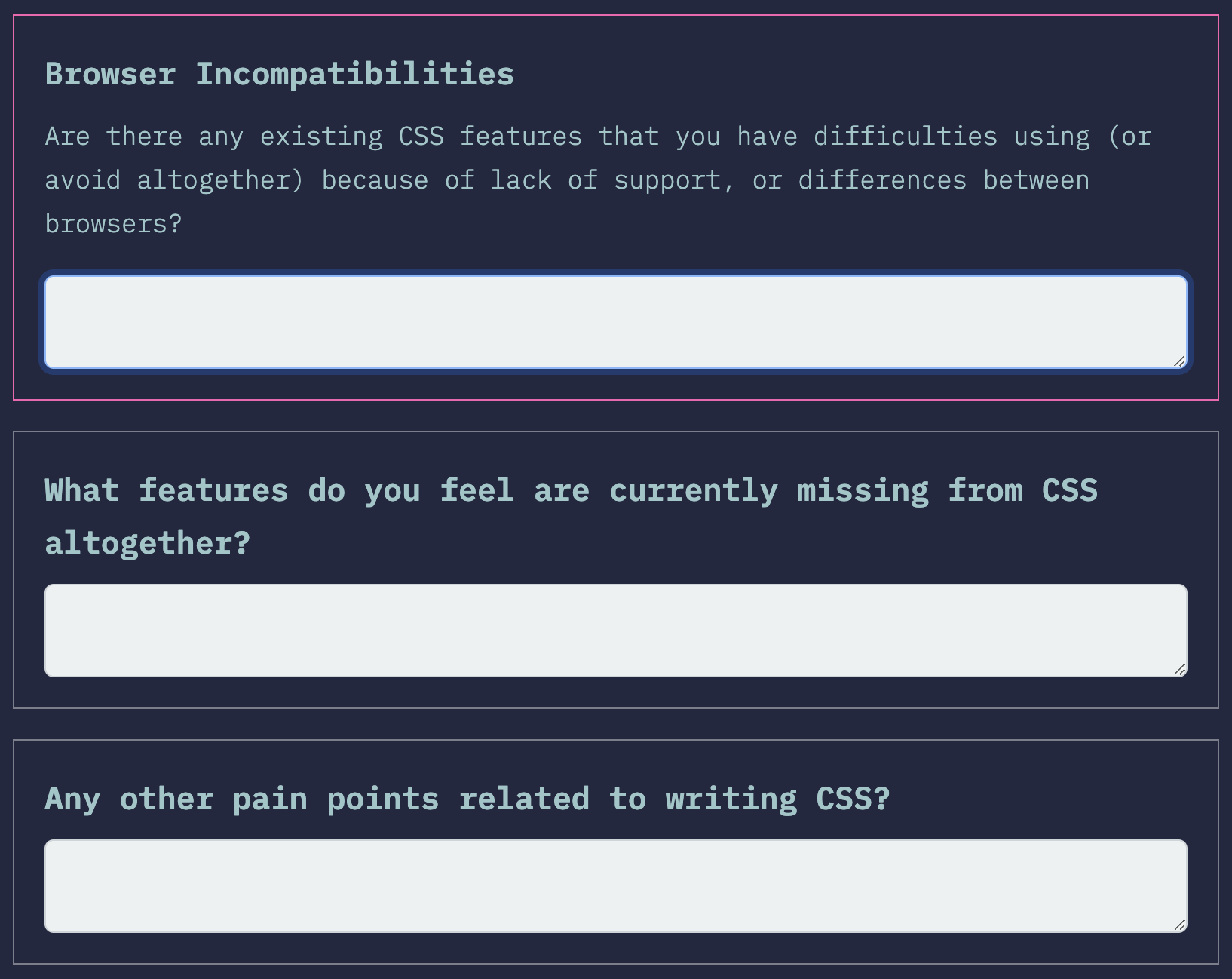
Last year, some of the freeform questions about pain points were particularly useful to browser vendors for prioritizing implementation and standards work, and we expect this to be true this year as well. We put considerable effort into redesigning these freeform questions to make them more intuitive, while maintaining their helpfulness for browser vendors:

We hope the new wording makes it more clear that these are mutually exclusive, so that respondents do not feel they need to duplicate their answers.

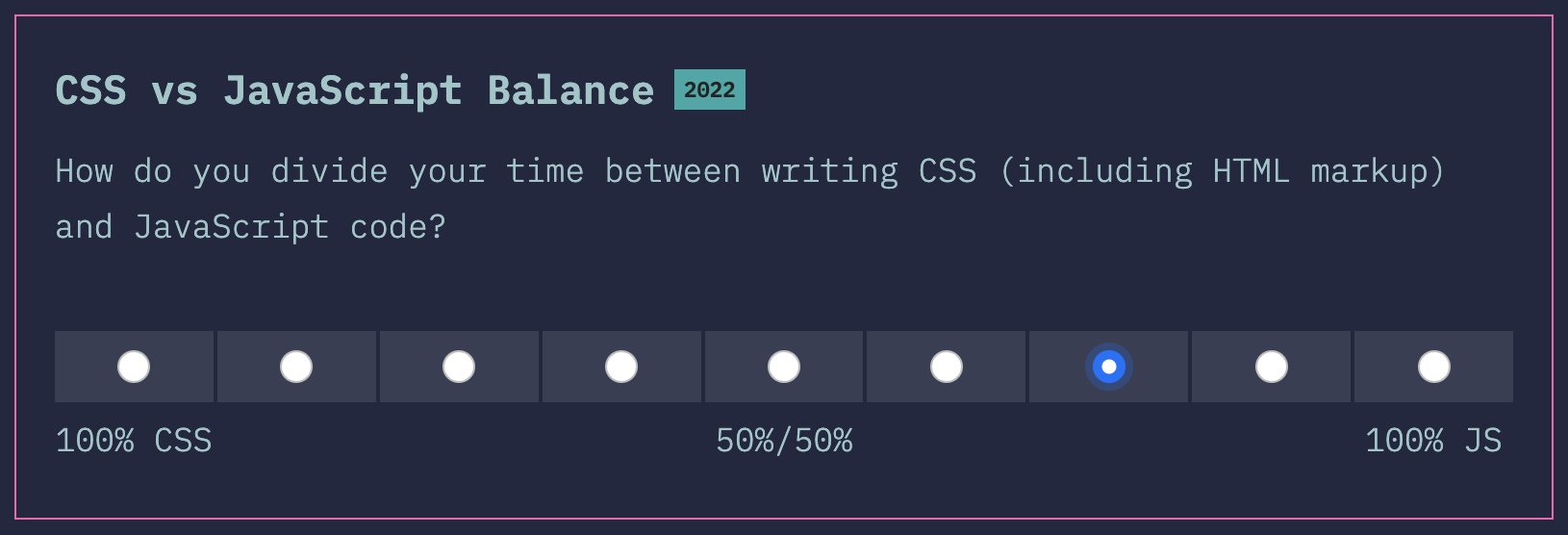
One of the new questions I’m excited about is this question to gauge whether the respondent spends more time writing JS or CSS:

A focus of this year’s State of CSS survey is to reach a broader range of developers; a majority of respondents of past surveys has been JS developers who also write CSS, rather than developers that focus on CSS equally or even primarily. This is a natural consequence of this having been spun off the State of JS survey. To truly see what the State of CSS is in 2022, we need input from all types of developers, as developers with different focus have different needs and priorities. This question will allow us to evaluate how well we have reached this goal, and going forward, whether we are improving every year.

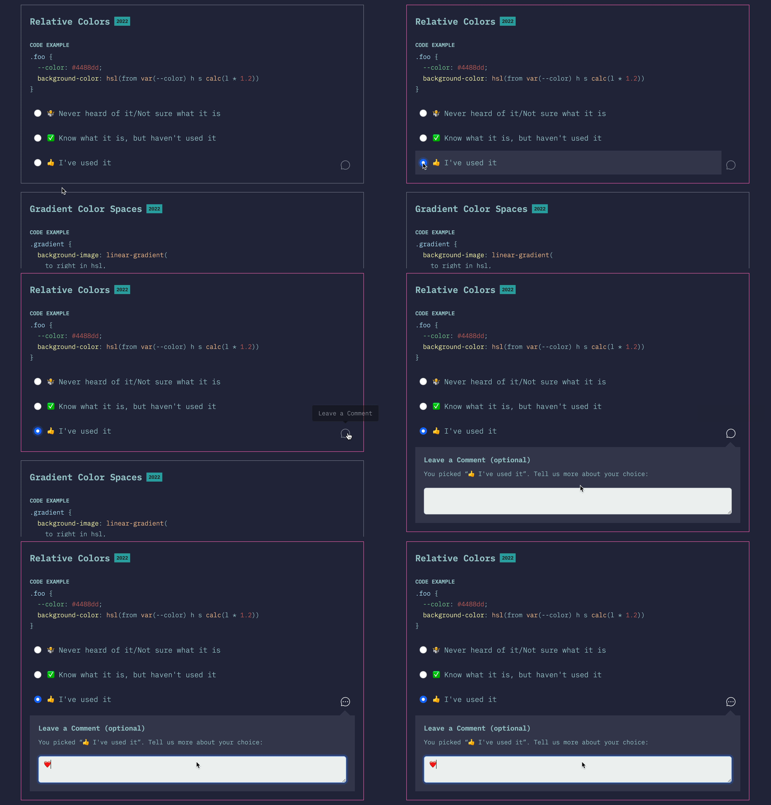
Another thing I’m excited about in this year’s survey is the ability to add freeform comments to any question.

Adding freeform comments to a question

It’s often hard to tell what the background is behind each of the three answers: are people not using a given feature due to poor browser support, poor ergonomics, or some other reason? When people do use a feature, was their experience good or bad? Would they use it again?

We went back and forth many times about having a more structured followup question there, but in the end settled on a simple freeform field for this first iteration. Maybe next year it will be more structured, depending on how people use it this year.

So, without further ado, the survey is finally open for responses:

Take State of CSS 2022 survey

This survey is not just for fun: the results actually inform what browsers prioritize for implementation. So by spending a few minutes on a thoughtful and comprehensive response, you can actually make both your and other developers’ lives better! What are you waiting for?

Categories
News

Help design the State of CSS Survey 2022!

Reading Time: 2 minutes

Since 2019, the annual State of CSS survey has collected feedback from web developers from across the world to try and take the pulse of the CSS ecosystem, and it’s become a valuable resource not only for CSS developers, but also for browser vendors. This summer, one of my side projects is helping out with survey design and outreach for the State of CSS survey, thanks to a generous Google UI fund grant.

The target is for the survey to launch in mid September, and we are currently working on the outline. So far we have created a preliminary outline based on last year’s survey and early research. All our work happens is in the open, in this repo. Here are some of the changes from last year’s survey:

  • Removed the Pre-processors category as it feels like there isn’t too much debate around that area.
  • Got rid of “which browser do you primarily develop in?” question as we already ask which browsers people test in.
  • Merged “Opinions” and “Environments” sections into new “Usage” section.
  • Moved browsers question to “Other Tools”.
  • New features:
    • currentcolor
    • color-mix()
    • Wide gamut colors
    • scroll-behavior
    • scroll-padding
    • font-palette
    • :focus-visible
    • :has() pseudo-class
    • :where() pseudo-class
    • Cascade Layers
    • Houdini Paint API
    • and there are several others we are considering

We are currently looking for feedback from the community, including suggesting CSS features to ask about, libraries and tools, or even new questions altogether.

There are also some design issues to flesh out, you’re welcome to weigh in there too.

If you want to quickly vote on which features are most important for you to make it into the survey, you can do that either via GitHub 👍🏼reactions, or here (which uses GitHub reactions behind the scenes). Do note that reactions are only one metric among many we will use to consider items.

The feedback period will be open until August 20, then we will start working on launching the survey.

Do note that browser makers are looking at this and similar surveys to prioritize what to implement. This is why Google is sponsoring this project. So any effort you put into survey outline feedback, and on responding to the survey when it’s ready, could come back to you tenfold when your favorite CSS features get implemented faster!

Categories
News Personal

New decade, new theme

Reading Time: 2 minutes

It has been almost a decade since this blog last saw a redesign.

This blog’s theme 2011 – 2020. RIP!

In these 9 years, my life changed dramatically. I joined and left W3C, joined the CSS WG, went to MIT for a PhD, published a book, got married, had a baby, among other things. I designed dozens of websites for dozens of projects, but this theme remained constant, with probably a hasty tweak here and there but nothing more than that. Even its mobile version was a few quick media queries to make it palatable on mobile.

Categories
News

Can we get rid of gradient prefixes?

Reading Time: 2 minutesI recently realized that unprefixed gradients finally propagated to stable Chrome, and after tweeting about it, I decided to do some research on which browsers support unprefixed gradients, and what percentage of users needs them.

Currently, unprefixed gradients are supported in:

  • Chrome 26+
  • Firefox 16+
  • Opera 12.10+
  • IE10+

Lets have a look at which prefixes we actually need to use for gradients today.

-ms-

There was never a stable release of IE that supported -ms- prefixed gradients, those were only in preview versions (stable IE10 supports both prefixed and unprefixed gradients). So, -ms- is most definitely not required.

-moz-

Firefox versions >= 3.6 and < 16 account for 4% of the global user base*. This might or might not be significant, depending on how good the fallback is that these users will see. If the gradient only adds a subtle shadow or something like that, I’d say ditch -moz-. If it’s more crucial to the design & branding, it might be wise to still keep it. More tech-focused websites probably have a much lower percentage than 4%, so it might be a good idea to drop it there completely.

-o-

Opera unprefixed gradients in 12.10. Opera Mini never supported them. Opera versions < 12.10 currently account to a total of 0.25% of the global user base*. I’d say it’s safe to ditch -o- in gradients in most cases.

-webkit-

Chrome only very recently unprefixed gradients and Safari is a long way from doing so. Not to mention all the mobile browsers using WebKit. Unfortunately, we can’t ditch -webkit- in CSS gradients just yet.

My opinion

Don’t use -ms- prefixed gradients, there’s absolutely zero point in doing so. Include -moz- for the less subtle gradients. No significant need for -o- gradients. -webkit- is still needed and probably will be at least until the end of 2013. Or, of course, just use -prefix-free and don’t bother. 😛

Keep in mind that your stats might differ from global stats, so which prefixes you need to include might differ on a case by case basis. The purpose of this post is to alert you that maybe you don’t need all these prefixes, not to prescriptively tell you which ones to keep. Except -ms-, please don’t use that. There’s absolutely zero reason whatsoever.

Last but not least, no matter which prefixes you include, always have a good solid color fallback!


* Global market share statistics from StatCounter, for a 3 month period of January 2013 – March 2013. The graph on the website only displays the most popular browser versions, but downloading the CSV file gives you all of them.

Categories
News

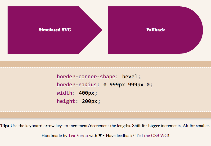
border-corner-shape is in danger, and you can help!

Reading Time: 3 minutesRemember my previous post about an app I made to preview border-corner-shape? It stirred a lot of discussion in the CSS WG, and David Baron posted this:

http://dev.w3.org/csswg/css4-background/#border-corner-shape appears
to me to be an example of a feature that’s addressing a problem that
we don’t have — or at least that we don’t have enough to be worth
adding such a feature. I think it should be removed.

In particular, if there were demand for the bevel | curve | notch
values, we’d be seeing authors using the equivalents of such values
on significant numbers of Web sites. So before agreeing to accept
this new feature, I’d like to see examples of Web sites that are
doing what these values would do. Not something similar to what
these values would do, but exactly what these values would do, or at
least close enough that the author wouldn’t care about the
difference.

You can read the whole discussion in the thread I linked to, above.

I might be wrong, but I believe border-corner-shape would greatly simplify many common effects, especially its “bevel” value, which can even create triangles and other polygons, that we go to great lengths to make with CSS today, and it would degrade much more nicely than border-image or backgrounds. I think it was one of fantasai’s many great ideas and I’m glad she added it to the Editor’s Draft of Backgrounds & Borders 4.

I posted a list of tutorials and questions from web designers & developers, to illustrate that these effects are needed. However, David argued that “Questions from authors don’t give you enough information to be sure that the feature being added is sufficient for the author’s needs. He did have a point, so with some help from the community, I posted a few links to websites using such effects, and use cases. Nicole Sullivan, Liam Quinfantasai and Lev Solntsev posted a couple more.

However, the more real examples we have, the more likely it is to retain the feature in some form. This is where you come in: If you think border-corner-shape has merit, provide use cases, either by links to websites whose design elements it would simplify, screenshots of websites or descriptions of cases where you needed such a thing (in that order of preference). You can either post to the thread directly, or comment here and I’ll post them to the list in batches.

If you think it has merit but it could be improved, feel free to post about that as well. If you don’t think it’s a good idea, any alternatives you can think of are welcome as well. Or, if you don’t think it’s useful, say that too (but make sure you first fully understand what it can do). If you’re not sure how it can be used, play around with the demo app I made and be creative!

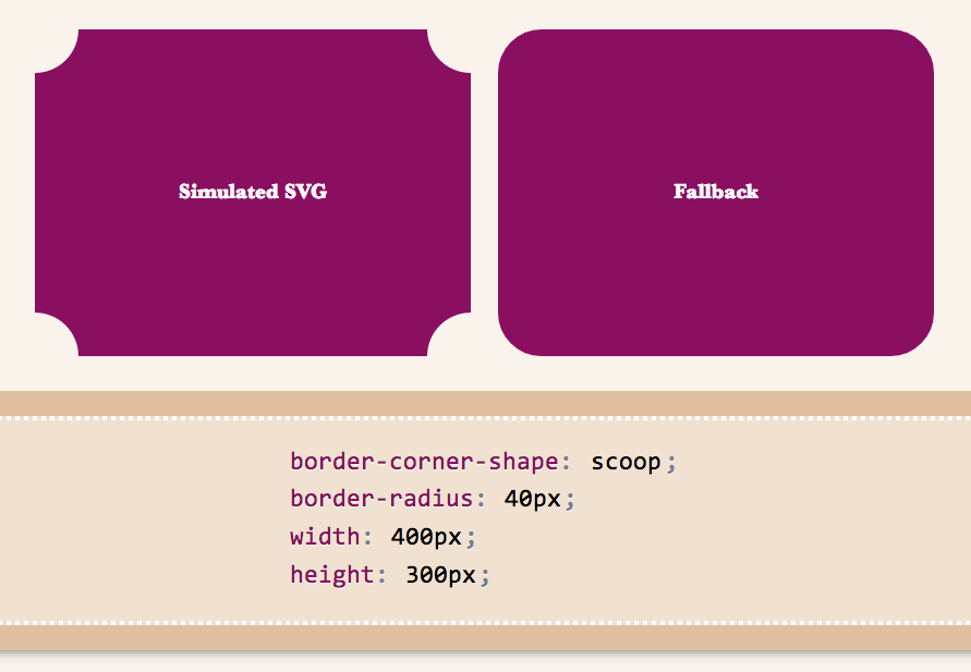
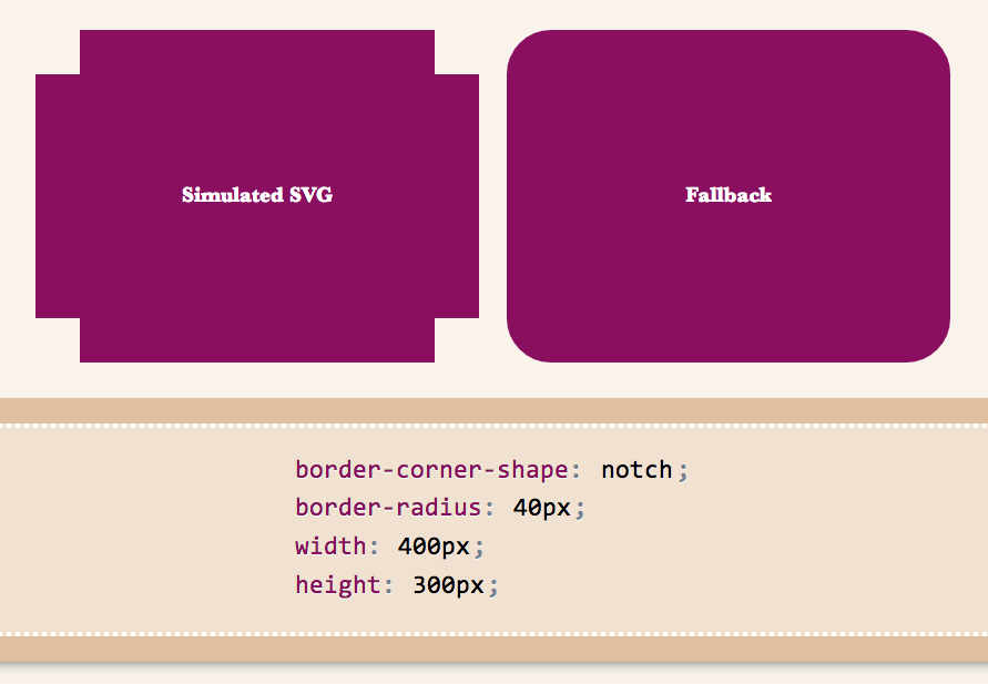
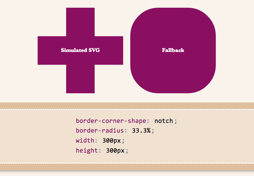
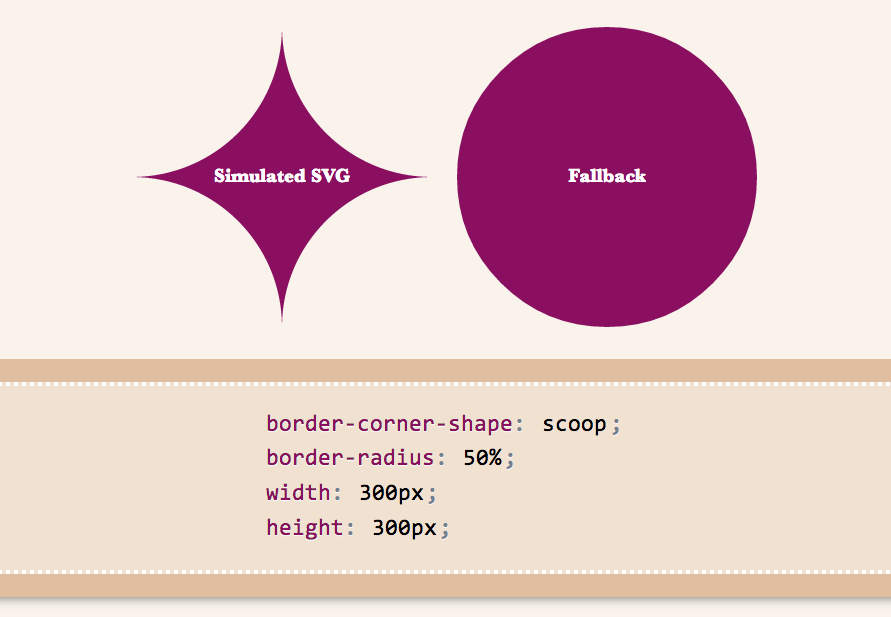
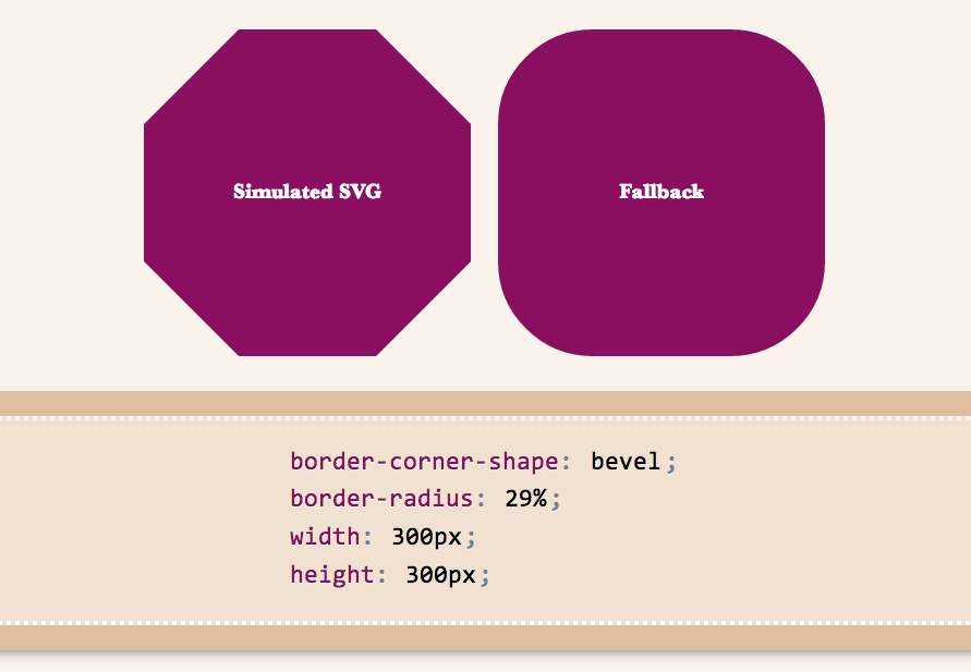
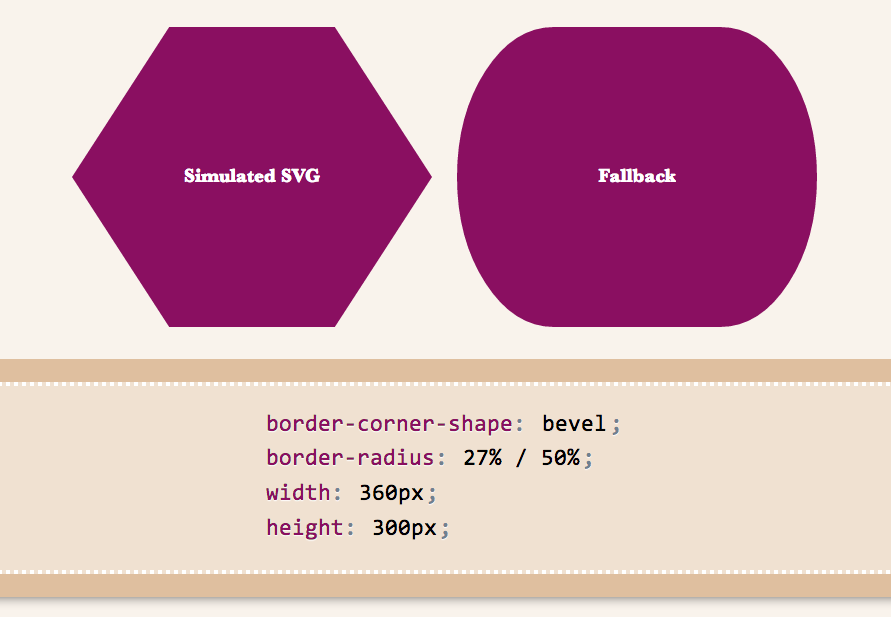
Below are a few examples of shapes:

bevel-1scoop-1notch-1 notch-2 scoop-2 bevel-4 bevel-3 bevel-2

I wanted to demo triangles and trapezoids as well, but it seems there’s a bug in my app, so I’ll have to debug it first 🙁 If we allow border-corner-shape to have different values for all four corners, even more possibilites open (e.g. arrows).

Spend a few minutes to help the CSS WG help you. Thanks!

Categories
News

Lots of improvements coming to dabblet

Reading Time: 2 minutesI posted about this in both the WebPlatform.org blog and Dabblet’s blog, but I thought it might be interesting to many readers of this blog as well:

As many of you probably know, I’ve started working for W3C Developer Relations since this August. Half of my time is devoted to WebPlatform.org, a very promising project to document the web with the help of all major players, in a vendor-neutral way. Even before I joined W3C, we discussed using a hosted, customized version of dabblet in WebPlatform.org, as a platform for live code examples. I recently started working towards making this happen.

A lot of changes and improvements need to be made to achieve this, but the good news is, most of these will be pushed to dabblet.com as well! In a nutshell, this is what I’m currently working on:

  • Adding JavaScript support — This will be a challenge UX-wise, as it shouldn’t run on every keystroke, like the HTML and CSS, but it should run on startup and it should be straight-forward how to get it to run. Perhaps it will also run after a significant pause in typing.
  • Dabblets that are not stored in Github, but get their data through POST requests.
  • Improving cross-browser support
  • Strengthening security
  • Integrating Prism. Dabblet’s syntax highlighter might have been Prism’s precursor, but currently Prism has solved many of its bugs, and these fixes need to be pushed to dabblet at some point.
  • General bug fixing

These will probably be gradually rolled out in dabblet.com and tested by the community, before we integrate dabblet into WebPlatform.org. If a new feature is significant enough, there will be a new blog post about it here, but don’t expect blog posts about bugfixes. I’m really excited to see dabblet flourish, and I believe you will be too, once these updates are out!

Categories
News

Important -prefix-free update

Reading Time: 3 minutesThose of you that have been following and/or using my work, are surely familiar with -prefix-free. Its promise was to let you write DRY code, without all the messy prefixes, that would be standards-compliant in the future (which is why I’m always against adding proprietary features in it, regardless of their popularity). The way -prefix-free works is that it feature tests which CSS features are available only with a prefix, and then adds the prefix in front of their occurences in the code. Nothing will happen if the feature is supported both with and without a prefix or if it’s not supported at all.

This worked well when browsers implementations aren’t significantly different from the unprefixed, standard version. It also works fine when the newer and the older version use incompatible syntaxes. For example, direction keywords in gradients. The old version uses top whereas the new version uses to bottom. If you include both versions, the cascade does its job and ignores the latter version if it’s not supported:

background: linear-gradient(top, white, black);
background: linear-gradient(to bottom, white, black);

However, when the same syntax means different things in the older and the newer version, things can go horribly wrong. Thankfully, this case is quite rare. A prime example of this is linear gradient angles. 0deg means a horizontal (left to right) gradient in prefixed linear-gradients and a vertical (bottom to top) gradient in unprefixed implementations, since they follow the newer Candidate Recommendation rather than the old draft. This wasn’t a problem when every browser supported only prefixed gradients. However, now that IE10 and Firefox 16 are unprefixing their gradients implementations, it was time for me to face the issue I was avoiding ever since I wrote -prefix-free.

The solution I decided on is consistent with -prefix-free’s original promise of allowing you to write mostly standards-compliant code that will not even need -prefix-free in the future. Therefore, it will assume that your gradients use the newer syntax, and if only a prefixed implementation is available, it will convert the angles to the legacy definition. This means that if you update -prefix-free on a page that includes gradients coded with the older definition, they might break. However, they would break anyway in modern browsers, so the sooner the better. Even if you weren’t using -prefix-free at all, and had written all the declarations by hand before the angles changed, you would still have to update your code. Unfortunately, that’s the risk we all take when using experimental features like CSS gradients and I think it’s worth it.

-prefix-free will not take care of any other syntax changes, since when the syntaxes are incompatible, you can easily include both declarations. The angles hotfix was included out of necessity because there is no other way to deal with it.

Here’s a handy JS function that converts older angles to newer ones:

function fromLegacy(deg) { return Math.abs(deg-450) % 360 }

You can read more about the changes in gradient syntax in this excellent IEblog article.

In addition to this change, a new feature was added to -prefix-free. If you ONLY want to use the prefixed version of a feature, but still don’t want to write out of all the prefixes, you can just use -*- as a prefix placeholder and it will be replaced with the current browser’s prefix on runtime. So, if you don’t want to change your angles, you can just prepend -*- to your linear-gradients, like so:

background: -*-linear-gradient(0deg, white, black);

However, it’s a much more futureproof and standards compatible solution to just update your angles to the new definition. You know you’ll have to do it at some point anyway. 😉

Edit: Although -prefix-free doesn’t handle syntax changes in radial gradients, since the syntaxes are mutually incompatible, you may use this little PrefixFree plugin I wrote for the CSS Patterns Gallery, which converts the standard syntax to legacy syntax when needed:

StyleFix.register(function(css, raw) {
	if (PrefixFree.functions.indexOf('radial-gradient') > -1) {
		css = css.replace(/radial-gradient\(([a-z-\s]+\s+)?at ([^,]+)(?=,)/g, function($0, shape, center){
			return 'radial-gradient(' + center + (shape? ', ' + shape : '');
		});
	}

	return css;
});

Keep in mind however that it’s very crude and not very well tested.

Categories
News

Poll: ¿Is animation-direction a good idea?

Reading Time: 4 minutes

¿animation-direction?

Lets assume you have a CSS animation for background-color that goes from a shade of yellow (#cc0) to a shade of blue (#079) and repeats indefinitely. The code could be something like this:

@keyframes color {
  from { background: #cc0 }
  to { background: #079 }
}

div {
  animation: color 3s infinite;
}

If we linearize that animation, the progression over time goes like this (showing 3 iterations):

As you can see, the change from the end state to the beginning state of a new iteration is quite abrupt. You could change your keyframes to mitigate this, but there’s a better way. A property with the name animation-direction gives a degree of control on the direction of the iterations to smooth this out. It also reverses your timing functions, which makes it even smoother.

In early drafts, only the values normal and alternate were allowed. normal results in the behavior described above, whereas alternate flips every other iteration (the 2nd, the 4th, the 6th and so on), resulting in a progression like this (note how the 2nd iteration has been reversed):

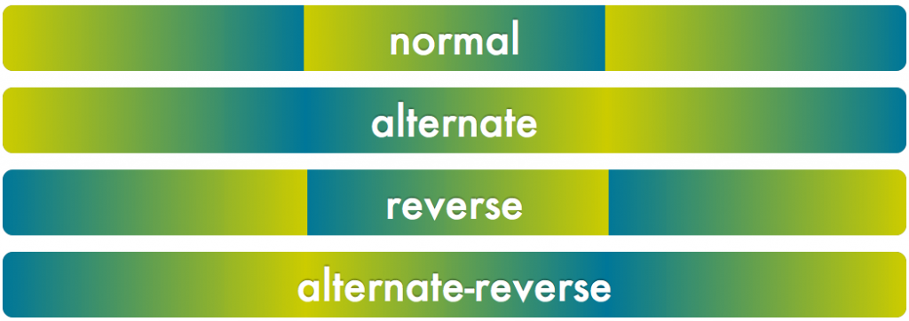
The latest draft also adds two more values: reverse which reverses every iteration and alternate-reverse, which is the combination of both reverse and alternate. Here is a summary of what kind of progression these four values would create for the animation above:
The problem

I was excited to see that reverse and alternate-reverse were finally added to the spec, but something in the syntax just didn’t click. I initially thought the reason was that these four values essentially set 2 toggles:

  • ¿Reverse all iterations? yes/no
  • ¿Reverse even iterations? yes/no

so it’s pointless cognitive overhead to remember four distinct values. I proposed that they should be split in two keywords instead, which would even result to a simpler grammar too.

The proposal was well received by one of the co-editors of the animations spec (Sylvain Galineau), but there was a dilemma as to whether mixing normal with alternate or reverse would make it easier to learn or more confusing. This is a point where your opinion would be quite useful. Would you expect the following to work, or would you find them confusing?

  • animation-direction: normal alternate; /* Equivalent to animation-direction: alternate; */
  • animation-direction: alternate normal; /* Equivalent to animation-direction: alternate; */
  • animation-direction: normal reverse; /* Equivalent to animation-direction: reverse; */
  • animation-direction: reverse normal; /* Equivalent to animation-direction: reverse; */

A better (?) idea

At some point, in the middle of writing this blog post (I started it yesterday), while gazing at the graphic above, I had a lightbulb moment. ¡These values are not two toggles! All four of them control one thing: which iterations are reversed:

  • normal reverses no iterations
  • reverse reverses all iterations
  • alternate reverses even iterations
  • alternate-reverse reverses odd iterations

The reason it’s so confusing and it took me so long to realize myself, is that the mental model suggested by these keywords is detached from the end result, especially in the case of alternate-reverse. You have to realize that it works as if both alternate and reverse were applied in sequence, so reverse first reverses all iterations and then alternate reverses the even ones. Even iterations are reversed twice, and are therefore equivalent to the original direction. This leaves the odd ones as being reversed. It’s basically a double negative, making it hard to visualize and understand.

I thought that a property that would reflect this in a much more straightforward way, would be animation-reverse (or animation-iteration-reverse), accepting the following values:

  • none (equivalent to animation-direction: normal)
  • all (equivalent to animation-direction: reverse)
  • even (equivalent to animation-direction: alternate)
  • odd (equivalent to animation-direction: alternate-reverse)

Not only this communicates the end result much better, but it’s also more extensible. For example, if in the future it turns out that reversing every 3rd iteration is a common use case, it will be much easier to add expressions to it, similar to the ones :nth-child() accepts.

I knew before proposing it that it’s too late for such drastic backwards-incompatible changes in the Animations module, however I thought it’s so much better that it’s worth fighting for. After all, animation-direction isn’t really used that much in the wild.

Unfortunately, it seems that only me and Sylvain thought it’s better, and even he was reluctant to support the change, due to the backwards compatibility issues. So, I started wondering if it’s really as much better as I think. ¿What are your thoughts? ¿Would it make it simpler for you to understand and/or teach? Author feedback is immensely useful for standardization, so please, ¡voice your opinion! Even without justifying it if you don’t have the time or energy. Gathering opinions is incredibly useful.

TL;DR

  1. ¿Is alternate reverse and reverse alternate (either would be allowed) a better value for animation-direction over alternate-reverse?
  2. ¿If so, should redundant combinations of normal with alternate or reverse also be allowed, such as normal alternate?
  3. ¿Or maybe we should ditch it altogether and replace it with animation-reverse, accepting values of none, all, even, odd?

Side note: If you’re wondering about the flipped question and exclamation marks (¿¡) it’s because I believe they improve the usability of the language if widely adopted, so I’m doing my part for it 😉 And no, I don’t speak Spanish.
Categories
News Personal

Dabblet blog

Reading Time: < 1 minuteNot sure if you noticed, but Dabblet now has a blog: blog.dabblet.com

I’ll post there about Dabblet updates and not flood my regular subscribers here who may not care. So, if you are interested on Dabblet’s progress, follow that blog or @dabblet on twitter.

That was also an excuse to finally try tumblr. So far, so good. I love how it gives you custom domains and full theme control for free (hosted WordPress charges for those). Gorgeous, GORGEOUS interface too. Most of the themes have markup from the 2005-2007 era, but that was no surprise. I customized the theme I picked to make it more HTML5-ey and more on par with dabblet’s style and it was super easy (though my attempt is by no means finished). There are a few shortcomings (like no titles for picture posts), but nothing too bad.