When a CSS animation is applied from the beginning of the page load, things are easy. You just use the animation property with appropriate parameters, and you’re done. However, what if the animation is applied on a certain state, e.g. :hover, :active, :focus or a JS-triggered class change?
A naïve approach would be to try something like this:
However, this means that when you hover out of the element, it abruptly snaps to its original state (no rotation). In many cases, it would be a more desirable to have it freeze in the last shown frame, until we hover over it again. To achieve that, we can apply the animation from the beginning, with animation-play-state: paused; and just change it on :hover to animation-play-state: running;. This is what happens then:
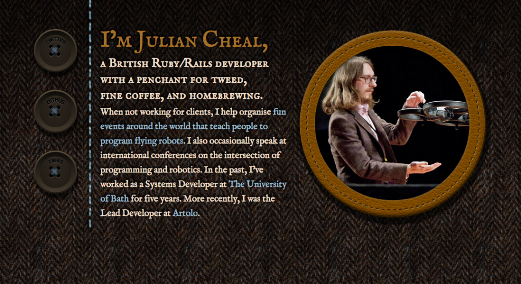
I figured this out when I was recently helping my good friend Julian with his one page website*. When you hover over the figure, it starts scrolling, but when you hover out of it, it doesn’t snap back to its original position, which would’ve looked awful.
*Beware it’s still a bit rough around the edges, e.g. the result has some rendering bugs on Firefox & IE plus some unsupported features messing it up (e.g. baseline-shift in SVG), but those are for another day as I had work to do and this ended up taking longer than the few hours I expected. Beyond the animation, you might want to explore the CSS-only buttons (see what I did there?) or the leather figure frame. Credits to Laura Kalbag for the tweed background & color scheme. I also experimented with SASS on this one and found it much smoother to work with than LESS, so I might stick with it for those cases where I need a preprocessor.
