Categories
Rants Thoughts

“Wow, Mona Lisa with pure CSS!”

Reading Time: 2 minutes

There has been a recent flood of CSS experiments that utilize CSS3 features to convert some meaningless markup to spectacular pictures. It all started when David Desandro used CSS3 to draw the Opera logo. This seemed to inspire lots of other folks who created similar demos:

I can certainly share their enthusiasm and I am also amazed by their results. Besides that, I think that pushing CSS3 to the edge like that, helps us understand the spec better, which leads us to find and file browser bugs or write comments regarding the spec itself. Filing bugs is crucial at this stage, with all browser vendors gradually adding experimental –and frequently buggy– CSS3 support to their products. Also, don’t get me wrong: I can easily see the benefits of reducing the number of images in a web application interface (far quicker/easier modifications, less HTTP requests and most of the time, less bandwidth).

However, I’m afraid we’re losing sight of the big picture. These aren’t demos that are or will ever be legitimate CSS use cases. Even after universal CSS3 browser support is achieved, they would (and should) still be considered “hacks”. Almost all the arguments pro their usage also apply to more suitable ways of including images in web applications:

  • Fewer HTTP requests: Same with any kind of embedded image (data URIs, inline SVG and so on)
  • Scalable: Same with SVG and symbols embedded in custom fonts
  • Easier to modify: Same with SVG
  • Less bandwidth (in some cases): Same with SVG (and it can be cached too, when not inline)
And apart from these, these illustrations require non-semantic crap to be included in the markup which, besides issues of theoretical purity, makes it harder for other people to use them.
As for the graceful degradation argument, yes, this does only apply to CSS “images”. But in this case, is it really an advantage? I seriously doubt it. People won’t notice rounded corners if they’re missing from an interface, but they’re definitely going to notice a blocky Opera logo. And they’re not used in thinking that their browser has something to do with how an image renders, so they’ll just blame the website.

CSS is supposed to enhance the presentation of a document or interface, not to be (ab)used for the creation of illustrations from scratch. It’s supposed to separate presentation from structure, not generate stuff. There are other technologies that are far more suitable for this (*cough*SVG*cough*). I think we should use our energy and creativity to make CSS3 demos that people will actually use in the future when all this is fully supported, not stuff doomed to be eternally considered hackery.

“Where should we draw the line?” one might ask. For example, is a Pure CSS analog clock a CSS abuse case? Or even my own CSS iPhone keyboard? Now that’s a good question! A rule of thumb seems to be “if it inherently (=not due to browser support issues) involves a bunch of empty (or with meaningless content) HTML elements, then that’s a bad sign” but that might be overly strict. What’s your take on it?

Disclaimer: Yes, I’m fully aware that most of the time, such experiments are created just for fun by their (very talented) authors, which are perfectly aware of all the things mentioned above. However, I’ve also grown tired of reading comments by people that seem to to think that “This is the future of the web!”. Let’s hope it’s not.
Categories
Articles Original

On CSS counters plus a CSS3 Reversi UI

Reading Time: 2 minutes

CSS Counters have a lot more potential than most web developers seem to think. The common use case consists of something like:

somecontainer { counter-reset: foocount; }
Ε { counter-increment: foocount; }
Ε::before { content: counter(foocount) ". "; }

commonly used to add numbering to section headings or re-create an <ol>’s counters in order to style them (since browser support for ::marker is ridiculous).

Have you ever thought of applying the counter to different elements than the ones being counted? This way we’re able to count elements and display their total count somewhere with CSS alone! (and with the variety of selectors in CSS3, I see great potential here…). I’m referring to something like:

ul { counter-reset:foo; }
li { counter-increment:foo; }
p::after { content:counter(foo); }

From my tests, this works flawlessly in Firefox, Safari, Opera and Chrome (I’ve only checked the latest stable though), as long as the element that displays the count comes after the elements being counted (in the markup).

Another underutilized aspect of CSS counters (well, far less underused than the above, but still) is how we can combine multiple in the same pseudoelement. For instance, to count rows and cells of a table and display the count inside each cell:

table {
	counter-reset:row;
}

tr {
	counter-increment:row;
	counter-reset:cell;
}

td {
	counter-increment:cell;
}

td::after {
	content:counter(row, upper-alpha) counter(cell);
}

Which displays counters like A1, A2, A3, B1, B2, B3, etc in the cells. When the content property is more properly implemented, you wouldn’t even need the last rule.

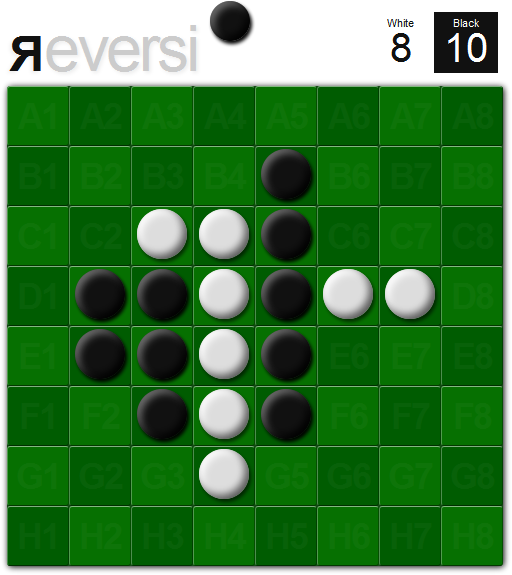
Last but not least, a CSS3 Reversi UI (no images used!) I created a while ago that demonstrates the above (and various other things, like –finally– a use case for :empty 😛 ). Looks fine only in Firefox and Opera 10.5, due to lack of support for inset box shadows in Safari and buggy support in Chrome. Works fine in all 4 of them (IE is out of the question anyway).

Screenshot of the UI

The displayed counts of each player’s pieces (top right corner) are just CSS counters. Same goes for every cell’s name. This is mostly a proof of concept, since it’s impossible to determine if someone won by CSS alone, so we would have to count the pieces in JS too.

As a game it’s not finalized, you are basically only able to play against yourself and it doesn’t know when somebody won, so it’s not very useful or enjoyable. If someone wants to take it up and develop it further be my guest.

Note to avoid confusion: CSS Counters are not CSS 3. They are perfectly valid CSS 2.1. The “CSS3” in the title (“CSS3 Reversi”) is due to other techniques used in it’s UI.

Categories
Tips

MySQL: Are you actually utilizing your indexes?

Reading Time: 2 minutes

This might seem elementary to those of you that are DBAs or something similar, but it was fascinating to find out (not to mention it greatly helped what I had to do), so I decided to post it, in case it helps someone else too. A few moments ago I found out that whereas a query along the lines of…

SELECT title, COUNT(1) as replies
FROM post INNER JOIN thread USING(threadid)
WHERE UNIX_TIMESTAMP(NOW()) - post.dateline < 86400
GROUP BY threadid
ORDER BY replies DESC
LIMIT 5

took a whopping ~10 seconds on a post table of around 2,000,000 rows and a thread table of around 40,000 rows, the following:

SELECT title, COUNT(1) as replies
FROM post INNER JOIN thread USING(threadid)
WHERE post.dateline > UNIX_TIMESTAMP(NOW()) - 86400
GROUP BY threadid
ORDER BY replies DESC
LIMIT 5

took a mere 0.03 seconds!

Probably, MySQL wasn’t able to utilize the B+ tree index of the dateline column in the first query, whereas in the second, things were a bit more obvious to it. This can also be observed by examining the information about the execution plan that EXPLAIN provides:

mysql> explain select t.threadid, t.title, count(1) as replies from vb3_post as p inner join vb3_thread as t using(threadid) where unix_timestamp(now()) - p.dateline < 86400 group by p.threadid order by replies desc limit 5;
+----+-------------+-------+------+---------------+----------+---------+------------+-------+---------------------------------+
| id | select_type | table | type | possible_keys | key      | key_len | re         | rows  | Extra                           |
+----+-------------+-------+------+---------------+----------+---------+------------+-------+---------------------------------+
|  1 | SIMPLE      | t     | ALL  | PRIMARY       | NULL     | NULL    | NULL       | 39859 | Using temporary; Using filesort |
|  1 | SIMPLE      | p     | ref  | threadid      | threadid | 4       | t.threadid |    49 | Using where                     |
+----+-------------+-------+------+---------------+----------+---------+------------+-------+---------------------------------+
2 rows in set (0.01 sec)

mysql> explain select t.threadid, t.title, count(1) as replies from vb3_post as p inner join vb3_thread as t using(threadid) where p.dateline > UNIX_TIMESTAMP(NOW()) - 86400 group by p.threadid order by replies desc limit 5;
+----+-------------+-------+--------+-------------------+----------+---------+------------+------+----------------------------------------------+
| id | select_type | table | type   | possible_keys     | key      | key_len | ref        | rows | Extra                                        |
+----+-------------+-------+--------+-------------------+----------+---------+------------+------+----------------------------------------------+
|  1 | SIMPLE      | p     | range  | threadid,dateline | dateline | 4       | NULL       | 1171 | Using where; Using temporary; Using filesort |
|  1 | SIMPLE      | t     | eq_ref | PRIMARY           | PRIMARY  | 4       | p.threadid |    1 |                                              |
+----+-------------+-------+--------+-------------------+----------+---------+------------+------+----------------------------------------------+
2 rows in set (0.00 sec)

So, don’t rest assured that MySQL will use your indexes every time it should. It seems that sometimes you have to explicitly point it out.

Categories
Original Releases

CSS3 structural pseudo-class selector tester

Reading Time: < 1 minute

I was doing some research today about how people explain the CSS3 structural* pseudo classes and I stumbled upon this demo by CSS tricks: http://css-tricks.com/examples/nth-child-tester/

I thought the idea is awesome, but lacks a few features:

  • It doesn’t use the native browser algorithm for selecting the elements. Granted, it’s not that tough to code your own properly, but I trust a browser implementation more (IE doesn’t support these altogether, so it’s out of the question anyway).
  • Doesn’t allow you to test for nth-last-child, nth-of-type, nth-last-of-type (and especially the last two are a lot harder to understand for most people)
  • Doesn’t allow you to add/remove list items to see the effects of the selector with different numbers of elements (especially needed if nth-last-child, nth-of-type, nth-last-of-type were involved)

So, I decided to code my own. It allows you to test for all 4 nth-something selectors, supports adding/removing elements (the selected elements update instantly) and uses the native browser implementation to select them (so it won’t work on IE and old browsers).

Enjoy: CSS3 structural pseudo-class selector tester 🙂

*Yes, :root and :empty also belong to those, but are rarely used. All other structural pseudoclasses are actually shortcuts to some particular case of the aforementioned 4 🙂

Categories
Replies

CSSNinja’s custom forms revisited to work with CSS sprites

Reading Time: < 1 minute

I read today CSS Ninja‘s (Ryan Sheddon’s) brilliant new technique about the creation of custom checkboxes and radio buttons with CSS alone.

The only thing that bugged me about it was something he pointed himself out as well:

This technique has only 1 drawback I can think of, IE support is not a drawback for me, you can’t use a big sprite image to save all the radio and checkbox states, they need to be individual images. Using CSS generated content to insert an image doesn’t give you control of the image position like a background image does.

And then I wondered “but hey, why can’t we use background images?”. It seemed pretty obvious to me that we could combine a transparent text color with normal css sprites and a display of inline-block in the ::before pseudo-element to achieve the exact same effect. I verified that my initial assertion was actually correct, and tested it in Firefox, Chrome, Safari and Opera (the latest only, no time for testing in older ones at the moment) and it seems to work fine.

Here it is: demo | source files (including .psd file of the sprite)

I’m afraid there’s some blatantly obvious drawback in my approach that made Ryan prefer his method over this, but I’m posting it just in case…

Categories
Original

iPhone keyboard with CSS3 — no images

Reading Time: 3 minutes

Yeap, this is yet another of those things that make no practical sense but are fun to make just to see whether it can actually be done. It’s also a proof of the fact that when I have too many things to do, I tend to procrastinate more. 😛

Here it is (resize the window to get the narrow version ;)):

http://lea.verou.me/demos/iphone-keyboard/

It should look correct in Firefox 3.6, Chrome 4 and Safari 4. It looks best on Firefox 3.6 due to it’s ability to render subpixel distances, whereas other browsers just round everything to the closest pixel. It also looks best in computers with Helvetica installed (it’s installed by default on macs btw) but it should look sufficiently OK with Arial too, since it’s a rip-off of Helvetica 😉 (the only problem with Arial is that the line-height of the buttons with the symbols will be slightly different since the custom font’s measurements are based on Helvetica Bold) Also, ironically, it doesn’t look ok in the iPhone!

For those of you that don’t use one of the aforementioned browsers as your primary and are way too bored to switch (or don’t even have them installed (!)), here are two screenshots from Firefox 3.6 (nicely cropped to only contain the keyboard):

Screenshot of the wide version
Screenshot of the narrow version
Categories
Personal

Redesign

Reading Time: < 1 minute

Was about time, wasn’t it?

I wanted a simpler, more minimalistic (and wider!) theme for a while now. The other one was too restrictive. I had designed it when I had absolutely no content, and few changes were made to it afterwards.

So, today that I was too sad and furious to do anything productive, I spent a few hours redesigning the blog (creative venting…). Please note that it’s just a few hours’ work (with no mockup), so it’s bound to be a bit rough around the edges. I will refine it more as time goes by.

(and just like the previous one, it’s best viewed in more CSS3-supporting browsers, like Firefox, Chrome or Safari. If we can’t use the latest bells n’ whistles in our personal blogs, where can we? ;))

Here’s a screenshot from the previous theme:

Screenshot of the old lea.verou.me theme

R.I.P. my first wordpress theme.

PS: Yeah, I know I haven’t posted in a while. I have started lots of posts, but didn’t finish any. I hope I’ll have something complete to post soon.

Categories
Original

Quickly find the Gravatar that cor­res­ponds to a given email

Reading Time: < 1 minute

Today I needed to quickly find the Gravatars that corresponded to a bunch of email addresses for some reason (don’t ask). After a bit of googling and wandering around in Gravatar’s official site and others, I firgured out it’s probably much quicker to write a short PHP script for that myself, than keep looking.

Here it is, in case someone ever needs to do something similar: (click on the screenshot)

Quickly find the Gravatar that cor­res­ponds to a given email

(has anyone noticed my latest love affair with Helvetica/Arial? 😛 )

Categories
Tips

Reading cookies the regular expression way

Reading Time: < 1 minute

While taking a look on the 2nd 24ways article for 2009, I was really surprised to read that “The Web Storage API is basically cookies on steroids, a unhealthy dosage of steroids. Cookies are always a pain to work with. First of all you have the problem of setting, changing and deleting them. Typically solved by Googling and blindly relying on PPK’s solution. (bold is mine)

Of course, there’s nothing wrong with PPK’s solution. It works just fine. However, I always thought his readCookie() function was too verbose and complicated for no reason. It’s a very common example of someone desperately trying to avoid using a regular expression. I googled for “javascript read cookie” and to my surprise, all examples found in the first results were very similar. I never understood why even experienced developers are so scared of regular expressions. Anyway, if anyone wants a shorter function to read a cookie, here’s what I use:

function readCookie(name) {
    // Escape regexp special characters (thanks kangax!)
    name = name.replace(/([.*+?^=!:${}()|[\]\/\\])/g, '\\$1');

    var regex = new RegExp('(?:^|;)\\s?' + name + '=(.*?)(?:;|$)','i'),
        match = document.cookie.match(regex);

    return match && unescape(match[1]); // thanks James!
}

Update: Function updated, see comments below.

I’ve been using it for years and it hasn’t let me down. 🙂

Probably lots of other people have come up and posted something similar before me (I was actually very surprised that something like this isn’t mainstream), but I’m posting it just in case. 🙂

Categories
Original Tips

Yet another email hiding technique?

Reading Time: < 1 minute

While exploring browser-supported Unicode characters, I noticed that apart from the usual @ and . (dot), there was another character that resembled an @ sign (0xFF20 or @) and various characters that resembled a period (I think 0x2024 or ․ is closer, but feel free to argue).

I’m wondering, if one could use this as another way of email hiding. It’s almost as easy as the foo [at] bar [dot] com technique, with the advantage of being far less common (I’ve never seen it before, so there’s a high chance that spambot developers haven’t either) and I think that the end result is more easily understood by newbies. To encode foo@bar.com this way, we’d use (in an html page):

foo&#xFF20;bar&#x2024;com

and the result is: foo@bar․com

I used that technique on the ligatweet page. Of course, if many people start using it, I guess spambot developers will notice, so it won’t be a good idea any more. However, for some reason I don’t think it will ever become that mainstream 😛

By the way, if you’re interested in other ways of email hiding, here’s an extensive article on the subject that I came across after a quick googlesearch (to see if somebody else came up with this first — I didn’t find anything).